I recently started a watch collection. To be different, to control costs and to honour a style which I have long liked, all my watches are hybrid analogue/digital models. Within that constraint, they vary widely in age, cost, manufacturer and style.
I wanted to write something about my observations, but not just a puff piece about my collection. At the same time, I am long overdue to write something on software architecture and design. This piece grew out of wondering whether there are real lessons for the software architect in my collection. Hopefully without being too contrived, there really are.
Hybrid Architectures Allow the Right Technology for the Job
There’s a common tendency in both watch and software design to try and solve all requirements the same way. Sometimes this comes out of a semi-religious obsession with a certain technology, at others it’s down to the limitations of the tools and mind-set of the designer. Designs like the hybrid watch show that allowing multiple technologies to play to their strengths may be a better solution, and not necessarily even with a net increase in complexity.
Using two or three rotating hands to indicate the time is an excellent, elegant and proven solution, arguably more effective for a “quick glance” than the digital equivalent. However, for anything beyond that basic function the world of analogue horology has long had a very apt name: “complications”. Mechanical complexity ratchets up rapidly, for even the simplest of additional functions . Conversely even the cheapest of my watches has a stopwatch, alarm and perpetual calendar, and most support multiple time zones and easy or even automatic travel and clock-change adjustments. Spots of luminous paint make a watch readable in darkness, but illuminating a small digital display is more effective.
The hybrid approach also tackles the aesthetic challenge: while many analogue watches are things of beauty, most digital watches just aren’t. Hybrid watches (just like analogue ones) certainly can be hit with the ugly stick, but I’ve managed to assemble a number of very pretty examples.
The lesson for the software architect is simple: if the compromise of trying to do everything with a single technology is too great, don’t be afraid to embrace a hybrid solution. Hybrid architectures are a powerful tool in the right place, not something to be ruthlessly eliminated by purist “Thought Police”.
A Strong, Layered Architecture Promotes Longevity
Take a look at these three watches: a 1986 Omega Seamaster, a 1999 Rado Diastar, and a recent Breitling Aerospace. Very different, yes?
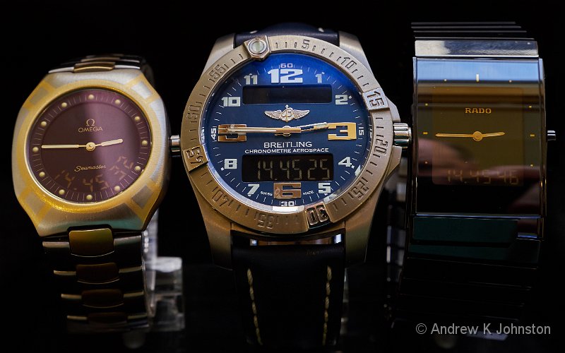
Sisters Under the Skin, or Brothers from Another Mother?
Visually, they are. But their operation is almost identical, so much so that the user manuals are interchangeable. Clearly some Swiss watchmaker just “got it right” in the late 1980s, and that solution has endured, with a life both within and outside the Swatch Group, the watch equivalent of the shark or crocodile. While the underlying technology has changed only slightly, the strong layering has allowed the creation of several different base models, and then numerous variants in size, shape and external materials.
This is a classic example of long-term value from investing in a strong underlying architecture, but also ensuring that the architecture allows for “pace layering”, with the visible elements changing rapidly, while the underpinnings may be remarkably stable.
It’s worth noting that basic functionality alone does not ensure longevity. None of these watches have survived unchanged, it’s the strength of the underlying design which endures.
Oh, and yes, the Omega is a full-sized mans’ watch (as per 1986)! More about fashion later…
Enabling Integration Unlocks New Value
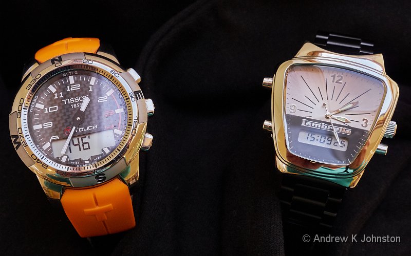
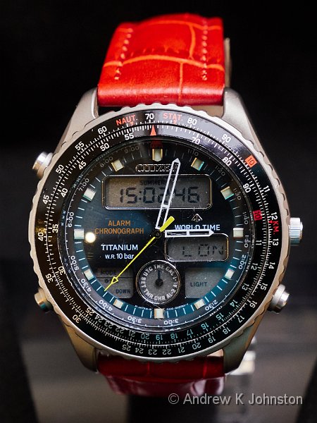
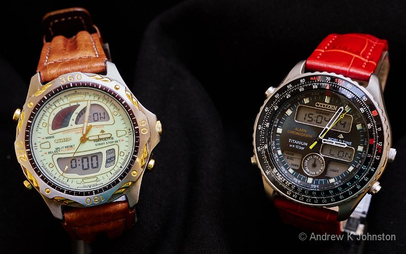
The earliest dual mode watches were little more than a simple digital watch and a quartz analogue watch sharing the same case, but not much else except the battery (and sometimes not even that!). The cheapest are still built on this model, which might most charitably be labelled “Independent” – my Lambretta watch is a good example. There’s actually nothing wrong with this model: improve the capability of the digital part, the quality of the analogue part and the case materials and design and you have, for example, my early 1990s Citizen watches which are among my favourites. However as a watch user you are essentially just running two watches in one case. They may or may not tell the same time.
The three premium Swiss watches represent the next stage of integration. The time is set by the crown moving the hands, but the digital time is set in synchronisation. There’s a simple way to advance and retard both in whole hours to simplify travel and clock-change adjustments. Seconds display is digital-only to simplify matters. Let’s borrow a photography term and call this “Analogue Priority” – still largely manual, but much more streamlined.
“Digital Priority”, as implemented in early 2000s Seikos is another step forwards. You set the digital time accurately for your current location and DST status, and you have one-touch change of both digital and analogue time to any other time zone. The second hand works as a status indicator, or automatically synchronises to the digital time when in time mode.
However the crown has to go to the Tissot T-Touch watches. Here the hands are just three indicators driven entirely by the digital functions: they become the compass needle in compass mode, show the pressure trend in barometer mode, sweep in stopwatch mode, park at 12.00 when the watch is in battery-saving sleep mode. And they tell the time as well! Clearly full integration unlocks a whole set of capabilities not previously accessible.
Extremes of analogue/digital integration
So it is with software. Expose the control and integration points of your modules to one another, or to external access, and new value emerges as the whole rapidly becomes much more than the sum of the separate parts.
Provide for Adjustment Where Needed…
While I love the look of some watch bracelets (especially those with unusual materials, like the high-tech black ceramic of the Rado), adjusting them is a complex process, and inevitably ends up with a compromise: either too loose or too tight. Even if the bracelet offers some form of micro-adjustment and you get it “just right” at one point, it will be wrong as the wrist naturally swells and shrinks over time. Leather straps allow easier adjustment, but usually in quite coarse increments of about 1cm, so you’re back to a compromise again.
The ideal would be a bracelet with either an elastic/sprung element, or easily accessible micro-adjustment, but I don’t have a single example in my collection like that. I hear Apple are thinking about an electrically self-adjusting strap for the next iWatch, but that sounds somewhat OTT.
On the other hand, I have a couple of £10 silicone straps for my Fitbit which offer easy adjustment in 2mm increments. Go figure…
We could all quote countless similar software examples, of either a “one size fits all” setting which doesn’t really suit, or an allegedly controllable or automated setting which misses the useful values. The lesson here is to understand where adjustment is required, and provide some accessible way to achieve it.
… But Avoid Wasting Effort on the Useless
At the other end of the scale, several of my watches have “functions” of dubious value. The most obvious is the rotating bezel. In the Tissot, it can be combined with the compass function to provide heading/azimuth information. That’s genuinely useful. The Citizen Wingman has a functioning circular slide rule. Again valid, but something of a hostage to progress. 🙂
At least the slide rule does something, if you can remember how!
Do the rotating bezels of my Citizen Yachtsman, or the Breitling Aerospace have any function? Not as far as I can see.
Now I’m not against decorative or “fun” features, especially in a product like a watch which nowadays is as frequently worn as jewellery than for its primary function. But I do think that they need to be the result of deliberate decisions, and designers need to think carefully about which are worth the effort, and which introduce complexity outweighing their value. That lesson applies equally to software as to hardware.
… And Don’t Over-Design the User Interface
The other issue here is that unless it’s pure jewellery, a watch does need to honour its primary function, and support easily telling the time, ideally for users with varying eyesight and in varying lighting conditions. While I have been the Rado’s proud owner for nearly 18 years, as my 50-something eyesight has changed it has become increasingly annoying as a time-telling device, mainly due to its “low contrast” design. It’s not alone: for example my very pretty Citizen Yachtsman has gold and pale green hands and a gold and pale green face, which almost renders it back to a pure digital watch in some lights!
At the other end of the scale, the Breitling Aerospace is also very elegant, but an exemplar of clarity, with a high-contrast display, and clear markings including actual numbers. It can be done, and the message is that clarity and simplicity trump “design” in the user interface.
This is equally true of software. I am not the only person to have written bemoaning the usability issues which arise from loss of contrast and colour in modern designs. The message is “keep it simple”, and make sure that your content is properly visible, don’t hide it.
Fashion Drives Technology. Fashion Has Nothing To Do With Technical Excellence
All my watches are good timepieces, bar the odd UI foible, and will run accurately and reliably for years with an occasional battery change. However, if you pick up a watch magazine, or browse any of the dedicated blogs, there is almost no mention of such devices, or largely of quartz/digital watches at all.
Instead, like so much else in the world we are seeing a polarisation around two more “extreme” alternatives: manual wind and “automatic” (i.e. self-winding) mechanical watches, or “charge every day” (and replace every couple of years) smartwatches. The former can be very elegant and impressive pieces of engineering, but will stop and need resetting unless you wind or wear them at least every few days – a challenge for the collector! The latter offer high functionality, but few seem engineered to provide 30 years of hard-wearing service, because we know they will be obsolete in a fraction of that time.
Essentially fashion has driven the market to displace a proven, reliable technology with “challenging” alternatives, which are potentially less good solutions to the core requirements, at least while they are immature.
This is not new, or unique to the watch market. In software, we see a number of equivalent trends which also seem to be driven by fashion rather than technical considerations. A good, if possibly slightly contentious example, might be the displacement of server-centric website technologies, which are very easy to develop, debug and maintain, with more complex and trickier client-centric solutions based on scripting languages. There may be genuine architectural requirements which dictate using such technologies as part of the solution, e.g. “this payload is easy to secure and send as raw data, but difficult and expensive to transmit fully rendered”. Fine. But “it’s what Facebook does” or “it’s the modern solution” are not architecture, just fashion statements.
On a more positive note, another force may tend to correct things. Earlier I likened the Omega/Rado/Breitling design to the evolutionary position of a shark. Well there’s another thing about sharks: evolution keeps using the same design. The shark, swordfish, ichthyosaur, and dolphin are essentially successive re-uses of a successful design with upgraded underlying architecture. Right now, Fossil and others are starting to announce hybrid smartwatches with analogue hands alongside a fully-fledged smartwatch digital display.
In fashion terms, what goes around, comes around. It’s true for many things, watches and software architectures among them.
Conclusions
Trying to understand the familial relationships, similarities and differences in a group of similar artefacts is interesting. It’s also useful for a software architect to try and understand the architectural characteristics behind them, and especially how this can help some designs endure and progressively evolve to deliver long-term value, something we frequently fail to achieve in software. At the same time, it’s also salutary to recognise where non-architectural considerations have a significant architectural impact. Think about the components, relationships and dynamics of other objects in architecture terms, and the architecture of our own software artefacts will benefit.

 List
List Abstract
 One+Abstract


 Email me
 Others
 Main feed (direct XML)