In October last year I wrote an article celebrating the hybrid analogue/digital watch and offering some architecture and design observations from my collection of them. I ended up slightly sad about the style’s fall from fashion, but confidently predicting that new models with smartwatch capabilities would be forthcoming. It turned out that I did not have to wait long.
In March Alpina announced the AlpinerX, via a KickStarter campaign. That approach was designed to work around a frequent challenge with new digital watches from smaller brands, that of guaranteeing sufficient early sales to justify decent batch sizes of the components and materials. Predictably, I was an early backer, and my watch arrived in mid-June.
At first sight, this is simply a classic analogue/digital watch. I have read reviews comparing it with the Breitling Aerospace or Omega Speedmaster X33, but a much closer existing comparator is the Tissot T-Touch Expert Solar. That watch is a similar size, style and price and has a similar sensor set. The two watches share similar deep integration of the hands with the digital functions, so that they become, for example, the needle in compass mode.
However the AlpinerX goes further. It has a couple of extra sensors including a pedometer and a UV level meter, but this is also a fully-fledged connected smartwatch, just as much as an iWatch or equivalent, and it really comes into its own in partnership with your phone.
Size and Styling
Regarding the watch’s design, we should start by addressing the elephant in the room, or more correctly the elephant on the end of your arm. While it’s certainly not the largest gong around, it is a big watch, 45mm in diameter, larger than the Breitling Aerospace, and 14mm thick, much thicker than the Tissot T-Touch Expert Solar (or latest Breitling Aerospace Evo). This is not going to slide unnoticed under a dress shirt cuff. The size is a result of several factors. First fashion – we have all got used to wearing a dinner plate on our wrist like something from The Fifth Element – and its outdoor focus. Practically its composite case (which Alpina call glass fibre) may well have to be a bit thicker than a metal one.
However although I haven’t confirmed it, my money is on the size of the battery, or batteries. If Alpina’s claims are borne out they have pulled off a remarkable coup: a watch with the rich sensors and connectivity of a smartwatch, but with battery life measured not in hours or days, but around two years just like its non-connected cousins. I hope that promise comes good: Alpina haven’t provided a “sleep mode”, like older T-Touch models, in which the watch can be put into a battery-saving dormant state when not being used, and I do hope I’m not going to be changing the battery too frequently.
Although it’s quite large, it’s not a heavy watch by any means (a benefit of the composite shell), and it sits comfortably on my fairly average wrist. The Tissot, with its solar power solution, may be slimmer, but the AlpinerX is perfectly wearable, albeit better with casual clothing.
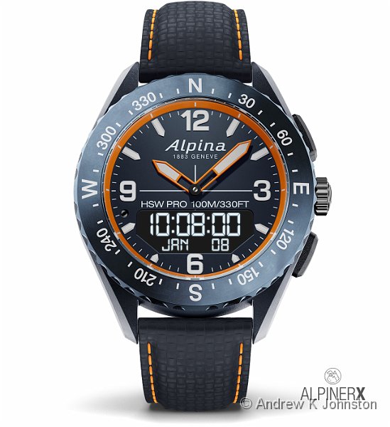
The watch has a simple, clean design, with simple white digits on the face, matching markings on the bezel (which rotates to work with the compass) and clear intermediate markings. The digital display takes up most of the bottom of the dial, dark yellow in background mode, or white on black when lit. Unlike some designs, the digital display has been positioned symmetrically, and all the cardinal points of the analogue display are retained.
Alpina offer buyers the ability to select the colour scheme of almost all elements of the watch, allowing extensive customisation, although in reality the main choices for most components are black or navy – the latter being a sort of dark purple (which I rather like) rather than a completely neutral blue. In the expectation this will be a travel/holiday watch, I have chosen cheerful orange highlights wherever possible: for the hands, the ring, and the stitching on the leather strap. I also have a rubber strap in bright orange, but so far the leather strap has proven adequate for my use, and very attractive with a texture reminiscent of woven carbon fibre.
Operation – General Observations
Operation of the watch is very simple, using the three buttons on the right-hand side. The “pusher” button in the crown lights the display and toggles through the main functions. Within a selected function the bottom button selects sub-functions (e.g. count up or count down) and the top button does start/stop.
The rotating “crown” appears to be simply decorative. As we will see, Alpina have missed a number of opportunities where this could usefully provide setting adjustment , but that’s not the model here. For more complex settings this is a watch controlled not directly, but via the companion app on your phone. That allows the local controls to be simpler, but does sometimes mean that it can take some digging into the app to find out how something is managed.
The free-rotating bezel (with click stops) provides a compass indicator which can be teamed with the compass needle to provide azimuth and heading indication. At least it does something useful!
For those used to more complex smartwatches with high-resolution OLED displays, the simple two-line alphanumeric digital display might look a little crude. However it suffices to provide most of the information you need while actually on the move, and presumably helps deliver the excellent battery life. Again the operating model is for detailed review to be done on the much larger display of the phone. On a positive note, the simple display could be readily combined with the design of any of my Swiss hybrid watches, even the diminutive 1987 Omega Seamaster Polaris, so maybe there’s scope for a smaller, neater variant of the watch at a later date.
When illuminated (which happens by default every time you switch functions or activate the connection to the phone) the digital display is bright and clear. When the backlight is off the digital display is a bit dim, but there’s no issue with the clean, high-contrast analogue indicators (or hands, as they are otherwise known 🙂 ).
The watch has a number of nice touches. For example, one of the challenges with this style of watch (which is also a problem with multiple dial chronograph watches, although it’s rarely mentioned) is that sometimes the hands obscure a key part of the digital display. Alpina has come up with a neat solution to this – simply swing the hands out of the way of the display when the user activates the digital display. (However it has to be said that the neatest solution for smaller watches, adopted by Rado and older Casio and Seiko models, is an oblong case with digital displays above and/or below the dial. Sometimes simple is best.)
Pairing/Connection
Use of the AlpinerX depends heavily on connection to a phone. It is therefore rather annoying that the process of connection can be rather fiddly and unreliable, especially with Android devices. Experiences vary – mine is that the two devices will connect and communicate easily immediately after the phone has been rebooted. However if thereafter the phone’s BlueTooth is turned off and on, or the devices are separated for a long time, then it can be tricky to get the connection working again, and the simplest, but not ideal, solution is to restart the phone.
What seems to happen is that the watch thinks it is connected but the phone does not, and in this mode there’s no reliable way to restart the process. I just hope that Alpina can improve things and deliver a firmware and/or app fix, which at least is an option here.
Timekeeping Functions
Ultimately, setting the extended functions aside, this is a watch, and so needs to provide good basic timekeeping. It therefore comes as a surprise that some capabilities standard in every digital watch since the 1970s are either missing, or delivered in a non-standard and somewhat clumsy fashion.
The biggest omission is the alarm function. Either I am being very stupid, or the AlpinerX doesn’t have one! There is no way to simply set the watch to make a noise at a pre-appointed time of day. You can set the watch to receive a push notification from your phone, and then set your phone to provide the alarm, but Alpina warn that doing so can harm battery life, and if you are going to do so, you might as well just use the alarm on your phone. If your phone suffers from late alarms due to the brain-dead Android “doze” mode, then this watch is not going to help you.
There are no direct controls to set the time on the watch. The idea is that the watch takes its primary time from the phone, which in turn takes the time from the network. This allows an elegant, simple solution to travel adjustments and so forth, but it’s not clear how to make micro adjustments if needed. In my experience “network time” can sometimes be adrift of the time provided by a good watch. If you are in an area where the network does not provide reliable time indication (like during a flight) you will have to adjust your phone manually, and if you don’t have your phone when you need to adjust the time, you’re stuffed.
Operation of the stopwatch is straightforward, but the count-up/count-down timer is really annoying, as you have to set the target value on the phone before it can be used. This is one example where it would be really useful to provide a way (the rotating crown, obviously?) to set the value locally. If I’m going to have to use my phone, I’ll just use the timer app on my phone, or wear a thirty year old watch where this just works.
Fitness Monitoring
On a more positive note, the AlpinerX does provide some very useful fitness monitoring features: principally a pedometer and a “connected GPS” mode for tracking an exercise route and duration. If you’re not doing complex exercise and you don’t need heart rate monitoring, then you don’t need to wear a Fitbit. That could provide a useful simplification to the holiday gadget set.
As pedometers the AlpinerX and Fitbit Charge 2 agree within 0.2%: 12 steps in over 6300 on my first test. However they behave very differently in “connected GPS walk” mode. The AlpinerX can be fiddly to get started with first GPS fix, but then very accurate – you can see where I double back to my car at the start of the walk with the parking ticket. The Fitbit is very crude by comparison, taking only a handful of fixes in an hour. The result is about a 10% difference in distance, with the AlpinerX’s figure of 4.7km rather more believable than the Fitbit’s “straight line” estimate of 4.3km. (The Fitbit is also more painful to sync with your phone if they have been disconnected for some time, although the AlpinerX can get confused if you turn Bluetooth off and on and try to reconnect. You pay your money and take your choice.)
The AlpinerX’s “phone first” model means that it only provides a simple time display during the exercise, and I would like to see this extended to some basic “steps/distance so far” information. Yes, I know I can get my phone out, sync them and read the phone, but I don’t want to do this when walking.
I haven’t tried the sleep monitoring, but I don’t hold out a lot of hope for it. Even with its heart rate monitoring the Fitbit can’t discriminate (for me) between “asleep” and “lying awake but still”, and I don’t expect the AlpinerX to do any better, especially since I would probably have to use the “under the pillow” mode. If you thrash about all the time when you are awake it might work…
UV Sensor
The AlpinerX has something which I haven’t encountered previously in a watch, a UV sensor. The marketing claim was that “AlpinerX can give timely warnings to reapply sunscreen or seek the shadow…” This is a great idea, but unfortunately the initial implementation falls a long way short of expectations.
Based on the claims, I was expecting an intelligent function which would continuously monitor UV exposure throughout the day. Plug in some information about your skin type and the strength of your suncream, and the phone would automatically set an alarm to remind you when to take action. Fat chance.
As far as I can see, the current implementation requires the user to switch the watch to UV monitoring mode and manually initiate each measurement. The phone then displays a very simple set of maximum, minimum and average values for the day. There is no concept of history or cumulative values. There is also no way to get the promised “timely warnings”, because there is no alarm function.
There is a text page in the app which provides some guidance on interpreting the UV measurement, but I’m not convinced of its value. The guidance is almost exactly the same for all UV levels from 3 to 11, effectively just “use SPF 30+ sunscreen and re-apply every 2 hours”. That’s for a range which at one end shouldn’t trouble anyone but a troglodyte albino, and at the other would rapidly scorch an Ethiopian mountain dweller.
Alpina really need to sort this out, or modify their claims. Regular automatic measurements and an exposure history would be a start, and ought to be pretty simple to achieve.
Altimeter and Barometer
Like the Tissot T-Touch watches, the AlpinerX provides altimeter and barometer functions. Like the Tissot watches, it has then same challenge that with a single measurement it my be difficult to disentangle changes of weather and changes of location during the same period. You can come back to your starting point after a day’s travel which included weather changes and the altitude doesn’t quite return to its initial value. The AlpinerX does, however, appear to do something clever with either average pressure or in concert with the phone’s GPS and will correct itself given a bit of time at rest. Advantage AlpinerX.
The app displays a continuous periodic readout of your altitude throughout the day, but like the UV, the barometer reading is displayed as a crude set of current, maximum and minimum values. Given that the rate of change of pressure can be important, it would be great, and presumably relatively simple, to be able to see this as a timeline as well.
Thermometer
The AlpinerX has a built-in thermometer. Like other watch thermometers, this tends to indicate the temperature of the wrist while being worn, but the AlpinerX seems to be better than most, with a smaller error and quicker recovery to ambient temperature when then watch is removed, maybe due to the non-metal case. Ironically temperature is displayed as a timeline in the app, but tends to hover round a fixed value close to human skin temperature through the wearing day.
Guidance and Documentation
While the watch does many things well, getting the best from it is a real challenge given the frankly appalling documentation which is delivered with it. The box includes a thick printed manual … which doesn’t cover this watch at all! There is a three page “getting started” leaflet, but that doesn’t cover key functions such as time setting. Between the two of these I spent some time trying to pull out the crown, which is how other watches in the Alpina range achieve that, and I’m lucky that I haven’t broken anything.
You need to find the relatively well hidden link to download a PDF of the 23 page version of the manual to have a hope of understanding the watch. Why a printed copy of a 23 page manual isn’t included in the box is a complete mystery. The fact that it isn’t downloaded automatically with and intelligently linked directly from the app is a travesty.
It doesn’t help that the app is a graphic example of how ease of use and ease of learning are completely separate and sometimes even conflicting objectives. There is little or no help to find your way through its structure and the options. Once you have found how something works it is usually easy to use repeatedly, but I do wonder how many users will abandon some tasks altogether, defeated by the poor guidance.
Conclusions
I do like the AlpinerX. It is a smart, capable watch and has delivered on a majority of its promises, if not all. It has already supplanted my Fitbit for my fitness walks, and I expect it to become my primary travel watch, although given the additional dependency on my phone, I may have to carry a second more traditional hybrid watch on longer trips, just in case.
Coming to this watch from my experience with older hybrid models, that phone dependency is a challenge, although I suspect users of other smartwatches might be less surprised. I would prefer the AlpinerX to be independently capable of all the traditional timekeeping functions, including setting alarms and timers, without recourse to the phone, and I don’t see a good reason why it isn’t.
With my other watches, any limitations are permanent, for the duration of my ownership. By contrast the AlpinerX architecture does allow some of its limitations to be addressed through firmware updates or even simple app changes, and I hope Alpina listen to me, and other users, and work hard to progressively improve the product. At the same time, I would like to see them open up the data, and maybe even the app functions, through a development API or SDK. The independent developer community could deliver significant value to users if this watch is treated as a platform, not a closed product.
If Alpina are thinking of further similar models, then I suggest they do treat the Breitling Aerospace Evo as a reference, not for its functionality, but for its size. It pulls off the trick of being wearable as both a casual watch, and also with formal or business attire. A smaller and thinner AlpinerX model which could do that might make it into my list of regular daily timepieces, and that would be a great result.
This is a good watch, and at least partially realises my prediction about the future of analogue/digital models. It’s not without frustrations, many of which could have been avoided, some of which can still be fixed. It will be interesting to see where Alpina take it, and whether others recognise a good thing.

 List
List Abstract
 One+Abstract


 Email me
 Others
 Main feed (direct XML)