
 List
List Abstract
 One+Abstract


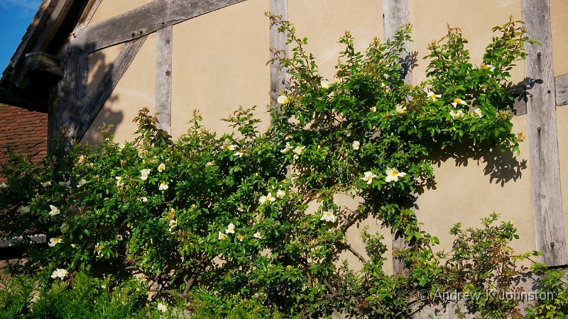
| Detail from the side of Shakespeare's birthplace, Stratford-on-Avon | |
| Camera: Panasonic DMC-GH2 | Date: 27-06-2012 19:24 | ISO: 400 | Exp. bias: 0 EV | Exp. Time: 1/1300s | Aperture: 8.0 | Focal Length: 42.0mm | Lens: LUMIX G VARIO PZ 14-42/F3.5-5.6 | |
First Impressions of the Panasonic GH2
Regular readers will know that technology miniaturisation has been on something of a negative trend chez Johnston. My most recent TV, desktop, main camera and most notably laptop purchases have all been significantly larger and heavier than their predecessors. Even my latest phone, purchased a few weeks ago, is rather larger than the previous one, although there’s no real weight penalty.
However, I’ve finally bucked the trend. Recovering from knee surgery (which limits my carrying ability), and thinking about my next holiday under the cloud of increasingly challenging airline luggage limits, I’ve taken the plunge and invested in an EVIL camera (“Electronic Viewfinder, Interchangeable Lens”:) ), in the shape of a Panasonic GH2. It’s funny how several influences came together:
- A very good Panasonic cinema advertising campaign featuring a professional taking great shots in Yosemite, using a Panasonic G3,
- Rave reviews of the new OM-D,
- A growing desire on my part to get a new toy and kick-start my slightly stuck photographic activities.
I had a look at the OM-D, but it just didn’t fit my hand. Oddly the Panasonic G3, almost identical in size, felt fine, but came up short on spec. A bit of research suggested that the GH2 would be a better match for my needs – a similar package, but closer to my Canons in capability. However, what really swung it was a review by Michael “Luminous Landscape” Reichmann, a man who apparently thinks nothing of spending £10k on the latest medium format wonder, who used a GH2 as his main camera for a six-month stay in Mexico last winter. Sold!
It’s been in my hands a few days now, and so far I’m very impressed. In terms of functionality, it’s closer to my Canon 7D than anything else in my fleet. There are proper knobs and switches for all the major functions, but also a comprehensive set of custom functions and buttons (the lack of which is one of the things which would make the Canon 60D a poor replacement for my much-loved 40D). Handling will take a little getting used to, but it all makes sense and with a bit of practice should work by feel with the camera up to the eye – very much my preferred mode. The electronic viewfinder is very clear, now I’ve got it focused at a point which works for my eyes with glasses either on or off!
The camera is rich in features with some, like the ability to change the aspect ratio in camera, potentially very useful. However, it has to be said that neither Canon nor Panasonic have made any progress against my list of enhancements we really need in DSLRs. Let’s hope the next generation do better, and in the meantime I’m off to investigate the growing phenomenon of GH2 “hacking”…
Image quality is really very good. Despite the smaller sensor noise levels are similar to my Canon 7D, certainly up to ISO 1600. I haven’t played with the really high ISOs yet. Beyond that is the performance of the 14-42mm “power zoom”. This comes in a package which when switched off looks like one of Panasonic’s tiny “pancake” primes, but extends when powered up to provide a useful zoom with 28-84mm range (in 35mm equivalent terms). It’s pretty sharp throughout its range, and chromatic and geometric aberrations seem to be almost absent. This conflicts sharply with the Canon EF-S mid-range zooms: the 17-85mm suffers very bad CA, the 15-85mm has very noticeable geometric distortion for a large part of the “wide” end, and neither is very sharp at the edges of the frame. Admittedly the Canon lenses have almost twice the zoom range, but I’d much rather have a really good 15-45mm “L” zoom, if only Canon made one… 🙁
All this comes in a tiny package. The camera is just about as small as it can be and fit my hands. Powered off, it’s about 3″ deep. And the body plus standard zoom is less than 500g. That’s about 40% of the weight of the Canon 7D + 15-85mm combo, or less than that lens alone. I suspect a “three zooms plus fast prime” lens set will probably still weigh less than the 7D and standard zoom lens, and not cost much more.
Now I don’t know how reliable it will be, or how it will stand up to regular use. The current version couldn’t compete with the 7D for fast action, or in very low light, although the gap is narrowing with each generation of these new mirrorless, smaller sensor cameras. Whether there’s a case for the 550D is more questionable. Will I dump my Canons for the GH2? Not yet, but it feels like the writing may be on the wall…
Update, September 2012
The apparent excellent performance of the tiny MFT lenses is due to in-camera correction of the JPG files. The RAW data shows the geometric challenges of such lenses in their full light. If you are prepared to use either SilkyPix or Adobe LightRoom as your RAW processor, then it will automatically read the correction data and re-apply it, but this is not available to users, like me, of other RAW processors. I’m becoming slightly obsessed by this problem, and now running a project to try and get to grips with it. However, I thought it worth updating my original post with this note. If you shoot JPG, then the MFT cameras are little short of amazing. If you shoot RAW, be prepared for a bit of a challenge…
 Email me
 Others
 Main feed (direct XML)