I’m off on my travels again – another photographic trip with Light and Land, this time to Myanmar (formerly Burma).
Having recently downloaded a copy of Canned Heat’s Greatest Hits I was tempted to call this blog “On the Road Again”, but that’s not correct for this trip. It appears that outside the main centres Myanmar’s roads are pretty non-existent (despite managing to host a very good Top Gear special a few years ago), and most of the medium as well as long-range travel on this trip will be by air, hence the title. However we’ve not got off to the best of starts, and I’m hoping that’s not an omen…
Things start on Tuesday, the day before travel, when I received a flurry of emails late in the morning explaining that my outbound flight to Bangkok is being rescheduled by 3 hours, and as a result I’d be on a rather later connecting flight to Yangon (formerly the Burmese capital of Rangoon). That isn’t too much of a trial, as Frances is able to re-arrange to accommodate the later drop-off, and it means that we avoid rush hour on the M25. As a result we have an easy trip to the airport and arrived in plenty of time. At check-in I meet Julia, who was also on the Bhutan trip, and it is no great hardship having a natter and looking at photos over lunch. Unfortunately when we get to the gate, things started to look a bit more problematic, and it becomes clear that there are going to be further delays. We finally get away about an hour and a quarter later than the rescheduled time.
The flight is smooth and uneventful, apart from sleep being impossible due to the old lady next to me listening to the entertainment that I could hear her film soundtrack from her headphones, with mine on (and I’m quite deaf)!
The process for dealing with a delayed, full A380 at Bangkok airport is a number of Thai Airways employees scattered throughout the terminal, each with routing instructions and meal vouchers for a subset of the passengers. I am beginning to wonder how this can work, when the second person I ask for directions turns out to have my name on her list, and my lunch voucher. Impressive, or just good luck??
The flight to Yangon is rostered onto an airbus A330, capacity over 300, despite the fact that there are only a handful of passengers who only just outnumber the crew. Loading takes about 5 minutes, and is complete a good quarter of an hour before departure time. However that doesn’t stop departure being delayed by a further 25 minutes, for no reason which was ever explained to us. I’ve come to the conclusion that Thai Airways regard the clock as a broad guideline rather than anything more. Oh well, if you can’t face these things with reasonable equanimity you shouldn’t be doing international travel…
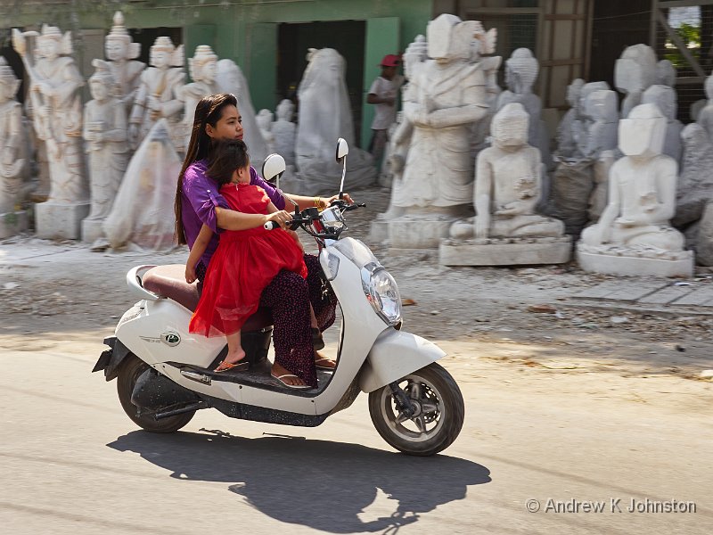
Arrival in Myanmar was straightforward, and it was good to meet up with the rest of the group, and particularly Clive Minnit and Phil Malpas, the group leaders. This will be the third of Clive and Phil’s trips I’ve been on, and I have great expectations based on the previous ones. It takes a while to get across Yangon – it’s a busy city of a similar size and population to London, and there’s a fair amount of traffic at rush hour – but it was noticeably different from the mania often portrayed of this part of the world, and which I experienced in reality in Kathmandu. There’s none of the milling bikes, mopeds and overcrowded buses. Yangon seems to be “London busy” rather than “Asian busy”, if that makes sense. It will be interesting to see how Mandalay compares.
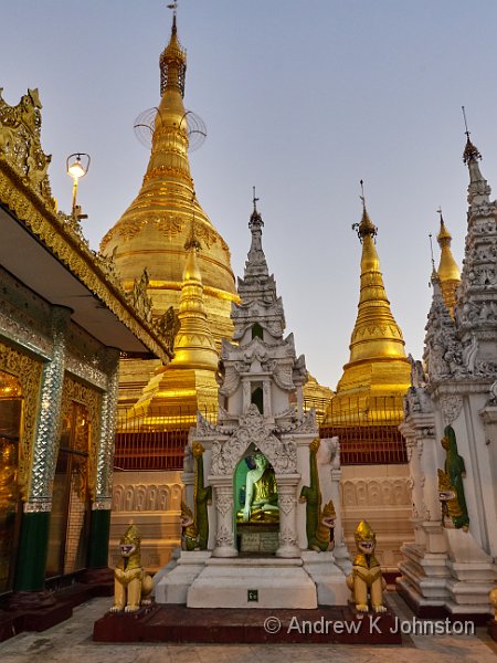
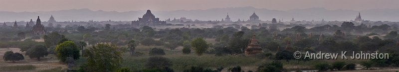
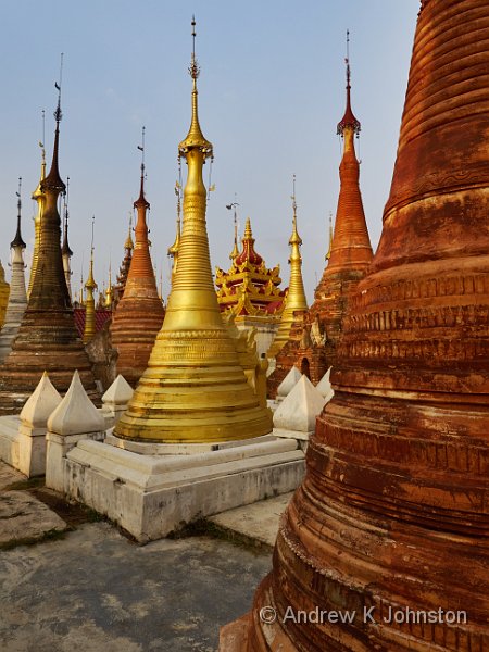
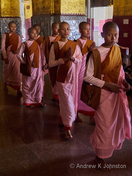
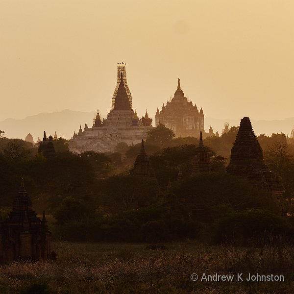
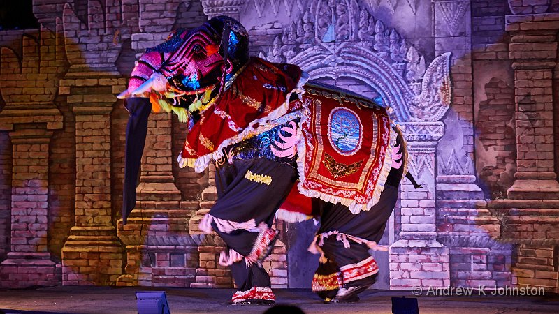
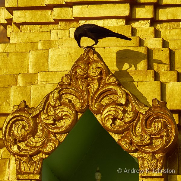
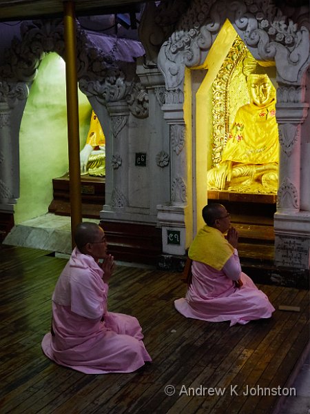
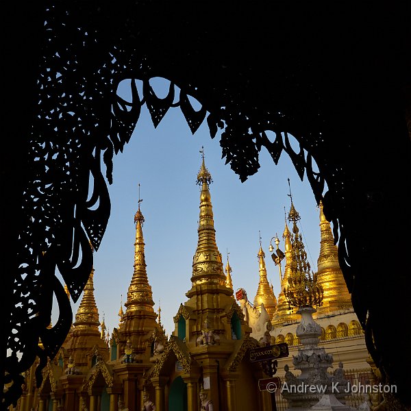
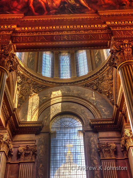
We only have about half an hour to unpack the cameras before setting out again, and I’m starting to feel somewhat ragged, but that all evaporates when we got to the Shwedagon Pagoda. This is actually a “pagoda complex” over several acres, where the huge central golden pagoda has been progressively surrounded by hundreds of other pagodas, temples and shrines. We arrive just as the sun was starting to paint these fascinating structures in late afternoon light, and stay until an hour after sunset, by which time everything is artificially lit. The enormous difference from Bhutan is that the Burmese don’t mind you photographing inside the temples, and you’re free to photograph them as well as long as you don’t actually disturb someone’s meditation. Talk about a “target rich environment”!
I’m slightly stunned by the wealth of visual information, and not quite sure where to start, so these two images are just a taster. More tomorrow!

 List
List Abstract
 One+Abstract


 Email me
 Others
 Main feed (direct XML)