Picasso had his blue period. I had a blurry period.
There’s a common line in much of photography writing. Set aside those actively trying to sell you something, and most will at some point claim that "kit doesn’t matter”. The idea is that a good photographer can get excellent results with any equipment. He or she will understand and work within any limitations, potentially even making an artistic feature of them. Conversely the mediocre photographer chasing improvement through better equipment is wasting time and money better spent on training in technique.
However that has not been my experience…
I’ve been a photographer since my teens. Until the mid 00s I muddled along with low-end 35mm film cameras and a variety of relatively cheap lenses, typically “kit” lenses or items purchased randomly from shop displays of used items. Over the years I’d worked up from a “manual everything” camera with fixed 50mm lens to an entry-level Canon EOS SLR which provided automatic focus, exposure and film winding. The photos had their limitations, but I lived with them. They were better than most friends and relatives managed with “point and shoot” cameras, but they didn’t really relate to the sharp, colourful large-format images I saw in magazines or at exhibitions.
That changed with the advent of my first DSLR, a Canon 350D. Now I had a tool capable of producing high-quality digital images, in theory up there with the best of them. OK, auto-focus was slow for anything but well-lit static subjects, and the maximum usable ISO was 800, but by using the histogram I could reliably get correctly exposed and focused shots almost every time, banishing most of the technical issues which had limited my film photography. At the same time I realised that because of the constraints of my work, photography, and travel for it, was really my main hobby, and I wanted to become good at it.
Score 1 for a kit upgrade, but I suspect we all overlook this one.
I knew I needed to improve my compositional skills and my eye for images, but I read widely, attended courses, got some mentoring, and practiced. I do say so myself, but my ability to see, frame up and capture an image improved steadily. I learned to shoot RAW, and started to develop an efficient toolkit to work through and develop my pictures. I took the better ones proudly to my mentor…
…At which point he made a comment about sharpness, and I realised that it was true, many of my images seemed a lot softer than they should. Ignoring those with motion blur (due to subject movement), depth of field limitations or environmental constraints (haze or low light), quite a lot of straightforward static shots seemed to lack “bite”. I tried fiddling with the processing, but to little avail. I wondered if the problem was camera shake, but that seemed unlikely as I have a steady hand, and I proved that I could get sharp shots with my telephoto at full stretch and a moderate shutter speed, and from my non-stabilised wide-angle lens. That should have told me something, but it didn’t.
At the time my main lens was the Canon EF-S 17-85mm f4-5.6 IS USM. This was a decent lens, neat, smooth in operation with good stabilisation, and received decent reviews. It did suffer quite bad chromatic aberration near its limits, but that was usually correctable. However I became convinced that simply because it was relatively cheap maybe it was the culprit.
So I set about trying to find a better mid-range Canon zoom. This proved easier said than done. Canon had multiple well-reviewed zooms which were 24mm at the wide end, but that’s only "wide" on full frame, and useless for my style of photography with APS-C bodies. I borrowed a 17-40mm lens, but that seemed heavy, lacked image stabilisation and didn’t seem to produce much better results than what I had. Ditto the 17-55mm, which is a good lens, but a big lump for what it is. At the same time these all equated to about 28mm at the wide end, and I was ideally hoping for something a bit wider. My options seemed limited.
At which point, Canon released the EF-S 15-85mm f3.5-5.6 IS USM lens. This looked like the answer to my prayers: similar range to the 17-85mm but a bit wider, marginally faster, and about twice the price, so it had to be better, didn’t it? I read reviews and tried one in a shop, all of which looked quite promising. I bit the bullet and purchased one.
Picasso had his blue period. This was the beginning of my blurry period.
I don’t mean that every shot I took was a fuzzy mess. In well-lit conditions straight on to a static subject with no vast challenge on depth of field the results were OK. Subject movement wasn’t a problem either – the lens played very well with the Canon 7D’s excellent autofocus on moving targets. However in terms of my images being a bit disappointing on the sharpness front, if anything the rate seemed to have gone up.
Nice colours, no shake, but still blurry
Some of this was down to my technique. I was arguably becoming too reliant on multi-purpose autofocus, and maybe not paying enough attention to depth of field complexities. Some was due to a straightforward mechanical weakness of the 15-85mm lens: pointed too far up or down the front element would move under its own weight and disturb zoom and focus, but I learned to recognise and manage that. However the fact remained that some images which should have been consistently sharp just weren’t.
Things came to a head on the first day of my Iceland trip, when I suddenly realised that only the autofocus lights in the bottom 2/3 of the viewfinder were active – the others never came on. The lens just wasn’t focusing properly on objects at the top of the image. I swapped to the 17-85mm lens and the problem went away, so that became my main lens for the remainder of the trip.
The 15-85mm lens was still under warranty, so it went back to Canon for repair. Actually it went back twice, as the first time it was returned "no fault found" and my carefully listed symptoms clearly ignored. The second time Canon reported that they had adjusted the front element of the lens. It was a bit better, but not right. I could point it straight at a wall, and either the top of the image would confirm focus or the bottom, but not both.
I went for a walk with friends, and took the shot below. It may not show up well at web resolutions, but it’s a very odd image. The roof tiles reflected in the water are sharp. The tiles photographed directly, without the challenges of reflection, but by definition at the same optical distance, are blurred.
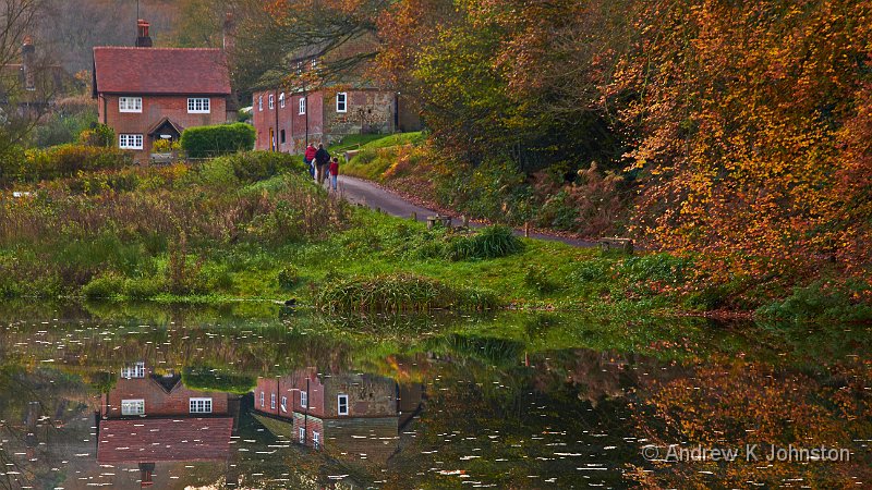
The Canon 15-85mm lens’ failings uncovered
After that walk I did another review of the market, but was still unexcited by any other option. I sold the lens (for a fairly low price to a happy buyer, I checked), and bought another, brand new. It was a further step in the right direction, but I still couldn’t be sure that I was getting the images I should.
One problem is that it’s very difficult to understand the limitations of your kit if that’s all you have to compare. It’s a bit like trying to assess the benefits of Blu-Ray via an advert on a DVD – you only have a DVD quality image to judge. I call this the “can’t tell through current medium” problem. At the risk of channelling Donald Rumsfeld, you don’t know what you don’t know…
I was getting frustrated, and it shows in my portfolio. After the walk which generated the top image, the Canon 7D hardly contributed apart from sporting events, where coupled with the 70-300mm lens it continued to shine. Everything else was taken with other, supposedly "lesser" cameras.
When I bought the Panasonic GH2, I wasn’t intending to buy a "better" camera. I’d become attracted to the idea of mirrorless cameras, and I wanted a "full capability" camera kit which was genuinely small and light. In truth there was also a bit of gadget lust, partly bought on by my growing frustration with Canon, who were also very tardy in upgrading the 7D. Driven by the small/light mantra, I chose as my first micro four-thirds lens the 14-42mm "power zoom" (which folds itself down to a pancake when not in use), a lens which requires prodigious geometric correction in the camera or RAW convertor.
And the images it produced were so sharp, they just "popped" off the screen. Casual grab shots with the GH2 had a clarity of detail and colour I had rarely matched with the Canons, and only readily achieved with the excellent EF 70-300mm f/4-5.6 IS USM lens, rather than the mid-range zooms. I had found my reference!
My first real shot with the GH2 – sharp!
It’s surprising in hindsight, but even with this realisation, it was a long 18 months before I completely moved on. I was both personally and financially invested in the Canon system, and couldn’t change instantly. The GH2 was only 12MP (only 9MP at some aspect ratios). It struggled if the subject was actually moving, by comparison a great forte of the Canon 7D. In addition the early micro four-thirds cameras and lenses were tiny but felt fragile, and I was more disposed to expose the Canon kit to rain, dust or the sands of the Erg Chebbi. Underneath it all I suspect I was still somewhat in denial that a much cheaper, as well as smaller kit was capable of superior results.
The end of the transition came suddenly, via an accident which was happy for me, less so for my friend David. He was trying to shoot the swirling floodwaters of Winter 2013-14, knocked his tripod, and in went his 7D and lens. He wanted time to choose an upgrade replacement, so offered to buy my 7D as an interim solution. He also took a couple of lenses, but wasn’t interested in the 15-85mm. He’d obviously heard me swearing once too often!
The rest of my Canon kit went on eBay. Most sold quickly and for good prices. There was one exception: the execrable 15-85mm took months to sell and achieved a very low price. I was slightly chastened, but not really surprised.
Somewhat before the end I had mentally and practically moved fully into the Panasonic system. I loved much about it, especially the image quality, but also my kit finally included something which Canon had never been able to provide, a lightweight high quality mid-range zoom (the wonderful 12-35mm f/2.8, beloved even of lens snobs). My blurry period was over.
Now I’m sure there are plenty of people doing good work with APS-C Canon cameras, working carefully within the limits of the lenses, or living with their limitations. I could always have invested instead in a bunch of primes, or maybe I might have fared differently if I had got better results from my trial of the 17-55mm lens. However the reality is that I just couldn’t believe Canon would sell bad lenses for good money, and tried to "stick it out", rather than moving on sooner. For every photographer who is constantly chasing the next big thing, there’s probably one like me, constrained by the "I’ve bought it, so I must use it" mentality (or maybe just limited financial resources).
What moved me on wasn’t any clever analysis of reviews or lens performance charts. It was a few quid burning a hole in my pocket, frustration, a bit of gadget lust and a couple of inspiring Panasonic adverts. Effectively "Gear Acquisition Syndrome" saved my photography. I’m not sure to whom that should be a lesson, and I can imagine that this article may well not go down well with partners of dedicated gear nuts, but this is a true story, and you will never hear me say "kit doesn’t matter". I don’t agree.

 List
List Abstract
 One+Abstract


 Email me
 Others
 Main feed (direct XML)