Disentangling a well-known “fact” about email
There’s a lot of “received wisdom” kicking about on the internet – ideas and “facts” which are essentially presented without question on the basis of “he said it, so it must be true”. This afflicts many fields, and sustainability is no exception. One common example is that “sending an email generates 4 grammes of CO2 or more”.
There are a couple of problems with this figure. One is that it doesn’t pass what one old manager of mine called “the giggle test” – email processing sits very lightly on computers and the amount of processing, and therefore energy consumption, for each is clearly tiny. We need to understand what else is included in this figure, or run the risk of discrediting otherwise valid environmental impact analysis by using it.
The bigger problem is that this figure is then taken, without unbundling its elements, and multiplied by large corporate email volumes to come up with massive estimates for the environmental impact of email which are clearly wrong – I have seen cases where the energy saving claim for an email improvement exceeded what we know to be the power consumption of all the company’s systems put together.
Finally because this is specifically about “email” people start to believe that other mechanisms, such as instant messaging, must be more efficient when the exact opposite may be the case.
We need a better way to understand and estimate the environmental impact of emails and similar mechanisms. In this article I try to develop one.
Where Did the 4g Figure Come From?
Although the figure is “all over the internet”, dig behind it and everything goes back to the work of Mike Berners-Lee, an academic at Lancaster University (by coincidence my own Alma Mater), who researches carbon footprints and has published a useful reference for them in his book “How Bad Are Bananas?: The carbon footprint of everything”. The 4g figure is widely quoted from the original 2010 edition. A revised analysis in the newer 2020 edition quotes smaller values for some cases, but even larger values for others.
While it’s a great book, providing much food for thought, there are a few challenges with the figures, particularly in this case. Berners-Lee doesn’t really “show his working”, and each section tends to present the answers, with a small following discussion, but you are left to try and unbundle the separate elements and decide which apply in which circumstances. The email figures are dominated by “preparation time” and embedded emissions, both of which need to be treated with caution. In addition the focus on “carbon” makes it a bit more tricky to reconcile his figures with actual measurements.
Power Consumption, not Carbon
While quoting the “equivalent carbon emissions” of different activities allows wider comparison, it’s actually a bit counter-productive for things where the primary source of emissions is electric power consumption, and I instead prefer to use kWh, or equivalent, for a number of reasons:
- Power consumption figures are unambiguous, whereas carbon equivalence varies between locations, over time (both seasonally and with longer-term changes), and with energy-sourcing arrangements. Carbon is to some extent subjective, whereas 1 kWh is the same across time and space.
- Carbon figures can be “gamed”. It’s very easy to say “we have no emissions because we only buy green electricity” or “we offset all our emissions with carbon credits, so we’re already net zero”. Neither helps to understand where consumption is happening and how to reduce it.
- Quoting carbon instead of consumption adds a layer of opacity to the calculation. If we’re just multiplying Watts by Seconds (or some multiples thereof) the calculations are easy, if we’re then applying a variable equivalence factor then things become more difficult to follow.
At the very least carbon figures need to be heavily qualified, e.g. “1 kWh means about 193g CO2 emissions in the UK using the typical generation mix in 2022”. Working at least as far as the penultimate line in power figures is easier.
Preparation and Reading Time
Berners-Lee’s estimate is not really about “sending an email” itself, and is dominated by the use of the computer to prepare and digest the email content. I think this needs to be excluded, or at least treated separately, for two reasons:
- It’s not predictable: there is a direct relationship between the size of an email and the work computers and networks have to do physically processing it. That does not exist for the writing and reading stages. A funny picture at the size limit of the system may take a few seconds to send and another few for each reader to look and laugh. At the other end of the scale a 5-line email about business restructuring and possible redundancies may take the boss a morning to write, and will then sit on the screen, being processed by its recipients, for the same time.
- It’s nothing to do with the use of the email channel. The preparation and reading effort will be similar if the same content is sent via WhatsApp, Teams, Snail Mail or hand-delivered using a gold Rolls Royce. The first two will have a similar “delivery” carbon cost to email, but I can promise you that the others start to get much larger!
The best way to handle this is to separate out two things. The first is the energy cost of sending and receiving the email. This is calculated, based on real measurements, below. Then there’s the “cost of using a computer for office work” (to distinguish it from more expensive variants like gaming or complex modelling). A modern PC with something like a 24” monitor and typical home or office networking uses around 50-70W. For an 8 hour working day that’s a total of about 0.5kWh, or about 100g CO2 using the current UK electricity generation factor, say 12g per hour for all your computer activities. If you’re just working on a phone, or on a low-spec laptop with the screen dimmed the figures will be much smaller again.
Embodied Emissions
Embodied emissions are those generated in the manufacture and delivery of a device. Berners-Lee quotes figures around 400kg CO2 for a range of laptops. Compared with the runtime emissions that’s enormous – if a laptop consumes an average of 20W and is left on 24 hours a day its annual power consumption is about 175 kWh, or about 34kg CO2 at the current UK equivalence (0.193kg / kWh). If it’s more efficient, and off or in a low-power state when not in use, then the power consumption is going to be a small fraction of the embedded emissions.
The challenge with including embedded emissions in something like a “per email” figure is twofold. First you need to choose a realistic, consistent life-cycle and duty-cycle over which to allocate them, and small changes in those rules will make a massive difference to the per-use emissions, dominating other considerations. For example, do you average them over the typical 3 year life and 10 hours per working day of a new corporate PC, or over the much longer actual lifetime of a typical PC including the second-hand phase, possibly 10 years or longer?
The other problem is they don’t scale, except in the most gross terms. If you have a system (PCs, servers and network) comfortably capable of handling 40,000 large emails per working day (see boring details below) then the embodied emissions are exactly the same whether your daily email volume is 40,000, or 4. If you do something dramatic and reduce your email volume by a factor of 100 then the “per email” emissions increase by the same factor. Even if you get rid of email altogether if the same people still have a PC then the reduction in embodied emissions is limited to maybe one server.
What you absolutely cannot do is take a relatively high “per email” figure and then multiply that up by a large volume to get the total. If the same system is able to handle that large volume, then the embodied emissions element simply does not change.
Unless you are comparing options for a device which will only ever be used for a single task (e.g. email) then it’s probably best to exclude embodied emissions from any task-specific calculation, but consider them alongside the general environmental cost of the computing infrastructure.
A Better Estimate for Email Processing
My initial approach was to try and come up with a theoretical model based on known power characteristics for typical computing equipment. The problem is that those models generate figures around a thousand times lower (milligrammes rather than grammes of CO2 per email), and I came up against repeated challenges of the form “but the internet says it’s 4g per email”.
To try to short-cut these arguments I’ve actually measured power consumption sending and receiving test emails, and derived some practical guidelines from the results. The approach taken is as follows:
- Measure power consumption of a test PC, and test duration, while sending and receiving a number of test emails
- Measure CPU activity on the email server used to process the emails
- Calculate the power usage for the test, both as a total value and as an increment over background consumption
- Derive an average energy cost for emails of different sizes, and the related estimated carbon emissions
The focus is on the physical creation of the emails (equivalent to pasting prepared text), sending, processing and receiving them. The time to write the email and other content, or to read after receipt, are not considered for the reasons set out above.
The following table shows the results from tests with various email sizes and volumes. The top section shows the total power consumption, the lower section the incremental consumption over background:
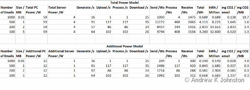
The following should be noted:
- The test PC (a Dell XPS 9500) has a relatively high specification and consumes more power than average office devices, so the total power figure is higher than quoted above. However it is expected that the greater processing power should result in a faster test execution, and therefore to some extent cancel out in the additional power model.
- Sending and receiving were automated using Microsoft Outlook, and therefore the PC processing should be representative of typical office or home environments.
- The email server is an AWS t3a.small instance with 2 vCPUs and 2GB RAM. Email processing is Linux-based, but does include some moderately complex routing and spam filtering, and is therefore broadly indicative of generic email processing.
- I use a figure of 200g CO2 emissions per kWh for simplicity. The DEFRA recommended emissions factor for the UK in 2022 is 193g.
The following observations can be made:
- For smaller emails gross power consumption is of the order of a few kWh per million emails.
- Average emissions per email are therefore <1 milligramme (mg), even allowing for other elements such as the PC’s monitor and networking
- The incremental power required to process an email on a system already in use is even smaller, <1kWh per million, substantially less than 1mg per email
- Power consumption and therefore emissions rise roughly linearly with the size of the test email, giving a gross estimate of 8 kWh per million emails per MB. For emails at the maximum practical size of around 20MB this gives an estimate of 160 kWh per million.
- The proportions between the different elements are very consistent except for the smallest emails, at about 82.5% send, 13.5% receive, 4% server processing
Recommended Estimating Approach
I recommend the following estimating basis. For the actual email processing:
- To send emails estimate 7kWh (~1.4kg CO2) per MB average size per million. For small text-only emails allow 0.5kWh / million
- To receive emails estimate 1kWh (~0.2kg CO2) per MB average size per million. For small text-only emails allow 0.5kWh / million
- For email processing estimate 0.6kWh (~0.12kg CO2) per million. This allows for each email passing through two servers, one sending and one receiving, which is fairly typical.
- The proportion of the above figures which represents the power dedicated to email processing (above background activity) is about 20-25%.
These figures give a total end to end equivalent carbon emissions cost of about 1.6mg per 1MB email, assuming one recipient.
To include preparation and reading time, use a figure of 0.5 kWh (100g) per working day, which covers a typical modern PC, monitor and network, or an equivalent alternative figure if your arrangements are different. Then think about the number of emails each user processes per day and what proportion of their time they spend doing that. For example, if a typical user spends 20% of their working time on email and sends or receives 50 emails per day then their “per email” figure is (0.5 * 20%) / 50 = 0.002 kWh per email, or about 0.4g CO2. We need to double that to get the full send and receive picture.
I’d recommend keeping the embedded emissions separate, because they are fixed and tend to distort the picture. However for completeness if the PC has embedded emissions of 400kg CO2, has a complete economic life of 10 years, and is used 200 days per year then each working day equates to about 400 / (10 * 200) = 0.2 kg/day, or about 0.8g CO2 per email per user on the same basis as above.
Can a Figure of 4g or Above Be Justified?
Yes, but with significant caveats. Now we have a better understanding of the elements we can see a number of ways to get to a figure of 4g, or even much larger, although whether these are true typical “per email” figures which can then be multiplied up is somewhat dubious:
- Include processing time and embedded emissions, but average the embedded emissions over a much shorter time and fewer emails. If we take our PC with 400kg embedded emissions but only consider a typical 3 year corporate life-span and also use a lower figure of 25 emails per day we get a net figure per email something like 6g per email. However as noted above it’s incorrect and misleading to scale up a figure including embedded emissions.
- Have a high-spec PC sitting powered on but idle most of the day, just used for occasionally checking email. If the machine sends and receives 25 emails per day then the power consumed per email is 0.02 kWh, or about 4g emissions. If it’s on 24×7, not just in the working day this goes up to about 0.05 kWh per email. However this is a far from typical arrangement, and the figures break down as soon as the PC is also used for anything else, or a sensible power management scheme is put in place. Again you shouldn’t scale up from such an atypical figure.
- Setting aside processing time and embedded emissions, it is possible to get to 4g total power consumed per email – simply send a 20MB email to 1000 recipients!
How Can We Reduce The Impact of Email?
It’s important to keep things in context. A short textual email sits lightly on the world, using a tiny amount of electricity for its processing, and making no difference to already-present embedded emissions. Email is arguably a very efficient mechanism for such messages – some instant messaging programs are much heavier on PC resources. Saying “thank you” or “I agree” is not going to single-handedly melt the ice caps as “How Bad Are Bananas?” seems to imply.
Conversely, while blocking spam and encouraging the reduction of other “low value” emails is absolutely the right thing to do for usability and security reasons, the emissions impact is relatively small.
If the same content has to reach the same people then ultimately all electronic mechanisms are going to be broadly similar, but there are some additional considerations for larger documents. If most recipients use an email program like Outlook which downloads the whole email to the PC in one go, with attachments, then use that mechanism. The attachments are downloaded once, in the background so there’s no waste of either human or PC time waiting for them to download, and can be re-opened from local storage as many times as required. By contrast sending a link to a central location means the user has to wait for the attachment to download and open, potentially many times. There are other good reasons for sending a link, for example to ensure users see the latest information in a live document, but it may be less efficient.
If, however, not all recipients of the email need to see the full document then the best practice is to send a short textual summary in the covering email, and let each reader decide whether they need to download and open the full document. To do this the summary needs to explain what the document covers and significant findings/details. Compare:
Please find attached the progress report [Att: PrgRep.pptx, PrgRep.xlsx]
and
The Emissions Progress Report is now available. We have completed our submission for an extra £50k budget. All workstreams are green except Email Emissions which is amber, and should return green with the publication of the report this week. Please see Emissions Project October 2022 [PPT] for details
This strategy has usability benefits, but potentially also materially reduces the amount of data being shipped around.
You can go further – for example set up your email client to only download pictures and attachments on demand – but there’s a trade-off between marginal energy savings and a significant usability impact, and if the user has to sit waiting for the attachments then the energy saving may be wasted.
Generally good email etiquette aligns with efficiency – don’t send emails to large circulation lists unless absolutely necessary, and let the recipients decide whether they need to dig into detail or not. Think about the convenience of your recipients, not your own.
All electronic communications do have an environmental impact and in this energy-conscious world it’s our duty not to waste it. However ultimately the impact is small, significantly smaller than the “received wisdom” asserts, and I’d suggest that the value of communicating clearly and politely outweighs other considerations.

 List
List Abstract
 One+Abstract


.jpg)


 Email me
 Others
 Main feed (direct XML)