
 List
List Abstract
 One+Abstract


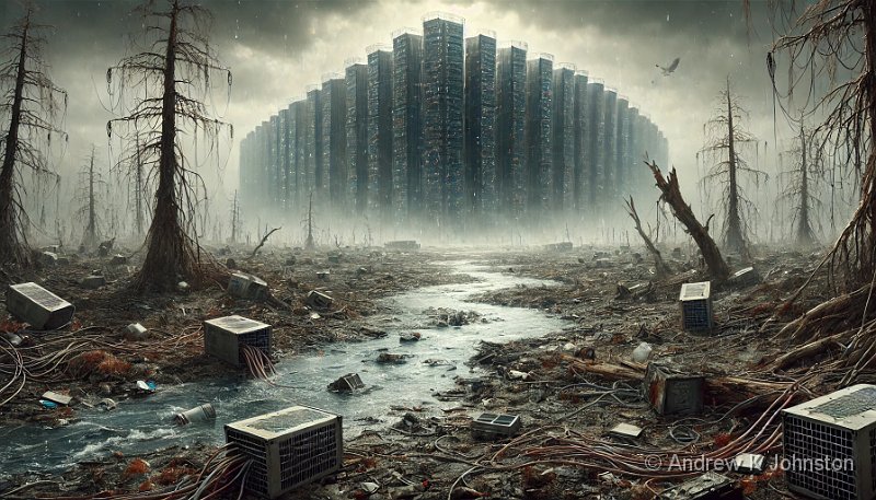
| Dystopian Landscape | |
| Resolution: 1792 x 1024 | |
Just how bleak can an AI’s world view become?
One of my clients asked me to write an article on the environmental impact of generative AI. Like a lot of large corporations they are starting to embrace GenAI, but they are also a leader in sustainability, aiming to be one of the first major financial organisations to Net Zero, and so they are rightly worried about the potential adverse effect of large-scale use of GenAI. I’ve already been doing work with them to measure and to better understand the power consumed by GenAI, so the article is an obvious next step.
I’ve already written several articles for their internal Net Zero blog, and to add a bit of interest to each I’ve asked ChatGPT to generate a short essay on the topic, in the style of a well-known author. This appears to be a task at which ChatGPT excels, and I saw no reason not to do the same again.
God, That’s Bleak…
I like the way ChatGPT mimics the very direct writing style of Hunter S Thompson, and I like to think that if he was still with us, Thompson would be working to expose shortcomings on all sides of the climate change debate. The prompt to ChatGPT was therefore a simple one: “Write a short essay about the risks of AI with a focus on the environmental impact, in the style of Hunter S Thompson”. This was the result:
A Savage Journey Into the Heart of Techno-Doom: AI, the Environment, and the Goddamn Reckoning
We live in a time of extraordinary madness, where artificial intelligence (AI) has become the darling of our cursed, frenetic age. It’s a glittering gem, a tool of infinite promise—yet lurking beneath this polished veneer lies the venomous bite of catastrophe. If you think AI is just another shiny toy for the tech elites to fiddle with, you’re in for a rude awakening, my friend. The real story here is not just the dystopian nightmares of machines outsmarting us; it’s the environmental havoc that this digital beast is ready to unleash on an already bleeding planet.
Let’s be blunt—AI is a power-hungry, resource-guzzling monster. It doesn’t just run on hopes and dreams; it feasts on data and electricity, and the price is paid in the blood of the earth. Picture it: vast data centers sprawling like cancer across the globe, consuming as much energy as entire nations. These steel-and-silicon behemoths are the new factories of the digital age, but instead of churning out cars or canned goods, they spit out algorithms and predictions. And just like the smoke-belching mills of the industrial revolution, they’re leaving a trail of destruction in their wake.
But who cares, right? So what if AI needs a few gigawatts here and there? We’re advancing, after all! The future is here, and it’s smarter than ever—never mind that the goddamn planet is burning. That’s just collateral damage, a minor inconvenience on the road to progress. This is the kind of twisted logic that’s driving us headlong into the abyss. The tech lords promise us a utopia of endless convenience, while quietly brushing the environmental costs under the rug. But you can’t hide the truth forever.
Let’s get real about the energy. Training AI models, particularly those gargantuan neural networks that gobble up every scrap of data they can find, is like fueling a fleet of private jets with coal. The carbon footprint of these operations is staggering. Every keystroke, every click, every goddamn chatbot response comes at the cost of churning out more CO2. And let’s not forget the hardware—the servers, the cooling systems, the endless upgrades. They all need minerals mined from the earth, ripped from the ground in a frenzy that leaves behind a scarred landscape and poisoned water.
And then there’s the e-waste. This relentless march of technology demands constant upgrades, and when those shiny new devices become obsolete, they’re tossed aside like yesterday’s trash. But this trash doesn’t just disappear. It festers in landfills, leaching toxins into the soil, contaminating water supplies, and creating a slow-motion disaster that will haunt us for generations.
But here’s the kicker: as AI becomes more “efficient,” as it gets better at predicting, automating, and optimizing every facet of human existence, it only exacerbates the problem. The smarter it gets, the more data it needs, the more servers it demands, the more energy it consumes. It’s a feedback loop of doom, an ouroboros of technological advancement eating its own tail, and we’re all along for the ride, whether we like it or not.
So what’s the answer? Do we unplug the machines and head for the hills? Not likely. The AI genie is out of the bottle, and there’s no stuffing it back in. But we need to start facing the reality of this techno-madness before it’s too late. This isn’t just about smarter machines or even smarter humans. It’s about survival. Our planet is at stake, and if we don’t get our heads out of the silicon-scented clouds, we’re going to find ourselves deep in the muck, wondering where it all went wrong.
In the end, AI might just be the ultimate test of human intelligence—a test of whether we can outsmart our own creations before they outstrip our ability to live on this Earth. If we fail, the machines won’t need to destroy us. We’ll do it ourselves.
Bleak, or what?
And how do I teach myself to write like that without an AI?
Cheerful, but Profound
I liked it, but unsurprisingly my clients were not that keen, especially as there’s a current internal campaign about the benefits of AI. So I tried again. Let’s not do bleak, let’s do cheerful. As a child of the 1960s I struggle to think of anything more cheerful and unthreatening than Winnie The Pooh, so I went back to ChatGPT with a second prompt: “Same again, please, but in the style of Winnie the Pooh”. Usually the “same again” instruction or similar resurfaces the same concepts, just wrapped in different language, but this time ChatGPT did something quite profound…
A Thoughtful Little Reflection on AI and the World Around Us
One fine day in the Hundred Acre Wood, while sitting on a sunny spot, Pooh Bear began to think—very hard, which is not something he did often, mind you, but this was a special kind of thinking. You see, there was talk in the Wood about something called Artificial Intelligence, or AI, which sounded very important and rather clever. So, Pooh decided he ought to try to understand it, especially since it seemed to be making quite a fuss in the world beyond the trees.
Now, Pooh was a bear of very little brain, as we know, but he had a great deal of heart. And when he thought about this AI, he began to wonder not just about what it could do, but about what it might mean for the world—especially for the bees, the flowers, and all the other important things that made life in the Hundred Acre Wood so delightful.
“AI,” said Pooh to himself, “must be a very busy sort of thing, always thinking and learning. But if it’s thinking and learning all the time, it must need a lot of honey to keep it going!” But of course, AI didn’t eat honey. It ate something else—electricity, and lots of it. And that gave Pooh pause. He remembered how much work it took to make a pot of honey, and he wondered how much work it must take to feed all that electricity to AI.
Pooh scratched his head, thinking of the bees buzzing in the flowers, gathering nectar bit by bit. “If AI needs so much energy,” he thought, “where does it all come from? And what happens to the Wood if we use too much?”
You see, Pooh had heard that the world was getting warmer, a little more each year, and that too much energy-using could be a rather bad thing. The flowers might not bloom as they should, the rivers might run dry, and the trees might stop growing so tall and green. And that would be a very sad thing, indeed. For without the trees, where would Owl perch? Without the flowers, where would the bees find their nectar? And without the rivers, where would Piglet splash on a hot summer day?
It seemed to Pooh that while AI was very clever, it might not always be very wise. For if it wasn’t careful, it could use up too much of the things that the world needed to stay happy and healthy. It was a bit like eating too much honey in one go—not a bad thing in itself, but too much of it might leave you with a tummy ache, or worse, no honey left for tomorrow.
Pooh also thought about all the things that AI needed to be made. It wasn’t just the electricity; it was all the metal and other bits that had to be dug up from the ground, and then made into machines that could think and learn. And when those machines got old, they couldn’t just be tossed aside like a worn-out honey pot. No, they had to be dealt with carefully, or else they might end up in a big heap, making a mess of the beautiful Wood.
So, Pooh decided that while AI might be a very useful and clever thing, it needed to be used with a bit of care, the same way one should be careful not to eat all the honey at once. He thought that maybe, just maybe, if everyone thought a little more about how to use AI wisely, and didn’t let it gobble up too much of the world’s energy and resources, then perhaps the Wood could stay green and lovely for a long, long time.
And with that, Pooh decided it was time for a little smackerel of something—because even a bear of very little brain knows that sometimes, a small break is the best way to keep thinking about big, important things. So off he went, humming a little tune and hoping that the clever people working on AI would remember to take care of the world around them, just as he took care of his honey pots.
There are some quite deep messages in here. I particularly like “It was a bit like eating too much honey in one go—not a bad thing in itself, but too much of it might leave you with a tummy ache, or worse, no honey left for tomorrow.”
What’s interesting is the different focus of the two pieces: the dominant message in the “Hunter S Thompson” one is very much “our rush for more technology is destroying us”, whereas in the “Pooh” one it’s “AI is a good thing, but not if we use it too much”, which is much more balanced.
Sadly I haven’t yet persuaded my clients to use either version, but at least I get to share them with you.


 Email me
 Others
 Main feed (direct XML)