
 List
List Abstract
 One+Abstract


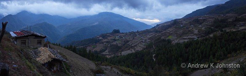
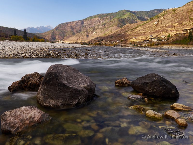
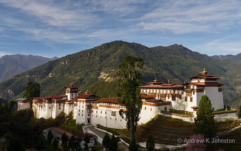
| Last light over the Haa Valley, Bhutan | |
| Camera: Panasonic DMC-GX8 | Date: 14-11-2015 17:04 | Resolution: 1920 x 1440 | ISO: 400 | Exp. bias: 0 EV | Exp. Time: 1/40s | Aperture: 5.6 | Focal Length: 12.0mm (~24.0mm) | Lens: LUMIX G VARIO 12-35/F2.8 | |
Bhutan: What Worked and What Didn’t
Sorry it’s been quiet for a couple of weeks. Inevitably there’s catching up to do on the return from a trip, plus I’ve had a couple of practical challenges before I could start properly sorting out the photos from the trip. However things are working OK now.
As always at the end of these trips, I’ve prepared a couple of posts with general observations on the trip, in the hope that it may be of assistance to someone planning a similar visit. To keep things manageable, this post focuses on the trip as a whole, and the following post focuses on photography and equipment matters. There will be a final post reflecting on my observations of Bhutan, the country and people.
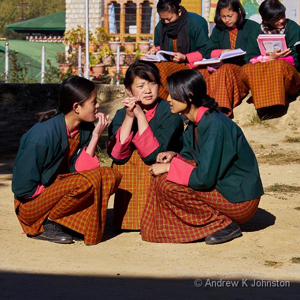
On a positive note, the people everywhere were friendly, welcoming and most were happy to pose for the camera, without expectation of more than a "thank you". In reality most away from direct tourist contact have limited English, although that will change, but they all understand basic pleasantries well enough.
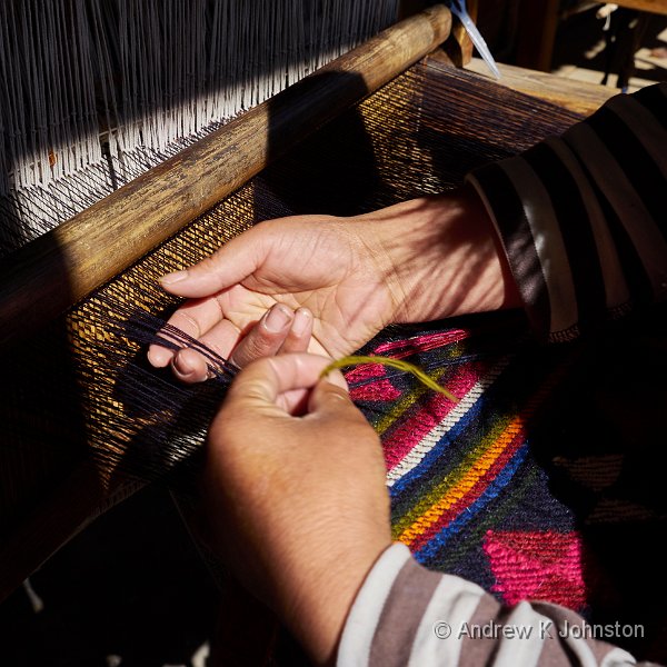
Bhutan is not an expensive location once you’re there and the $250 per day has been paid to the tour operator. My additional costs (mainly tips, T-shirts and beer) probably came to not much more than £200. Western money goes a long way in a country with a 1p note! There are plenty of stalls and shops selling handicrafts, but they understand the value of a "no thank you", and there are no street hawkers or other more annoying channels. There’s no need to haggle, and transactions are very straightforward with no nasty catches, but you do need to be aware of prices which can vary substantially between locations (beer varying between about £1 and £3, for example).
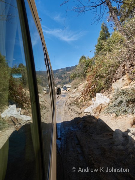
Travel in Bhutan is slow. 20kph is a very good speed in a bus, 15kph is a more sensible basis for estimating. One suspects that the current over-ambitious programme of simultaneously trying to widen almost all the roads is doomed to failure, or at least to very late delivery, so things will probably get worse before they improve.
In hindsight, the trip to Bumthang cost us two long days of uncomfortable travel for not much benefit, and I think most participants on our trip will be advising Light and Land to omit if from future itineraries. If your itinerary includes statements like "a full day of travel", question whether that is the best use of time and endurance, or whether further exploration of the nearer areas will be of more benefit.
Be wary of overcrowding on the transport. The standard tour buses are not terribly comfortable, and have a lower real capacity in practice than you might expect. They have a typical nominal seating capacity of 16-17 plus the driver and guide, but 4 seats are over the wheel arches with zero legroom, the back seat bounces so much that it suits only the hardiest, and there’s zero internal baggage space (suitcases are typically transported between hotels in an independent vehicle). Assume a maximum of 12 usable seats for longer journeys, in addition to the driver and guide.
Food is essentially Indo-Chinese buffets, mainly vegetarian with some chicken, although in the east you might also get a pork or beef dish. (I wrote most of this post at Doha airport, and I have never seen so many people queueing for a hamburger, in a Muslim country!… :))
The primary calorie source is uniformly boiled rice, although there is usually a secondary form such as potatoes, pasta or bread. Those catering more directly for tourists try and keep the main dishes fairly bland, with the chilli and garlic in separate dishes, but you can be caught out. One of the nastiest surprises of the trip for me was something called "cauliflower cheese", but about the strength and flavour of industrial defoliant!
The information I received about the weather was, essentially, lies. We had wonderful weather, dipping to around freezing most nights but between high teens and high twenties once the sun came up every day. We felt a couple of drops of rain once, and the mornings in Punakha started with a bit of mist, but otherwise we had zero precipitation. I had to carry a long-sleeved top or jacket for religious observation at the temples and Dzongs, but otherwise I could have operated entirely in T-shirts on all but two days. The waterproof, weatherproof tops, trousers, gloves etc. were completely unused.
Were we unusually lucky? It’s difficult to say, as this was the first time in Bhutan for all westerners in our party. However the fact that every other rooftop is covered with drying chillies, and the winter firewood is stacked in the open suggests that the Bhutanese are not expecting storms either.
This was my second trip (and the first for seven years) with Phil Malpas and Clive Minnitt of Light and Land. They continue to be great tour leaders: sensitive to the needs of their clients, well organised, and great fun to be with. As usual Light and Land partnered with a local tour provider (essential in Bhutan). Etho Metho provided a very good, supportive and knowledgeable guide in Yeshi, and I continue to be amazed by the accuracy and endurance of Chorten’s driving. Overall, a highly effective team.
So as a trip it worked well. Next: technology!

 Email me
 Others
 Main feed (direct XML)