Category Archives: Thoughts on the World
When I was a lad, there was a joke. It went:
"It must have been tough in the old days."
"Why?"
"They had to watch TV by candlelight."
Last night we were just sitting down to dinner and our evening’s viewing, and the power went off, for almost two hours. In lieu of candles we lit the gas fire and an oil lamp. Not happy to abandon our entertainment, we powered up the older MacBook, popped in our X Files DVD, and got on with our watching.
That’s right – we watched TV by candlelight.
But there’s a twist. It worked, because of late-noughties technology. DVDs and a laptop with a large screen and disk player slot. If we were reliant on 2017 technology, we would have been scrod: no disc player in the newer laptops, no access to streaming services (mains powered internet router and so on), no access to the mains-powered server which holds our recorded TV.
Normal service will therefore be resumed imminently.
I’ve always wondered about the phrase "a catholic taste", meaning "broad". Surely the way in which the Catholic religion (like most others) prescribes and proscribes certain behaviours and materials acts to limit rather than broaden an individual’s tastes? Apparently the Continue reading →
Tuesday, January 3, 2017 in
Reviews,
Thoughts on the World
I’m not sure I know why, but our leading hardware providers are definitely suffering a distinct deficiency in the Mojo department. Take Apple. I’m really very happy with my 2015 MacBook Pro, even though it was bloody expensive for what Continue reading →
Apologies if it’s been a bit quiet here recently, but I’ve been submerged under a tidal wave of new (to me) technologies, and it hasn’t left much space in this bear’s brain for blogging. In the last month or so Continue reading →
Thursday, November 24, 2016 in
Photography,
Thoughts on the World
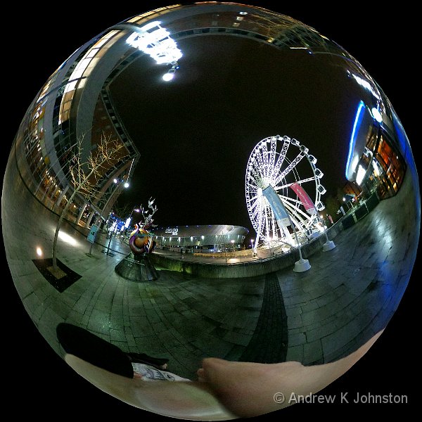
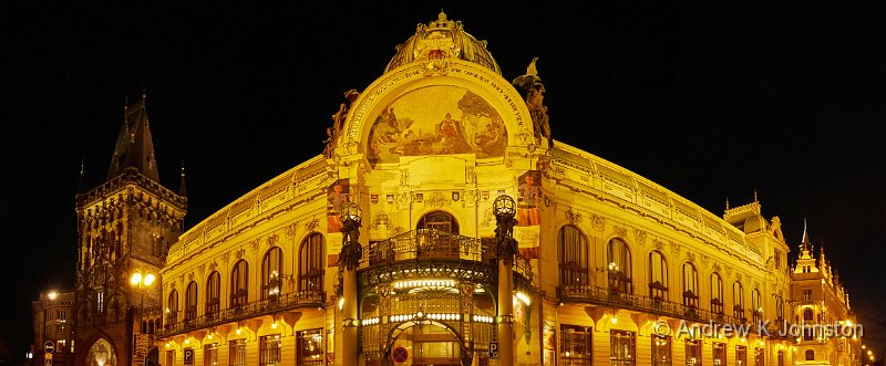
I’m aware that I’m a slightly lazy photographer. I’m not a great one for pre-dawn starts or rushing out the minute the weather changes, and I do tend to walk around with a single zoom lens on my camera making Continue reading →
Wednesday, October 12, 2016 in
Photography,
Thoughts on the World
Regular readers may remember that I classify films and plays according to whether they are about talking about getting on a train (i.e. deep and meaningful journeys into the soul), or actually getting on the train (/boat, /plane, /nuclear power Continue reading →
Once upon a time, not so long ago, there was a movement obsessed with removing colour, especially those whose skin colour or religious preference was different to their own. This went to great extremes, caused the greatest of all wars, Continue reading →
There’s an interesting, but intensely annoying, behaviour by the big software companies, which as far as I’m aware has no parallel in other areas of production for consumer consumption. We’ve all been used, since the mid-20th century, to the concept Continue reading →
Apologies if there hasn’t been much activity on the blog lately. I’m deep into the invention of the expert system I wrote about previously, and that’s filling the relatively small brain of this bear, and not leaving much space for Continue reading →
I’m about to start building an expert system. Or maybe I might call it a "knowledge base", or a "rule based system". It’s not an "AI", as at least in its early life it won’t have any self-learning capability, but Continue reading →
There’s a famous quote "never underestimate the bandwidth of a station wagon full of tapes bowling down a highway". Musing on this I decided to try and estimate the bandwidth of a carrier pigeon, given modern storage technology. According to Continue reading →
After talking about it for over a year, I decided that my transport needed to be “greener”, and finally bit the bullet on the respray. This is “Vivianite Green”, actually an official Mercedes colour in the late 90s, but for Continue reading →
Wednesday, May 4, 2016 in
Thoughts on the World

 List
List Abstract
 One+Abstract


 Email me
 Others
 Thoughts on the World (Main Feed)
 Main feed (direct XML)