
 List
List Abstract
 One+Abstract
LinkedIn is full of useful little articles about mistakes not to make in the world of work. However here’s one I’ve never seen mentioned. I’ve just had a kick-off meeting with a new client. In order to appear friendly and unthreatening I dressed in a dark green suit, with a brighter green shirt. Unbeknown to me, the brighter green is not only quite similar to one of the company’s logo colours, it’s also the colour they have chosen for many of the walls and much of the furniture at their offices. Take off my jacket, and I was approaching sniper levels of camouflage. There’s a lesson here somewhere…
Category Archives: Thoughts on the World
A First Day Mistake I’ve Never Seen on LinkedIn
3 June 2015 - Please share: 


Posted in Thoughts on the World
Leave a comment
Scary Format Reversal
30 May 2015 - Please share:
My penultimate purchase of music on vinyl was in 1989. I think, if memory at this distance serves, it was Running in the Family by Level 42. In the intervening 26 years I have felt very limited need to use other than CD or purely electronic formats.
That all went out of the window last week, when I tried to track down a particularly arcane track by the King’s Singers (their version of Eurovision winner Ding-a-Dong, if you must know). Despite their enduring popularity their album Lollipops has apparently never been released in a digital format. However a few minutes on eBay and £9 later I tracked down the LP, which turned up a few days ago nicely packed and in good order. Our record deck with a USB output and EZ Vinyl/Tape Convertor made quick work of digitising it, although it did get a bit confused by the track on side 2 with the substantial rests… Makes you wonder why the youth of today are so obsessed with all this downloading business when the alternative is so straightforward ![]()
Posted in Thoughts on the World
Leave a comment
Edge of Silence
29 May 2015 - Please share:
We’ve just finished our 30th anniversary viewing of Edge of Darkness. I must now have seen the series at least 10 times, but in this case familiarity breeds respect. Like the best Shakespeare play or Verdi opera the series rewards repeated study, and every time we notice something new about the story, the production, or both.
I’ve noticed before how Edge of Darkness has such an unforced pace, with space for the actors just to act. This time I consciously observed the phenomenon. In the first episode, after Emma’s death, there’s a period of about 20 minutes where Craven is grieving and the other policemen trying to help him deal with it. There are perhaps half a dozen lines of dialogue. In the 5th episode, where Craven and Jedburgh break into Northmoor, there are no more than a couple of hundred lines of dialogue in total. In over 50 minutes. Yet in both cases your attention is held completely, and there’s never a sense that the pace should be even slightly quicker.
This was also the first time I had watched it on a big screen, but at its original 3×4 aspect ratio. Now 3×4, especially with 1980s slightly grainy video, doesn’t suit expansive vistas or dramatic special effects. It does suit portraits, much better than wider presentations. What I noticed on this viewing was how Martin Campbell and his team really exploit this, filling the screen from corner to corner with one or two faces. It was powerful in the days of 20" TVs, but really punches through on a 50" set.
Yet again our understanding of the politics and personalities deepened. When I first saw the series, I wasn’t sure that Harcourt and Pendleton were the good guys. This time, I started to appreciate some glimmers of humanity in Grogan, the chief villain. Maybe by the 20th viewing we’ll understand him as well.
It’s slightly odd that the BBC chose to repeat the series last year rather than on this anniversary. 30 years on Edge of Darkness is still unmatched as a conspiracy thriller, and deserves some celebration.
Posted in Photography, Reviews, Thoughts on the World
Leave a comment
Standardising the Mac Keyboard
27 May 2015 - Please share:
My MacBook Pro is, ironically, the best portable PC I’ve owned. The Big Old Alien is slightly faster and more powerful, but you’d never use the word "portable" about it without gritted teeth, and since the PC world went to silly wide (=short) screens as standard, nothing else with a 15" screen can match the Apple’s bright, colour-accurate and relatively tall display. The form factor and elegant, strong body suit me very well.
The initial teething problems with accessing external displays resolved themselves when I bought some slightly higher quality display adapters. Ironically the best one for VGA has "Dell" written on it. The multi-touch trackpad works well with Windows as soon as you set the bottom right corner to provide a right mouse click, and the spacing and action of the keypad allows me to type quickly and fairly accurately in a way which isn’t possible on many of the other laptops I’ve owned.
The keyboard layout, however, is a different matter. I’m sure that Apple’s position is that you should just use Apple keyboards all day every day and get used to it, and that the more common layout is a Microsoft/IBM standard anyway. The latter point might be true, but that doesn’t help those of us who operate in a more heterogeneous world. I have to work on PCs as well. About half the time, I use my Mac via Remote Desktop, from a PC with a standard Microsoft Keyboard. Even when I’m working on it directly, and even though I’m not a true touch typist, my muscle memory is sufficiently good that I default to the UK PC positioning of the ", @, \ and # symbols, all of which I use quite frequently. And occasionally Frances gets to use it, and she is a touch typist who uses PCs all the rest of the time.
I therefore decided that something had to change, and that was the Mac! Unfortunately turning it into a "standard" PC layout is non-trivial, but I’m getting there.
The first step was to implement a proper "Delete" key, without which the Mac is unusable in many Windows programs. The solution to that one’s fairly well documented: you use SharpKeys to adjust the registry, and remap a suitable key to send the Del scancode, which is an easily reversible but permanent fix. I chose F12, which is easy to map and in pretty much the same relative position to Backspace as most Windows laptops. I believe it may be possible to use the CD Eject button instead, which would be even better, but I haven’t got that working yet.
The next layer is the Windows keyboard definition. Microsoft provide a free utility called the Microsoft Keyboard Layout Utility, which allows you to define the mapping for the main text keys. The advantage of this is that you can define multiple layouts and switch between them on the fly, if, for example, you work in several languages. I initially tried having the Apple layout, plus one based on a standard UK keyboard. This works tolerably well, but you can get tripped up if you haven’t switched the layout correctly, as you have to switch the keyboard separately for each application used in a login session. It also doesn’t resolve the problem of muscle memory on the Mac. Something more enduring was required…
I decided it was time to try and sort out the MacBook keyboard more directly. It’s relatively easy to pop the keycaps off and swap the standard text ones around. First change is to swap the \| key with the ~ key, which puts them into their correct positions for PC users, and remap their output in a copy of the Apple keyboard layout. While I was at it I remapped the non-shifted character on the ~ key from a grave accent to a # – consistent with PC keyboards and about 1 million times more useful in this hash-tagging world!
Apple’s approach to the quote keys appears to be wilfully obstructive. All European keyboards since the age of typewriters, including British ones, put the double quote above the 2. So do older American keyboards. However the US IBM Selectric typewriters put the @ above the 2 and the double quote above the single quote, and that became the standard for US PC keyboards. For reasons which I can only assume are due to an arrogant American company trying to impose American standardisation on others the UK MacBook keyboard follows US rather than standard UK practice. Fortunately they don’t impose the same change on the rest of Europe, so a partial solution presents itself by purchasing a replacement 2/" key for a German machine (from the excellent http://www.thebookyard.com), and swapping the outputs of the two shifted keys in the keyboard mapping file.
At this stage I have a single keyboard map which works with both the native keyboard or a PC one, and outputs all the symbols I regularly use on PC rules. The majority of keys on the MacBook keyboard also follow their labels. There are two exceptions: the @ key is generated by shift+quote as expected, but not shown on the key, and the same goes for the #, as the base symbol on the ~ key. Unfortunately as far as I can see there are no variants of the MacBook keyboard for any country which have these key combinations, so getting replacement keycaps is not an option. However I can probably live with this limitation.
The one remaining annoyance is the fact that the Fn and Ctrl keys are the opposite way round on the Apple keyboards to most PCs. That’s a bit of a problem with muscle memory for Ctrl+key shortcuts. However I’m gradually training myself to hit the standard PC Ctrl key on its right edge, which is almost the right position for the Mac Ctrl key as well. The real fix is to develop a new keyboard driver which swaps those keys altogether, and then swap the key caps. That’s not for the faint hearted, and I’m not going there unless I have to (and have lots of spare time).
There’s one more layer! ![]() Some of my software (particularly XnView, which I use for image management) uses the numeric keypad, which doesn’t exist on the MacBook (one of the big advantages of the Alienware M17X being so enormous!). However that has a relatively quick fix, using AutoHotkey to temporarily map the equivalent keystrokes from the standard number keys. This has the advantage that I only need to have those changes in place on demand, and can tweak the mapping on the fly if needed.
Some of my software (particularly XnView, which I use for image management) uses the numeric keypad, which doesn’t exist on the MacBook (one of the big advantages of the Alienware M17X being so enormous!). However that has a relatively quick fix, using AutoHotkey to temporarily map the equivalent keystrokes from the standard number keys. This has the advantage that I only need to have those changes in place on demand, and can tweak the mapping on the fly if needed.
It’s a complicated process, and definitely not standard end-user territory, but I’m nearly there!
Posted in PCs/Laptops, Thoughts on the World
Leave a comment
Schizo!
15 May 2015 - Please share:
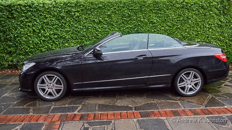
| Mercedes-Benz E Class Cabriolet E 350 CDI Blue Efficiency AMG Sport 125. Phew! | |
| Camera: Panasonic DMC-GH4 | Date: 14-05-2015 20:09 | Resolution: 4367 x 2457 | ISO: 500 | Exp. bias: -66/100 EV | Exp. Time: 1/60s | Aperture: 2.8 | Focal Length: 12.0mm | Lens: LUMIX G VARIO 12-35/F2.8 | |
It has been said that the ideal car for Darth Vader would be an original Mercedes CLS, in black. I think I have discovered the ideal car for Dr. Henry Jekyll, and Mr. Hyde!
Mercedes themselves acknowledge the dual personality of the beast with the space-filling full title of “Mercedes-Benz E Class Cabriolet E 350 CDI Blue Efficiency AMG Sport 125”. Now I may be wrong, but shouldn’t “Blue Efficiency” and “AMG Sport” sort of cancel each other out? Apparently not…
In normal use this is a typical, refined, Mercedes soft-top, very reminiscent of the old 129-series SLs. I was a bit worried before I took delivery that the suspension might be firmer than ideal, but it’s absolutely fine. It’s smooth, stable and quiet, the big Diesel engine hardly audible top up or down.It’s very quick, but doesn’t feel “fast”(even though on main roads you can maintain high speeds very easily), because the throttle response is fairly muted. And, the “Blue Efficiency” bit kicking in, on a long run as long as you keep it under about 85mph you can get around 40mpg, not bad for a heavy car with a 3l engine. Ideal for mild mannered Henry Jekyll.
And then you press the little button marked “SPORT”.
Now I’ve had cars with sport settings before. On the Mercedes SLs and the old Porsche 993 it supposedly made the gearbox a bit more responsive, but I never noticed much difference. On the VW EOS, with its petrol turbo engine there was a noticeable effect if you wanted to drive hard because the different profile meant that the turbo was always spun up and there was no lag, whereas that could occasionally catch you out in normal mode.
This is different. The button should probably be labelled “Dr. Henry Jekyll’s Patent Elixir”, but unfortunately that wouldn’t fit. It seems to signal someone to release a snarling, snorting monster from its cage. In practical terms the car sharpens its steering, firms up the suspension, changes the gearbox profile and dramatically modifies both the throttle response and engine behaviour. I’m not sure whether there’s also a change to the exhaust note, or whether that’s just a side-effect of the engine working harder. The net effect is a bit like having a large, powerful dog pulling you along on its lead – you go from nudging it gently in the rear end in ECO mode to desperately trying to reign it in in SPORT. 0-60 takes just over 6s, but the most noticeable effect is mid-range acceleration, which distinctly betters my last Porsche. Mr. Hyde would approve.
Some cars are soulless, and some have a distinct personality. This has two, and I’m enjoying both of them!
Posted in Thoughts on the World
Leave a comment
A Visitation
10 May 2015 - Please share:

| Hedgehogs in our courtyard | |
| Camera: Panasonic DMC-GH4 | Date: 09-05-2015 21:29 | Resolution: 3833 x 2555 | ISO: 3200 | Exp. bias: 0 EV | Exp. Time: 1/40s | Aperture: 2.8 | Focal Length: 100.0mm | Caption: Hedgehogs in our courtyard | Lens: LUMIX G VARIO 35-100/F2.8 | |
Great excitement chez nous last night. The security lights went on and we spotted not one but two hedgehogs snuffling around in the courtyard. Fortunately they stayed round long enough to get a few photos.
The security light provided good illumination, but kept on switching off (as it’s supposed to), so Frances ran around to wave at it and switch it back on. What was very funny was that each time the light came on, the hedgehogs froze mid-snuffle for about 10 seconds, just as portrayed in Over the Hedge, but which we’d never seen before in reality.
I spotted another one later on when I got up for a glass of water, so hopefully these welcome visitors will become a regular feature.
Posted in Photography, Thoughts on the World
Leave a comment
A Failure of Curation
5 April 2015 - Please share:
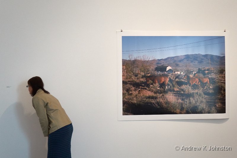
| Odd captioning practices at The Photographers Gallery | |
| Camera: Canon PowerShot S120 | Date: 05-04-2015 15:48 | Resolution: 3945 x 2630 | ISO: 200 | Exp. bias: 0 EV | Exp. Time: 1/60s | Aperture: 3.5 | Focal Length: 10.4mm | |
We visit a lot of photography exhibitions. The majority are inspiring or thought-provoking, and well worth the effort of the photographers, the presenters, and the attendees.
Along the way there has been the odd disappointment: sometimes we just don’t connect with the material, on other occasions we have felt that the volume or quality of the work hasn’t justified a high entrance cost. On one occasion an exhibition presented such a biased left-wing viewpoint that I felt desperate for the injection of some balance.
However today we had a new experience – an exhibition based on a good volume of high quality work, at a great location, which failed abysmally due to comprehensive incompetence in curation.
The offending exhibition was Human Rights, Human Wrongs at The Photographers Gallery. The piece was meant to chart the path of human rights since the Universal Declaration in the 1940s, drawing from a large archive of reportage. It failed.
The main problem was the complete absence of any organising principle. With the occasional exception of sequential shots of the same event, there was no attempt to group items by location, subject, date or photographer. It was just a confusing "bunch of stuff". At times the confusion seemed almost wilful – two related, well explained pictures from Vietnam together on a wall, but separated by a wholly unrelated picture from Chad.
The curators provided copies of original notes on some of the images, but these were presented in tiny type well below the average eye line, underneath the photos. To ensure there was no chance of even this being readable the images had thick frames spotlit from above, so half of each caption was adequately lit, and half in deep shadow. In any event there was no attempt to present any context, explanation or information about what happened next – unless the photographer wrote this on the back of the original you were on your own.
The caption typist had clearly lost the will to live with the highly structured but low information content approach, and even managed to mis-spell "Untitled".
Even the choice of content felt random. There were lots of good pictures of American Civil Rights events in the 1960s. Fine. Plenty of pictures of Martin Luther King Jnr, a portrait of JFK and a nice picture of Nixon with Coretta King. Good. But why have a blurry picture of Lee Harvey Oswald but none of Johnson, Bobby Kennedy or Malcolm X?
The supposed light relief afterwards, pictures of horses on the American prairies, didn’t work either, with captions in about 8pt type several feet away from the related shot, and the beautiful animals captured against wilfully ugly backgrounds.
The Photographers Gallery has a great new location, but they don’t seem to know what to do with it. This is an abuse of our human right to a decent exhibition!
Posted in Photography, Thoughts on the World
Leave a comment
Positively On Fire…
12 January 2015 - Please share:

| Winter light on the pampas grass, chez nous | |
| Camera: Panasonic DMC-GX7 | Date: 11-01-2015 10:45 | Resolution: 4592 x 3064 | ISO: 320 | Exp. bias: 0 EV | Exp. Time: 1/100s | Aperture: 5.6 | Focal Length: 45.0mm | Lens: LUMIX G VARIO PZ 45-175/F4.0-5.6 | |
Apologies, my first blog post of the New Year really should have wished you all the very best for 2015. Please accept this as a pseudo-first post, with said wishes.
I also just wanted to post this shot from yesterday. A low winter sun, passing clouds and unusually upright pampas grass for January combined to generate this remarkable light pattern. As we were just going out of the door this is a grab shot taken leaning out of the bedroom window, but I think the result worked. I hope it’s an omen for things being “on fire” (in a good way) in 2015.
Posted in Photography, Thoughts on the World
Leave a comment
Google Bowls a Googly
29 December 2014 - Please share:
Here’s a thing. Do a search for a restaurant, theatre or somewhere else you’d like to visit, using Google Chrome. Get a map using Google Maps, in Google Chrome. Print out a copy for reference – blank page!
Copy the URL into Internet Explorer, print out the map. Works…
Posted in Thoughts on the World
Leave a comment
An Experiment
23 November 2014 - Please share:
Readers of longer standing may remember the agonising when I had to replace my 2009 Toshiba laptop, as there had been yet another shift in screen aspect ratio standards, and in order to preserve a decent vertical screen size, I ended up buying a massive Alienware M17X laptop for my main work machine. It’s still a great machine, but “portable” is not an appropriate adjective…
This means I need another laptop for travel. For a while I soldiered on with the old Toshiba Satellite Pro, sticking a large SSD in and upgrading to Windows 7. This works fine, but inevitably software tends to expand to match hardware capabilities, which means running the latest versions of compute-intensive software such as Capture One starts to feel challenging on older hardware. The major nail in the coffin came in Barbados this year, when we discovered that The Crane had upgraded most of the televisions to new models with only HDMI inputs, and the Tosh only has a VGA output. This put a significant crimp in our television watching.
Back home, and the search for a new travel laptop began. One of the interesting challenges is that while I need an HDMI output for plugging into newer televisions, I also definitely need a VGA output on what will be a business tool, for plugging into projectors. However in about the past year Intel in their “wisdom” have decided that newer PCs should not have VGA outputs, despite the vast number of VGA-only projectors still in daily business use. After some agonising I found a deal from Dell for an “outgoing stock” 2013 model Latitude E5530, which has a Core i7 processor (of which more later), and, importantly, both VGA and HDMI ports.
Setting it up was refreshingly easy, as I purchased a 750GB SSD and simply cloned the old travel laptop onto this disk, stuck it into the new machine, and updated a few drivers. I have a fairly complex file replication scheme set up on all my laptops using the excellent SyncBack SE, which allows my work to just flow smoothly backwards and forwards between them, so that I can work on the Alienware M17X if I’m driving somewhere, or switch to the Dell if I’m travelling by other means. As a business computing arrangement it works pretty well. Recently I’ve been splitting my time between home, the Midlands, central London, Cologne and Berlin, and it’s served its primary purpose.
Unfortunately, there are some limitations. Firstly, although the Dell has a Core i7 processor, it turned out to be a dual core version. I didn’t spot this when I bought the machine, as I didn’t realise such things even existed! While it’s not a limitation if I’m doing normal business computing, it does affect my ability to do some tests with virtualisation or performance simulations, which have been an element of my recent work. Coupled with the relatively slow integrated graphics, it’s significantly slower when I’m processing images for my photography.
However the main issue is the stupid slitty “widescreen” display, which is only 768 pixels deep. This makes it almost unusable for some programs, such as Capture One, and a bit of a challenge even for working on large spreadsheets, project plans, or documents where I want to see an overview of a page. Coupled with a disappointingly dim screen which is very sensitive to viewing angle, it’s effectively unusable for my photography.
The result is that I’ve started lusting after alternatives. There is, of course, one hardware supplier who “get” the need for a sensible screen aspect ratio, and also have display technology which produces bright, colour accurate images tolerant of quite a wide viewing angle range. I am talking about Apple. One of my colleagues has a three year old 15″ Macbook Pro, and while I’m no lover of OSX, the screen is exactly what I need.
So that got me thinking, maybe the answer is a hybrid solution: Mac hardware running Windows :)… Yesterday I bit the bullet and purchased a 2011-era 15″ Macbook Pro, with a four core i7 processor. I will do my usual trick of installing maximum RAM and a big SSD, and it should more or less match the Dell for performance and portability, plus deliver a bit more style to boot. The interesting challenge is whether I can pull off my trick of just installing a clone of my existing laptop set-up, or whether I will have to re-install everything with a more complex dual-boot solution managed by OSX. I’ll also have to get used to running Windows on an Apple keyboard, which may be interesting.
Let the experiment commence!
Posted in PCs/Laptops, Thoughts on the World
Leave a comment
Goodbye Dr. Love
25 October 2014 - Please share:

| John Holt at the Barbados Reggae Festival, 2014 | |
| Camera: Panasonic DMC-GX7 | Date: 26-04-2014 04:14 | Resolution: 3424 x 3424 | ISO: 3200 | Exp. bias: -66/100 EV | Exp. Time: 1/100s | Aperture: 5.6 | Focal Length: 300.0mm | Lens: LUMIX G VARIO 100-300/F4.0-5.6 | |
I was very sad this morning to hear of the passing of the great reggae singer, John Holt. Help Me Make It Through The Night is very possibly my favourite reggae love song, and the contrast between his sweet voice and the electric brass section always sends shivers down my spine. We were lucky enough to see John perform several times at the Barbados Reggae Festival, most recently this April, by which time he was probably already ill, but it took nothing from his performance. A great musician, who will be sadly missed.
Posted in Barbados, Thoughts on the World
Leave a comment
Don’t Judge A Book By Its Cover
16 September 2014 - Please share:
This week I am supporting the TRW presence at Automechanika in Frankfurt. Due to a cock-up on the packing front by the team leader this morning found us short of a wireless router essential to connect our demonstration vehicle to the Internet. An attempt to source one at the airport failed, and this morning Anne and I were sent out to procure a replacement.
Our hotel is close to a small commercial area, and we quickly identified a number of promising stores, which unfortunately shared a relatively late opening time of 10am. 9am therefore found us wandering forlorn with only bakeries and pharmacies able to serve.
Right at the end of the street we found Zam Zam’s Party Emporium, and in desperation ambled inside. There amongst the balloons, fancy dress costumes and greeting cards, on a shelf above the till, was not one but a choice of six different wireless routers!
35min later we were on our way, problem solved. Dixons 0, Zam Zam 1. Result!
Posted in Thoughts on the World
Leave a comment
 Email me
 Others
 Thoughts on the World (Main Feed)
 Main feed (direct XML)