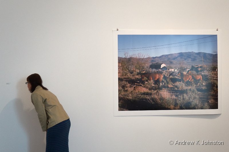
| Odd captioning practices at The Photographers Gallery | |
| Camera: Canon PowerShot S120 | Date: 05-04-2015 15:48 | Resolution: 3945 x 2630 | ISO: 200 | Exp. bias: 0 EV | Exp. Time: 1/60s | Aperture: 3.5 | Focal Length: 10.4mm | |
We visit a lot of photography exhibitions. The majority are inspiring or thought-provoking, and well worth the effort of the photographers, the presenters, and the attendees.
Along the way there has been the odd disappointment: sometimes we just don’t connect with the material, on other occasions we have felt that the volume or quality of the work hasn’t justified a high entrance cost. On one occasion an exhibition presented such a biased left-wing viewpoint that I felt desperate for the injection of some balance.
However today we had a new experience – an exhibition based on a good volume of high quality work, at a great location, which failed abysmally due to comprehensive incompetence in curation.
The offending exhibition was Human Rights, Human Wrongs at The Photographers Gallery. The piece was meant to chart the path of human rights since the Universal Declaration in the 1940s, drawing from a large archive of reportage. It failed.
The main problem was the complete absence of any organising principle. With the occasional exception of sequential shots of the same event, there was no attempt to group items by location, subject, date or photographer. It was just a confusing "bunch of stuff". At times the confusion seemed almost wilful – two related, well explained pictures from Vietnam together on a wall, but separated by a wholly unrelated picture from Chad.
The curators provided copies of original notes on some of the images, but these were presented in tiny type well below the average eye line, underneath the photos. To ensure there was no chance of even this being readable the images had thick frames spotlit from above, so half of each caption was adequately lit, and half in deep shadow. In any event there was no attempt to present any context, explanation or information about what happened next – unless the photographer wrote this on the back of the original you were on your own.
The caption typist had clearly lost the will to live with the highly structured but low information content approach, and even managed to mis-spell "Untitled".
Even the choice of content felt random. There were lots of good pictures of American Civil Rights events in the 1960s. Fine. Plenty of pictures of Martin Luther King Jnr, a portrait of JFK and a nice picture of Nixon with Coretta King. Good. But why have a blurry picture of Lee Harvey Oswald but none of Johnson, Bobby Kennedy or Malcolm X?
The supposed light relief afterwards, pictures of horses on the American prairies, didn’t work either, with captions in about 8pt type several feet away from the related shot, and the beautiful animals captured against wilfully ugly backgrounds.
The Photographers Gallery has a great new location, but they don’t seem to know what to do with it. This is an abuse of our human right to a decent exhibition!
 Thoughts on the World (Main Feed)
 Main feed (direct XML)