
 List
List Abstract
 One+Abstract


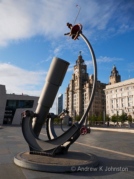
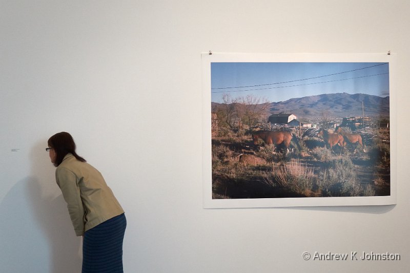
| Sextant statue in front of the Liver Building, Liverpool | |
| Camera: Panasonic DMC-GM5 | Date: 22-07-2015 19:41 | Resolution: 3423 x 4564 | ISO: 200 | Exp. bias: 0 EV | Exp. Time: 1/800s | Aperture: 5.6 | Focal Length: 14.0mm | Lens: LUMIX G VARIO PZ 14-42/F3.5-5.6 | |
On paper, the Panasonic GM5 should be an ideal "carry around" camera for me. The same sensor and processor as the excellent GX7 and GH4 in a neat pocket-sized packaged. A proper electronic viewfinder. Access to all the Micro Four Thirds lenses. Panasonic’s engineers have even been cunning beyond the normal behaviour of camera manufacturers and although it has a different battery to its larger brethren, it uses exactly the same charger. I’d managed to get a couple of minutes "hands on" in a shop and was reasonably impressed.
Last week, driven to Amazon by their remarkably "rubbish but effective" Prime Day pseudo-sale, I bit the bullet and ordered one, in a cheerful red. The general capability and image quality, as evidenced above, is all I expected. However, after a few days in my hands it’s going to go back. The reason – size. Like all disappointing love stories, it’s complicated…
It’s Too Large…
Although the GM5 body is tiny, not much larger than a Canon Powershot S series, put a lens, any lens, on the front, and it becomes too large to put in your trouser pocket, and too large to comfortably travel in my computer bag the whole time. In addition, I really need two lenses to cover a decent zoom range. The Panasonic 14-42mm and 45-175mm power zooms are both tiny, but together they make it into a package which demands a camera bag, in reality no different to using a next size up body.
… But It’s Too Small
In use, the camera is remarkably fiddly. I could live with the small buttons, but their legends and markings have also been scaled down, to a point which is almost invisible to me when I’m wearing my glasses. Also the smaller body puts my hands much closer to the lens and viewfinder in use, and I find that with the camera to my eye my hands are fouling my glasses.
Even wearing the smallest lens I own (the 14-42 PZ), there’s a bad case of "lens too big for the camera", and it won’t even sit flat on the desk. More of an issue, there’s no easy way to carry it in the hand, except gripping right round the body or lens, which makes it difficult to raise to the eye for a quick shot without having to use both hands.
For me, however, the killer is the tiny EVF. Impressive in the shop, in real use out and about, wearing my glasses, it’s almost unusable. The effective view size is tiny, and despite several attempts at adjustment I couldn’t get the view sharp with my glasses. You get, at best, a sense of what’s in shot, rather than being able to scan the picture for meaningful details. (Ideally I would have avoided the sextant statue "fouling" the statue of Edward VII on his horse in the above shot, but I just couldn’t see that detail.) If I can’t use the EVF I’d rather have a camera with a size larger rear screen, to give me some chance of being able to use it with glasses on, and in varying ambient light conditions.
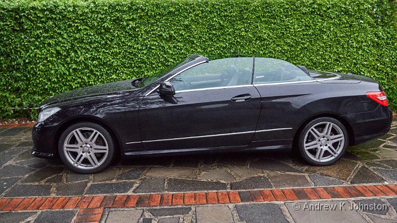
So much though I wanted to like this camera, It isn’t for me. Sometimes engineers can shoot for a compromise between two opposing targets and pull off a remarkable double. My delightfully schizophrenic Mercedes Cabrio is a case in point. Sometimes, however, you end up with the worst of both worlds, and that’s what’s happened here.
Just Right?
Ironically, the day I ordered the GM5, Panasonic announced the follow-up model to my much-loved GX7, unsurprisingly named the GX8. The improvements in pixel count, functionality and weather protection are all almost uniformly welcomed, but there’s been some criticism of the fact that the GX8 is a bit bigger than its predecessor, by about 5mm in height and depth, 10mm in width, and 75g in weight.
Now I love my GX7. It’s my favourite camera of the many I’ve owned. But it’s never been out of the house except wearing the bottom half of the "ever ready case" Panasonic supplied with it. This improves its fit to my hand no end. By my estimate, the ERC adds about 5mm to the height and depth, and about 10mm to the width, and weighs somewhere between 25 and 50g. It sounds like the GX8 is spot on!
I wait with baited breath…
 Email me
 Others
 Main feed (direct XML)