Well, I’m back! Apart from a mad dash the length of Bangkok airport which got us to our plane to the UK with only a couple of minutes to spare, the flights home were uneventful and timely. Here’s my traditional tail-end blog piece, with a combination of “what worked and what didn’t” and more general musings.
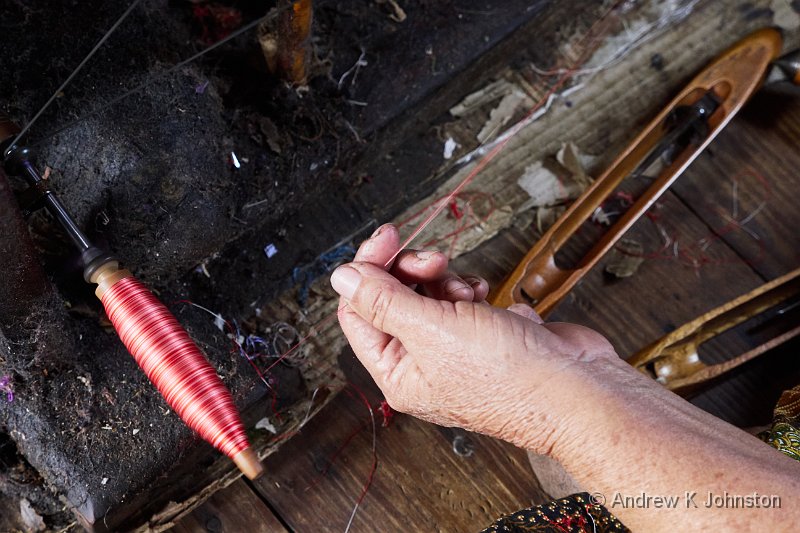
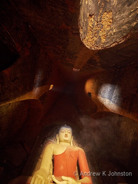
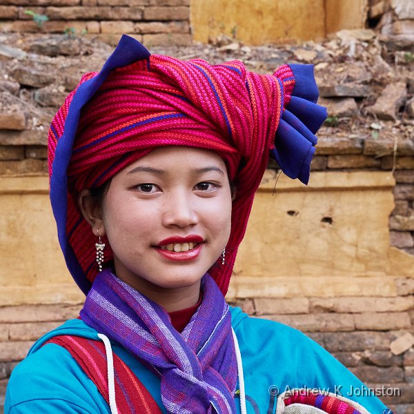
This was a truly inspiring photographic trip, with a combination of great locations, events and people to photograph. We had a very capable “leadership team” who got us to great locations in great light, and the Burmese people were only too happy to participate in the process. No praise can be too high for our local guide, Nay Win Oo (Shine), who is not only a great guide and competent logistician, but has a good feel for what makes great photography, and a real talent for directing the local people as models.
If I have a minor complaint, it’s the observation that the trip was largely focused on interiors and people to the occasional exclusion of landscapes and architecture. I had to declare UDI a couple of times to get a bit more of the latter subject matter in front of my lens. Bhutan was perhaps a better match to my own style, but that didn’t stop this trip being a great source of images.
Cameras and Shot Count
The Panasonic GX8 was the workhorse of the trip, and took approximately 3690 exposures. That’s about 20% higher than either Bhutan or Morocco, both of which were slightly longer trips, and reflects the more “interactive” nature of the photography, with a rather higher discard ratio than normal. As usual the total also includes raw material for quite a lot of multi-exposure images, mainly for 3D and panoramas. I expect to end up with 100-200 images worth sharing, which is about the norm.
I took around 84 stills on the Sony RX100, mainly “grab shots” from the bus, but it came into its own for video, and I have a number of great video clips, more than on previous trips. I also took a handful of images using the infrared-converted Panasonic GX7, but whether due to the subject matter or the lighting they weren’t terribly inspiring.
I used my Ricoh Theta 360-degree camera several times, mainly in the markets and at the group mealtimes. I’m treating this as “found photography” – I haven’t had much of a look yet at what was captured, and will look forward to exploring the output over time.
My equipment all behaved faultlessly. I used all the lenses a reasonable amount, with the Panasonic 12-35mm doing the lion’s share as expected, but the 7-14mm, 35-100mm and 100-300mm all getting substantial use. I didn’t use the camera on my new Sony Experia Ultra phone, but its excellent GPS was a vast improvement over the Galaxy Note’s poor performance in Bhutan.
I also did not use the Panasonic GX7 which I was carrying as a spare, but was able to lend it as a complete solution to another member of the group when her Canon L Series zoom lens started misbehaving. Having been burned previously I always carry a spare everything, and that’s a lot easier with the diminutive Panasonic kit.
Human Factors
While technology was broadly reliable, human systems were more challenged. The combined effects of the intensive schedule and the expected risk of tummy bugs led to as fairly high attrition rate. At least half the group missed a shoot or a meal, and a couple were quite ill for a couple of days. I was lucky that my own “wobble” was brief and started within a quick walk of a five star hotel. I would advise most travellers to think in terms of “when” not “if”, and definitely avoid all uncooked food.
Hotels and restaurants were clean, and even out and about most washrooms were acceptable. Similarly temple areas were kept clean, with the fact that all shoes are removed at the entrance a clear contributor. The challenge is in the more general areas, especially in the towns and cities, where any surface you touch may also have been touched by many others. Money is a particular challenge. All you can do is to keep sanitising your hands, but also bags, cameras, wallets and other items which you may have to touch with dirty hands.
Our Burmese travel agents certainly did everything they could to reduce stress. Once we arrived in Burma responsibility for our large luggage and travel documents began and ended with putting our bags outside the room at the appointed time. Then we just got on the bus, walked through the airport picking up a boarding pass as we passed Shine, and that’s about it! I could get used to travelling that way…
With someone else doing the “heavy lifting” (quite literally in the case of my case), you can get around with two phrases and 3 gestures:
- Minga-la-ba, which is a polite “good day” exchanged between any two people who make eye contact. The choruses in the school and markets were fascinating! This can be used to cover a multitude of sins, and works very well as “please can I take your photograph?”
- Che-su-ba, which means “thank you”. ‘Nuff said.
- The smiley face and thumbs up, which work when you’re not close enough to use Minga-la-ba and che-su-ba.
- A gesture consisting of the left hand held out at table level, palm up, with the right hand held about a foot above it, palm down. This is universally interpreted as “I would like a large Myanman beer, please” 🙂
Burmese Bizarre
Myanmar is a bit bizarre in a number of ways. Let’s start with the name. Myanmar (pronounce “mee…” not “my…”) is a relatively recent invention, and is not universally adopted. It doesn’t help that Aung San Suu Kyi (the popular and de-facto leader) tends to use “Burma” herself, and there’s no common adjective derived from Myanmar, whereas “Burmese” works, and is officially valid if it relates to the dominant ethnic group and language. It wouldn’t surprise me if “Myanmar” goes the way of “Zaire” and “Tanganyika”, and we’re all back to “Burma” in a few years.
The Burmese really do “drive on the wrong side of the road”. In another anti-colonial dictat a few years ago, one of the madder generals decided to change from the British practice, and instructed the country to drive on the right. On it’s own, that’s not a problem. It works fairly well for the Americas and most of Europe. However the Burmese are trying to do it with the same almost completely right-hand-drive vehicle supply as the rest of Asia and Australasia. So all of the drivers are unable to see round corners or larger vehicles in front, and every bus has a “driver’s assistant” who’s main job is to stop passengers being mown down by passing traffic as they disembark into the middle of the road!
At a daily level Myanmar is almost entirely cash-based, with effectively three currencies in circulation. Major tourist transactions are conducted in US Dollars. These must be large denominations and absolutely pristine – they may be rejected for a tiny mark or fold. Next down, most day to day transactions by tourists and the more wealthy are conducted in Kyat (pronounced “Chat”), in round units of 1000 Kyat (about 60p). 10,000K and 5,000K notes tend to also be quite tidy. Transactions with and between the poorer people are in tens or hundreds of Kyat and the money is quite different. It’s absolutely disgusting, clearly and literally passing through a lot of hands in its lifetime. It’s all slightly reminiscent of the two currency system in Cuba, but with one currency used two distinct ways.
Uniquely among the countries I have visited, Myanmar has no international GSM roaming. However we had good straightforward Wifi connectivity at reasonable speeds and without any obvious restrictions at all the hotels and in several other locations. I suspect this is a transitional state, as the enthusiastic adoption of mobile phones in the local population will inevitably drive a standard solution fairly rapidly.
One thing which did amuse me – one of the primary providers of Internet services is a company called SkyNet. Shine say’s they’ve all seen the films, so I’m assuming the founder is a Terminator fan…
The usual Asian approach of throwing people at any problem showed mixed results. Bangkok Airport is an enormous hub trying to run on small site processes which don’t scale just by adding people. The role of “bus driver’s assistant” does find employment for young lads with a helpful attitude but few exams. However we did have one very delayed meal where the problem seemed to be one of short staffing, despite a lot of people milling around the restaurant with nothing to do, most of the order taking, cooking and serving was being done by one or two individuals who were run ragged. It will be interesting to see how the approaches vary as the economy grows.
Guide books describe the food as “a rich fusion of unusual flavours” and “a repertoire of ingredients not found in any other cuisine”. Yeah, right. I’ll admit that I was being a bit cautious and avoided some of the more unusual fish and hot curry dishes, but basically it was Chinese or Thai food with a few local variations (more pineapple), alongside a number of Indian, Italian and Anglo-American favourites. One member of our group survived almost the whole trip on chicken and cashew nuts, and I’ll admit to a couple of pizzas!
To Sum Up
Lovely country, lovely people, great photos, but keep cleaning your hands and stick to the Chinese food (and beer)!

 List
List Abstract
 One+Abstract


 Email me
 Others
 Thoughts on the World (Main Feed)
 Main feed (direct XML)