I have decided that there are essentially two types of film or play, those which are about whether to get on the train, and those which are about how to get on the train. I don’t really like the former, but I love the latter.
OK, I know that not all films and plays involve trains, but enough do that this is a surprisingly powerful classification system.
A couple of years ago we went to see a performance of Chekhov’s Three Sisters. While I may be oversimplifying things slightly, most of the second act is the sisters talking about getting on a train. I forget the details, I think one wants to move away from the family to Moscow. I can’t even remember whether she actually gets on the train or not. Despite the fact that it was a good performance by several famous British actors, many of whose other work I love, I was bored out of my skull. Frances and I were both so affected by this, that we now have an in-joke reaction to any mention of Chekhov where one of us immediately says “just get on the —— train”.
But then I realised just how many of our favourite films do involve someone getting on a train. The key difference is that there is never any debate whatsoever about the need to do so. The challenge is how.
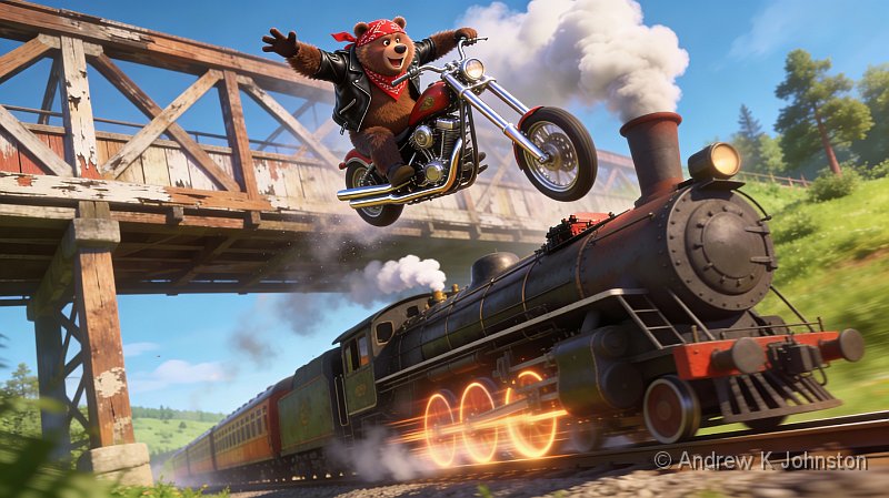
You may have to drive your Audi off a bridge (Transporter 3), jump from a helicopter (Under Siege 2, Broken Arrow, Unstoppable), shoot lots of bad guys first (3.10 to Yuma), jump from a camel (Sahara), talk the bad guys down (Pelham 123), jump from a car (Unstoppable, Octopussy), quietly murder some of the good guys (From Russia with Love), jump from another train (Unstoppable again, Indiana Jones and the Temple of Doom, Paddington 2, The Lone Ranger), hide in a mailbag (Live and Let Die), jump from a motorbike (Skyfall, Indiana Jones and the Dial of Destiny), run several Manhattan blocks and jump through the subway roof (Die Hard with a Vengeance), beam in (repeatedly) using a time machine (Source Code), jump from a horse (The Lone Ranger), claw into the back of the carriage with a Caterpillar digger (Skyfall again), jump from a hover-board (Back to the Future 3), couple up a car transporter (Fast Five), try and do a retinal scan from outside while the train is moving at speed, and you’re not really tall enough to reach the scanner (Mission Impossible 4), jump from a zipline tethered to the nearest alp (Captain America), lay the track as you go (The Wrong Trousers), jump into a boxcar while shackled to several other members of a chain gang (O Brother, Where Art Thou?), sneak onboard after clinging to the undercarriage (Octopussy again), jump from the subway platform (Safe, Captain Marvel, Skyfall yet again…), swing a ladder from another train (The Lone Ranger), extend a telescopic ladder from another train (Paddington 2), lasso the train while chasing it in a pump handcar (Due South, All the Queen’s Horses), jump from a bridge with a wolf in your arms (ditto), use your magnetic super-powers to latch onto the train as it goes past (X-Men Days of Future Past), leap between mine cars (Journey to the Centre of the Earth), sneak in inside a mine car full of explosive (A View to a Kill), jump from the platform of a picturesque station (Enigma), ride your motorbike off a mountain and then speed-fly with a parachute onto the train (Mission Impossible Dead Reckoning), get past the Gestapo with forged papers (The Great Escape), sneak into a train with the Turkish Nationalist Army (The Water Diviner!).
If you’re undead, you might just jump from trees alongside the track (Abraham Lincoln, Vampire Hunter), but that’s really a getting off the train film, a completely separate genre. There are also staying on the train films, such as The Wolverine. You get the picture, and I haven’t mentioned Speed, Batman Begins, Unknown, Goldeneye, The Rock…
So do you like stories about talking about getting on a train? Or those about doing it?
(Published June 2011, updated November 2012, July 2014, September 2014, August 2016, January 2017, April 2018, July 2018, September 2018, March 2019, January 2020, May 2020, June 2020, January 2021, January 2022, December 2023, January 2026 as the list grows…)

 List
List Abstract
 One+Abstract


 Email me
 Others
 Main feed (direct XML)