Infrared White Balance
"I'm shooting infrared. My main output is RAW files, and any JPGs are just aides memoire. Between my raw processor and Photoshop I'm going to do some fancy channel mixing to either add false colour, or take it away entirely and generate a monochrome image. So I'm assuming my white balance doesn't matter. Is that right?"
Nope, and this explains why.
In normal visible spectrum photography, most of the time, white balance is seen as "getting the colours to look right". In an infrared image there are no true colours, but ironically checking or fixing the white balance is still a critical first step in developing the image.
If you've bought or had a camera converted to infrared it should have been set up with an appropriate custom white balance, and things should run smoothly, but it's relatively easy for things to go awry. You may add additional filters, throwing the white balance off, you might accidentally upset the settings, or you might receive a camera which has not be correctly set. In any of these cases you need to understand the objective for the white balance, and how to fix it.
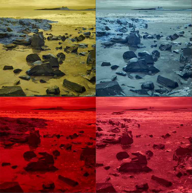
Have a look at the rogue's gallery above. These were taken one after the other on my converted Panasonic GX7, and are shown as they open in Capture One. Clockwise from top left:
- Camera with no extra filtration and custom white balance set.
- Additional R72 filter (which limits the incoming light to true infrared for a more extreme effect), using the standard custom white balance.
- With the R72 filter, but using auto white balance.
- Camera with just the built-in filter, using auto white balance
Not only are the bottom two a bit difficult to "parse" visually, but there's a more significant problem, which reveals itself from the histogram, which looks like this:
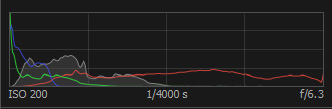
The "red" channel is overexposed, and the others have almost no information. If we try converting these images to black and white with the channel mixer, starting here, we find that the red slider is almost like a switch on the whole image, the yellow slider makes a small difference to the breaking waves, and the others might as well not exist.
This is the real importance of setting the white balance. It takes the available colour information (basically a bunch of reds) and re-aligns it with the visible colours, so that each frequency range can then be visualised, and manipulated by tools which work on a visible colour range. In the process, the information in any "overloaded" channels is spread out, and this will fix a lot of mild overexposure problems.
How do you rectify a problem image? Fortunately there are a few ways to fix these problems, even after shooting:
- If the image includes an element which you know to be a neutral grey, just use the white balance eyedropper. On these images this works very well, as several of the rocks in the middle ground were a good neutral dark grey. However, depending on the subject and the lighting that doesn't always work…
- If you still have access to the camera and/or filters, take a custom white balance, load that into your raw processor, and set its white balance (Kelvin and tint) as a preset to apply to your other images. Obviously that doesn't help if you borrowed the kit and it's gone back…
- By eye. If you've got the white balance about right (and it doesn't have to be perfect), then the image will look similar to the top-left example before you start manipulating it, with a mix of yellow and blue tones. Set the "tint" slider to -50 and just try moving the Kelvin slider between about 1500 and about 2600 until you can see a mix of both colours.
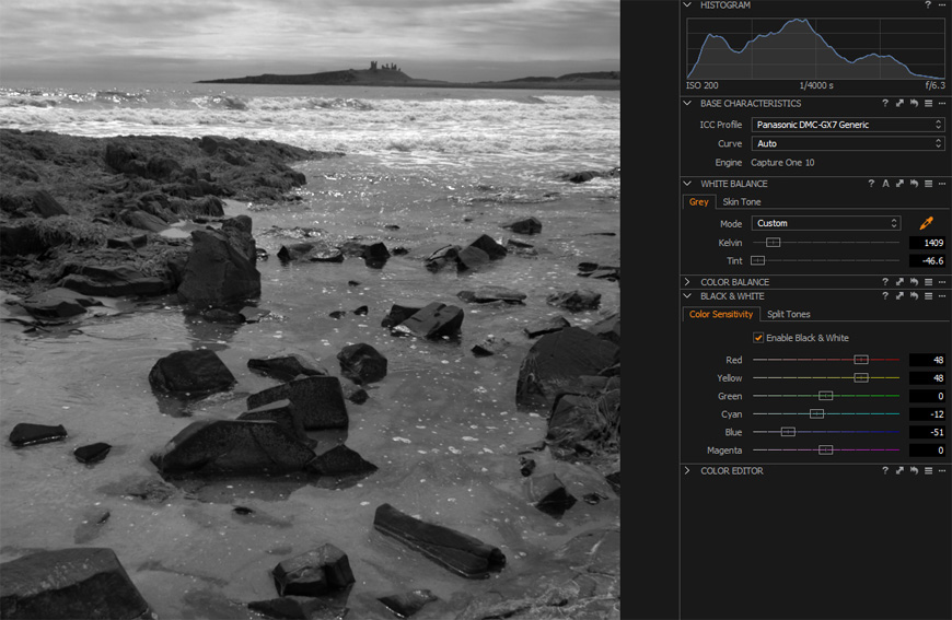
- By the numbers. Based on a quick review of a mix of Canon, Panasonic and Olympus kit at a recent workshop, it looks like the following should be a pretty good starting point: If your camera and/or filter has a cut-off of something like 590nm and includes some visible spectrum, then try a tint of -50 and Kelvin of about 1500. If you are using a more extreme "true infrared" filter such as the Hoya R72 (cut-off at 720nm), then try a tint of -45, and a Kelvin value around 2600.
Applying the above to the bottom left image gets an image where the red, yellow, blue and cyan channels all affect distinct elements, and I can mix to an image with a decent overall histogram, dark rocks and sparkling highlights, as I wanted:
So don't ignore your infrared images' white balance, but if it all looks a bit weird, don't panic, either!
 Email me
 Others
 Main feed (direct XML)