
 List
List Abstract
 One+Abstract


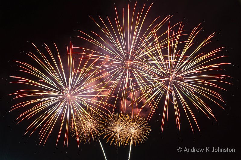
| Fireworks at the Albuquerque Balloon Fiesta 2012. (Genuine single exposure - only slight crop and exposure adjustments applied.) | |
| Camera: Canon EOS 7D | Lens: EF-S15-85mm f/3.5-5.6 IS USM | Date: 13-10-2012 20:05 | ISO: 200 | Exp. bias: -2/3 EV | Exp. Time: 8.0s | Aperture: 11.0 | Focal Length: 22.0mm (~35.6mm) | Lens: Canon EF-S 15-85mm f3.5-5.6 IS USM | |
Or, “What Worked and What Didn’t”
As usual, I tried to take a few notes regarding the more “technical” aspects of our holiday, which may be useful to others planning a similar trip.
One spectacular success was having Laurent Matres’ Photographing the Southwest in Kindle format, with a synced copy on my Galaxy Note phone. On our previous Arizona/Utah trip I missed a couple of the “best shots” because I didn’t refer to Matres’ notes, and at other times we did follow his directions but it was a bit painful lugging quite a heavy book around. The Kindle version solved both those problems, and the Galaxy Note is sufficiently large to be quickly readable, and to render the book’s images clearly and attractively.
It was definitely the right decision for us to hire a convertible. I drive a drop-top in the UK, and we both loved buzzing around with the sun on our faces and the wind in our hair (well, OK, that’s maybe more one for Frances to comment on… :)). However, we seemed to be in a tiny minority driving a soft-top in New Mexico and Colorado, and the rental choice was not good. I’m not sure of the reason, whether the locals are afraid of getting too much sun in the Summer or insufficient weather protection in the Winter, but of course that doesn’t stop us in wet, windy Britain…
We eventually went to Dollar (whereas my first choice would usually be Hertz), and got a Ford Mustang. I can’t fault Dollar’s friendly, efficient service, and would use them again. I can find some fault with the latest-model Mustang, which seems to have definitely regressed compared with the versions I previously drove in the mid-naughties. In particular luggage space seemed to be smaller than I remember, there was very little in-cabin storage, and the CD player wouldn’t play files in WMA format, which put paid to a lot of our music. However, the worst failing was a weird speedometer display cramming an optimistically large speed range into the top half of a small dial, with the result that it can’t be read to an accuracy better than about 5 mph. That doesn’t fit well in a country where a 5 mph error is often enough to earn a speeding ticket. Useless.
Complaints aside, the Mustang did the job, and helped bring us back with a decent tan.
Another trick which worked again was raiding a Radio Shack on the first day and purchasing a can of compressed air. The worst equipment challenge in the American SouthWest is dust, and being able to blow everything clean each day is a real boon. Now all I have to do is find out if I can do the same in Morocco this year…
Cameras
Including our phones we took five cameras this year, which may seem excessive, but each found a genuine use playing to its strengths, and justified its place in the luggage. As usual, the real workhorse was the Canon 7D. Out of a total of about 2050 exposures,1652 (or over 80%) were on the big beast. I have eventually mastered its ergonomic shortcomings, and extensive practice means that its operation is now quite intuitive. I know and can confidently predict its results, which are still better than those from the Panasonic GH2. OK, it’s still an enormous lump and the 15-85mm lens is not the sharpest optical tool, but it works.
The Canon 550D’s main role is as a backup body, offering the same sensor and lens compatibility as the 7D for half the price and weight. However, it came into its own for our balloon trip, where I wanted to carry a lightweight kit which still supported my beloved 70-300mm IS lens. The 550D, 70-300 and 17-85 did the job beautifully. As a result the 550D took 221 shots.
We also carried the Panasonic GH2 and its three lenses. Its main role was as Frances’ camera when she wanted to take her own shots, but I also used it as a lightweight “carry and forget” camera to have with me during shopping trips, evening sorties and similar. It has to be admitted that the 550D and a single zoom lens could also do this, but with less ultimate flexibility and at a higher weight. Having the GH2 along also provided further redundancy should my Canon long or wide zooms pack up, always a consideration given last year’s two lens failures. We took 172 shots on the GH2.
On a less positive note GH2 battery life is not good. A charge is genuinely only good for about 100 shots, and to add injury to insult Panasonic now effectively prevent the use of anything other than their own full price batteries, at £50 a pop or higher. Neither Canon suffers either limitation. It’s not a critical problem, but does place some boundaries on the Panasonic’s role.
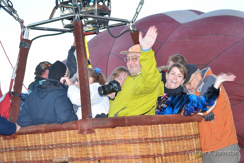
We both took a few shots on our phones as well (I took 4 on the Galaxy Note), mainly of things we wanted to share immediately with specific friends. However, I certainly wouldn’t advocate one practice I saw – a lady whose husband was having the “trip of a lifetime” in the cab of the Silverton-Durango railroad, and she was trying to capture his arrival using just the camera on an iPad!
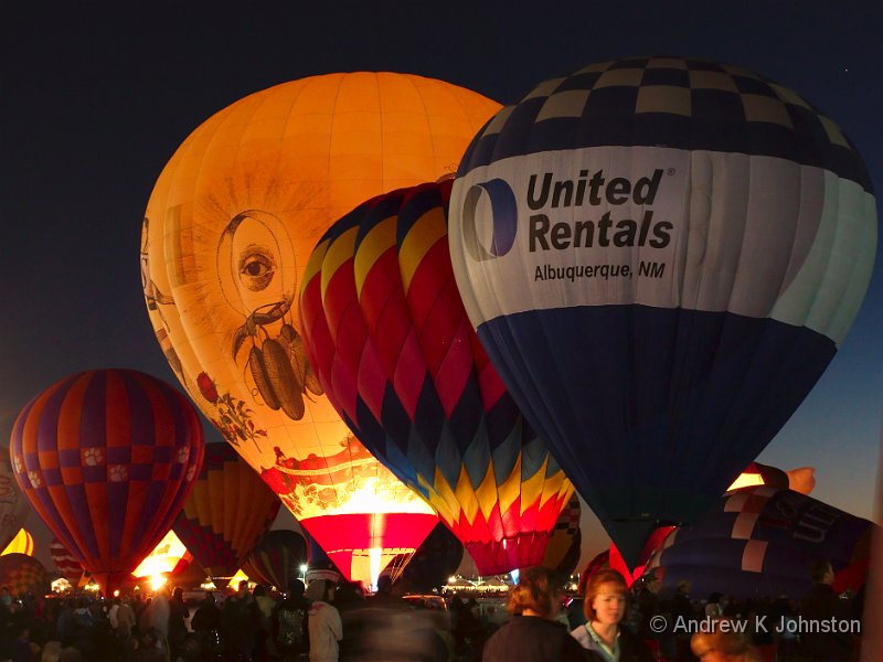
The Gitzo tripod paid its fare with the low light photography at the balloon fiesta, but otherwise saw very little action. I rely more and more on the combination of modern cameras’ performance at medium-high ISO, and the effective combination of my steady hand and Image Stabilisation. As the Americans say, “your mileage may vary”, but I now just assume that I will work hand-held if the sun is up or I need to move around.
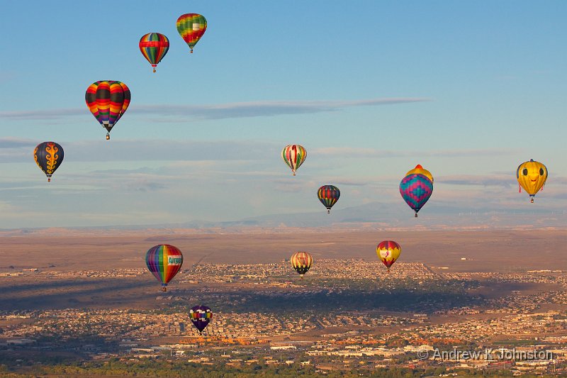
Given the extremely photogenic subjects, and a lot of fairly friendly lighting, my hit rate was pretty high, especially for the more static subjects. After an initial edit I still have about 1200 frames worth processing, and I expect to end up with about 200 worth showing to someone else. Cutting this down to about 100 which find their way to my blog and tablet may be a challenge.
Overall a wonderful trip, and very successful source for photography. Roll on the next one!
A very Happy New Year, and all the best for 2013!

 Email me
 Others
 Main feed (direct XML)