Category Archives: Thoughts on the World

Random? That’s a Coincidence…

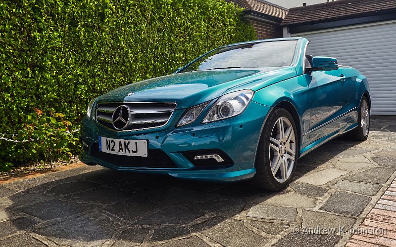
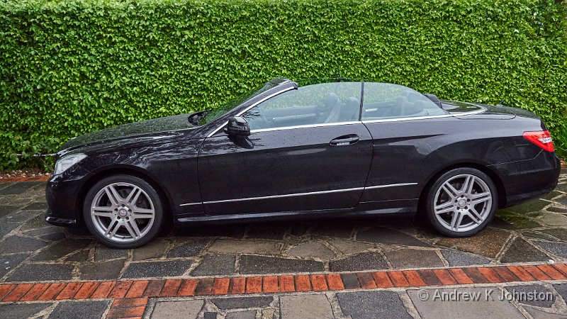
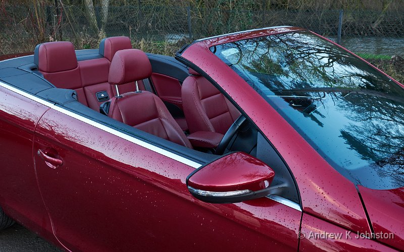
A randomly selected image this morning - my old VW Eos
Camera: Panasonic DMC-GX7 | Date: 30-01-2015 17:00 | Resolution: 4894 x 3059 | ISO: 320 | Exp. bias: -66/100 EV | Exp. Time: 1/60s | Aperture: 5.0 | Focal Length: 17.0mm | Lens: LUMIX G VARIO PZ 14-42/F3.5-5.6

My programming project of the last few weeks has been to build my own “rolling portfolio”, which shows random images from my photographic portfolio as either a screensaver or a rolling display on a second monitor. I’ve implemented a number of features I’ve always wanted but never had from freeware/shareware options, like precise control over timing, the ability to quickly add a note if I see a required correction, and the ability to locate and review recent images if someone says “what was that picture you were just showing?”.

Having previous blogged about the poor quality of “random” algorithms in Android music player apps (see  How Hard Can It Possibly Be?), I decided to put my money where my mouth is, and write my own preferred random algorithm. This does a recursive, random walk down the selected folder tree, until it either finds an image file, or a dead end (and then tries again). This was refreshingly easy to implement, and as expected runs quickly without needing any prior indexing of the content.

Also as expected, the simplest implementation returned a disproportionate number of hits (and therefore a lot of repeats) from folders with a very small number of images, but that was easily fixed by adding a “weighting” at the second stage of the walk, to reduce the number of hits on smaller portfolios.

Job done? Maybe. I started to notice that I still see the same image selected twice in quick succession, and sometimes more than twice over a day or two. At first I thought this might be an issue with seeding the random number generator, so that I was re-generating the same random sequences, but a quick check confirmed that wasn’t the problem. The next most obvious possibility (to me!) was an issue with the Microsoft .Net random() function, so I added some logging to the app, recording each random number, and then fed a day’s worth through some frequency analysis in Excel. That got Microsoft off the hook with a clean bill of health: there’s a slight preponderance of zeros, which I can explain, but otherwise the spread of results looks fine.

At the same time, I also added logging for the selected images themselves. In yesterday’s work hours operation the screen saver showed 335 images, of which no fewer than 21 were duplicates. Given that I have over 3500 images in the portfolio, this seems very high, but maybe not.

This is a known problem in mathematics, a generalisation of the “birthday problem”. It’s so known, because a common formulation is the question “given a room of people, what is the probability that at least two have the same birthday?”. While you need at 367 people to guarantee a duplicate, the counter-intuitive result is that with just 23 people in the room, it’s more likely than not. The generalised equation for the solution is the following:

E = k – n + n(1 – 1/n)k

In this n is the number of items, k is the number of random selections, and E is the expected number of duplicates. Feed in k = 335 and n = 3500, and you get the outcome E = 16. That’s close enough to my observed value of 21 (this is all random, so any one measurement might be either side of the expected value, but the order of magnitude is right). Couple this with the way my mind works, looking for patterns, and I must therefore expect to see some repetition. However it’s clear that the algorithm is working fine, it’s just the normal workings of probability.

Another implication of this is that as the sample grows, some images will naturally appear several times, and others may not appear at all. If we take 3500 samples, the expected number of duplicates rises to over 1200, so over 1/3 of the images will still be unselected.

Do I fix this? The relatively simple resolution is to keep a list of selected images, and use that to discard any selections which are repeats during a given period. However I would rather run this without a data store and maybe, now I can explain it, I’m comfortable. Time will tell.

View featured image in Album
Posted in Code & Development, Photography, Thoughts on the World | Leave a comment

The Jester and The Unicorn

A purple unicorn

A fable, sort of…

The jester who wanted to be king asked the crowd “Do you want a purple unicorn?”

Almost half the crowd said “We are happy as we are, and we don’t believe unicorns exist”, but slightly more than half said “Yes please, we’d love one.”

The king wanted his people to be happy, so the king’s men spent three years looking for a purple unicorn. They spent much of the kingdom’s treasure, and annoyed many of the kingdom’s friends, constantly asking for unicorns which they did not have, because unicorns don’t exist. Other realms laughed at the king and his kingdom, and important matters in the kingdom went without attention.

Eventually the king’s men came back and said “There are no unicorns. We’ve found a nice horse we can paint purple and glue a fake horn on its nose, will that do?”

All those who had never believed in unicorns said “told you so”. Many of the others said “OK, we agree”. But others were angry, blaming those who had never believed in unicorns. Some were so obsessed with the idea of a unicorn that they wanted to shoot all the horses, just so they would not get a horse painted purple with a fake horn glued to its nose.

A wise king could simply have stopped the search, saying “unicorns do not exist”. A wise king could have told the crowd “You may vote again. But just to be clear, unicorns do not exist, so you are voting for a horse painted purple with a fake horn glued to its nose.” But the foolish king thought that the only important thing was not upsetting those who wanted a unicorn, so the search continues…

View featured image in Album
Posted in Humour, Thoughts on the World | Leave a comment

Icons, or Heroes?

I’m slowly working through, and very much enjoying the BBC series Icons. There’s been a lot of discussion about whether it makes any sense to have a "final" in which "iconic" sportsmen, politicians and scientists go head to head, but that’s not the real issue. The big problem is that the series has wholly the wrong name, and should be called not Icons, but Heroes.

To qualify as a 20th Century icon, a person should be:

  • Instantly recognisable, to a large proportion of people,
  • Representative of some characteristic of the 20th Century,
  • Usable in the abstract, perhaps through a caricature or a single word, to stand in for others and key concepts.

The simplest and least controversial example is probably Albert Einstein. Everyone knows that smiling face and wild hair. Through a series of seminal papers in 1905 and the following years he established not only relativity theory but also key elements of quantum theory, the two major planks which ensured that 20th Century Physics diverted strongly from the Victorian version. I can use the single word "Einstein" or draw a very crude cartoon of a smiling face with spiky hair and a bow tie, and it immediately invokes a range of concepts in the beholder.

Einstein was also a hero. He completed his early work despite a number of personal and academic setbacks. A Jew, he escaped Nazi Germany and helped the allies to defeat the axis powers, but then became a strong proponent of denuclearisation and peace. He qualifies both ways.

At the other end of the scale, consider Ernest Shackleton. Shackleton is undeniably, absolutely a hero. The story of the Endurance voyage, and how his leadership bought them all back safely despite horrendous tribulations bears endless retelling. Shackleton is certainly a personal hero to me: I have read books about him, watched programs, travelled to exhibitions. I managed to track down a copy of the wonderful dramatisation by Kenneth Branagh and we re-watched it just a few weeks ago.

But is Shackleton a 20th Century icon? How many people would recognise a picture of him out of context? I might struggle myself. Also in many ways he represents not 20th Century exploration, but the end of the Victorian era: plucky white men opening up the dark areas on the world’s map. There is a case for considering the Endurance story as a precursor to Apollo 13, that other great 20th Century tale of explorers rescued, but it’s not a strong one.

If you want an iconic 20th Century explorer, you really have to focus on aeronautics or the space race. There are many heroes, but the best chance for an icon is probably Neil Armstrong. We may not all instantly recognise his face, but that picture of a man in a spacesuit standing next to the American flag, or those words announcing "a giant leap for mankind" are certainly iconic, and representative of a type of exploration which didn’t exist before, and no longer really exists now.

In the political space, Winston Churchill is certainly an icon. His name and face, even in caricature, immediately invoke concepts such as strong leadership, freedom fighting tyranny, a blend of conservative and liberal ideals sadly lacking today. He is a clear exemplar of one side of 20th Century politics. His qualification as a hero is more nuanced: his amazing talent for being in the wrong place at the right time, his determination to do the right thing, his dominant skill as a leader, orator and writer all support it. However I acknowledge that his position on issues like Ireland and India, and his errors such as over Gallipoli and Singapore do at least slightly offset his great successes elsewhere. His icon is also capable of being misused, for example by those who view him as a symbol of British independence, who carefully ignore his post-war advocacy of unifying international institutions such as the UN and EU.

However, if you accept Churchill as a 20th Century political icon, you also have to consider another: Adolf Hitler. As an icon he qualifies without question. We instantly recognise his name and image, even if it’s just a simple cartoon of the hairstyle and moustache. He also stands as a clear exemplar of the other side of mid-20th Century politics, and a clear warning of the risks of allowing the rise of his like again. Icons do not have to be heroes. They can be villains.

A basic qualification for iconic status is that someone, or something must be famous, or infamous. However the BBC series has been so determined to not just parade a series of middle-aged white men that they have made some odd choices with the candidates. I enjoyed the story of Tu Youyou, the Chinese lady who discovered an important antimalarial drug, but can you honestly propose as a "20th Century Icon" someone whose individual identity was carefully suppressed until well into the 21st?

I have just sneaked a look at the results, and I see that neither of my prime examples of unquestioned icons (Einstein and Churchill) got through to the final. That doesn’t matter: I also consider both Turing and Mandela among my heroes, and I will still enjoy the rest of the episodes. However even if it risked being confused with that series about people with imaginary physical super-powers, rather than just real mental ones, I think the series should have been called simply Heroes.

Posted in Thoughts on the World | Leave a comment

The Favourite: A Great Opportunity Missed

I was really looking forward to The Favourite. It had a lot going for it. The period – the reign of Queen Anne, the end of the Stuart dynasty and the wars with Louis XIV – is an important piece of British history but has rarely been tackled in modern popular culture. The core plot of battling rival Queen’s favourites was a good one, with great scope for a hilarious period romp. The three strong leading actresses, great costumes and the wonderful Hatfield House locations were all strong positives. And yet I came away feeling very disappointed, that I had just spent two hours watching a very average film, with a great film trying to get out.

The main problem is that the film seems to be suffering a major identity crisis. It can’t quite decide whether it’s a bawdy romp, a serious drama about interpersonal dynamics or a sombre historical portrayal. As a result it misses all three targets. I appreciate that Anne was quite a tragic figure, and there are some unavoidable poignancies, but a slightly lighter touch would have let the "bawdy romp" out to play, rather than keeping it somewhat repressed.

The music (I’m very tempted to write "the alleged music") really doesn’t help. It actually took me a while to realise that the incessant sawing on a couple of string instruments was actually meant to be incidental music, rather than just some weird background sound effect representing troublesome Stuart plumbing or the like. This gets to the point where you are listening to it rather than following the action and dialog, and then you suddenly get blasted by a full "Night at the Opera" fanfare on the organ, for even relatively minor twists in the plot. It reminded me of the ghastly alleged music in Dunkirk, but at least Christopher Nolan had the excuse that he was trying to tell three overlapping stories with time playing out at completely different rates, which isn’t the case here. Now I know that occasional twinkles on the virginal or the odd burst of something recognisable by Vivaldi are very traditional, but they would have worked here, whereas what was provided definitely did not.

The dialogue was unnecessarily crude. I have no problem with swearing, but it needs to be in the right context and period. If I watch something about 21st Century New Jersey gangsters (for example), and every other sentence has a f*** or c*** that’s fair enough. Take two incompetent hit men, stick them in an enforced holiday in a charming Belgian town, and you can even make that a hilarious core part of the work, as in the incomparable In Bruges. But in The Favourite it just feels out of time, and out of place. It’s also wholly unnecessary. 18th Century English was rich with frequently hilarious euphemisms for sex, body parts and so on, and a bit of effort could have sprinkled these into the dialogue to much greater effect. As Upstart Crow demonstrates so well, you don’t even have to bother with the detailed historical research: I have no idea whether Elizabethans actually used the term "cod-dangle", but we all get what it means, it sounds right, and it’s genuinely funny.

I did enjoy some bits of The Favourite, and I did laugh in many of the right places. It’s not The Revenant. But just as the central character in that film spends a grim time hiding from his protagonists in a horse’s corpse, The Favourite feels like a better film has been partially hidden by a layer of pretentiousness and crudity which it really didn’t need.

Posted in Thoughts on the World | Leave a comment

Why I Like My MacBook, But I’m Beginning To Really Hate Apple

Battery Replacement on a 2015 MacBook

I realised a couple of weeks ago, much to my horror and chagrin, that I had been walking around with a potential incendiary bomb. Not that I had done anything wrong – this is a more common practice than we’d like to admit, and it’s quite possible that some readers are doing the same, equally unaware.

The culprit was the battery in my 2015 MacBook. Now unlike the batteries on older laptops, this is sealed inside the alloy case, and not immediately visible to inspection. My laptop was still working fine, with battery life still around 2 hours even under quite hard use, which is not bad for a hard-used 3 year old machine. It was running a bit warm, especially in Namibia, but not so much that it indicated any real problem.

The only thing which was a bit suspicious was that it no longer sat flat on a table. The middle of the base-plate seemed slightly raised relative to the edges. At first I blamed myself, thinking that when I had taken the base off to check to see if you can upgrade the hard disk (you can’t, but that’s another story), I hadn’t screwed it down straight. However over time the problem seemed to be getting a bit worse, and I also started to note that the lid didn’t always close completely flush.

I would probably have let this go on a bit longer, but I happened to mention it to two others on the Namibia trip, who immediately suspected the possibility of a dying and swollen battery. Now this can be a serious issue, so as soon as I was back I went on eBay to order a new battery (fairly readily available at about £70), and opened the laptop up for inspection. If I wasn’t already convinced of the problem, I reached that point when I had undone about three screws and the base literally “pinged” open. With all the screws removed I could see that not only one, but all six sections of the battery were badly swollen. Yikes!

So the battery definitely needed replacement, and a new one was on the way. I carefully discharged the old one by playing a movie until the battery was below 2%, and switched my work to my spare machine. I then started researching the process of replacement.

Now pretty much every laptop I have owned or used in the last 20 years has the following simple process for battery replacement:

  1. Unclip old battery
  2. Clip in replacement

In some Toshiba and Dell/AlienWare machines you can even do a “hot swap” without powering the machine down. The 2011 MacBook gets a bit more complicated, as the battery is inside the case, but it’s still pretty straightforward:

  1. Unscrew the base
  2. Unplug the battery from the motherboard
  3. Unclip the battery
  4. Clip in the new one, and plug it in
  5. Screw the base back on

So surely, it wasn’t going to be that difficult to do the 2015 MacBook battery? Surely not?

I should coco. Like the 2011 Macbook has standard memory boards, and the 2015 device has soldered chips, or the 2015’s SSD has a unique connector, Apple have made battery replacement deliberately difficult. This is the one component which is highly likely to fail through age before the rest of the machine, but it is glued to the baseplate, with key components then mounted over it. The iFixIt Guide has no fewer than 72 steps (I’m not making this up), at which point you have stripped almost the entire laptop, used some quite powerful solvents to melt the glue, and have your new battery in place with the instruction “To reassemble your device, follow these instructions in reverse order”. The last time I followed 72 instructions and then “reassembled my device following the instructions in reverse order” it took me two days, and I ended up with a Renault 5 with working engine and clutch, but 5 large bolts left over. Not keen.

Should I get professional help? For a machine up to about 5 years old, Apple will do a battery replacement, for about £300. Apparently they strip out all the components from your MacBook and mount them into a new chassis complete with new battery, keyboard and trackpad. Presumably the old chassis and related components go to the skip. However apart from the time this might take, I could see my MacBook coming back with all my keyboard customisations undone, and my hard disk which boots into Windows carefully wiped and OSX installed. Not keen.

[Aside: this is still a better position than if you go to Apple with a 5+ year old machine seeking service. Their official position is apparently “We are happy to recycle this for no cost. Here’s the price list for a brand new one”!]

I could look for a specialist, but again I was concerned about timing, and whether I’d get the machine back as I left it. So I decided on a self-fix, but trying to find a solution that didn’t mean stripping out the motherboard and all the peripherals. Now I could see that it might be possible to get a lever under the outer battery cells (the six cells are largely independent) without major disassembly, so I decided to try that route, hoping fervently that the iFixit guidance was overkill (as it appeared to be).

Obviously it’s a bit risky levering up already damaged lithium ion batteries, as you don’t want a fire, but hopefully the risk would be small since they were almost fully discharged. I took the precaution of having a heavy saucepan and lid sitting on a metal skillet at the end of the desk as a fire bucket, and used plastic tools as far as possible.

I also sourced a Torx T5 screwdriver for the internal screws. While the case screws and the inner screw heads look similar, the former have 5 points, and the latter 6. Just to make it a bit more difficult. Actually I’m not surprised Apple have a five-pointed design – the pentagram fits well with their generally Diabolical attitude to service, maintainability and the risk of immolation from faulty batteries…

So here’s my rather shorter process for replacing a 15″ Retina MacBook battery:

  1. Make sure the battery is fully discharged. I left it playing videos which is a good way to exhaust the battery without having to battle battery-saving timeouts etc.
  2. Unscrew the base. Make a note of which screws went where – they are not identical!
  3. Unplug the battery.
  4. Following the instructions on the iFixit guide, carefully remove the trackpad ribbon cable, which runs over the battery and is actually stuck to it.
  5. Unscrew the batteries’ circuit board (to which the plug is attached).
  6. Unscrew the two screws in each speaker which adjacent to the batteries. You can’t remove the speakers (they are held firmly in place by the motherboard and other components mounted on top), but removing the lower screws allows them a bit of movement.
  7. Using a flat plastic lever (I used a plastic fish slice) and (if essential) a wide-bladed screwdriver, slowly lever up the rightmost battery cell.
  8. When it’s free, use side-cutters to snip the connection to the other cells, then place it in the fire bucket.
  9. Repeat the process with the next cell in.
  10. Repeat with the two left-hand cells.
  11. Lever up the two centre cells from the sides until you can get your fingertips under them. Do not lever from front or back as you risk damaging the trackpad or keyboard connections.
  12. Once you can get your fingers under the central cells, they should continue to prise up and will eventually pop out.
  13. Carefully remove any remaining adhesive tape from the chassis.
  14. Site the new batteries, making sure the screw holes for the circuit board line up with the motherboard. This is the bit I didn’t get exactly right, but managed to “fiddle” afterwards.
  15. Remove the protective film, and press the batteries down. Once this has been done they are glued in place and will not move, so this needs to be done carefully. However leaving the speakers in place means that you have good visual guides for positioning as well as the circuit board mounts.
  16. Re-assemble the trackpad cable. This isn’t explained in the iFixit guide, but basically you need to carefully slide the ZIF connector into its socket, then press down the black tab. You can then plug in the other end and screw down its cover.
  17. Screw down the battery circuit board. Replace the speaker screws.
  18. Plug in the battery. Boot up the laptop to make sure all major systems (especially the keyboard and trackpad) are working.
  19. Turn the laptop over and screw up the base. Remember that the two central rear screws are slightly shorter than the others and need to go back in those holes.
  20. Check everything and fully charge the battery.

It worked, I didn’t set fire to anything, and my laptop now sits absolutely flat on the table. We’ll know shortly how life of the new batteries compares with the old.

However, it really doesn’t have to be this way. If Apple cared remotely about their customers and the environment instead of screwing everyone for the maximum revenue then the battery replacement would be a simple clip or screw process similar to the 2011 version, optimised for repairability rather than designed to actively minimise and inhibit it. I’m not impressed.

Posted in PCs/Laptops, Thoughts on the World | Leave a comment

Normal Service Will Be Resumed After Completion Of This Rant

Sleepy Cheetah!
Camera: Panasonic DC-G9 | Date: 16-11-2018 17:29 | Resolution: 3345 x 3345 | ISO: 800 | Exp. bias: 0 EV | Exp. Time: 1/500s | Aperture: 5.6 | Focal Length: 193.0mm | Location: Okonjima | State/Province: Okonjati, Otjozondjupa | See map | Lens: LUMIX G VARIO 100-300/F4.0-5.6II

The last day of any trip is always a bit sad, and hard work with the travel. However this year three separate organisations covered themselves in something which is not glory, and I have to get this out of my system before I write the traditional tail piece for my blog…

As a bit of compensation, here’s a nice picture of a cheetah, feeling about like I did at 1am on Friday.

Thanks.

Rant 1: Designing Hotel Bedrooms

The recurring dysfunctional ingenuity of hotel designers never ceases to amaze me, and provides an endless supply of material for this blog. On our way back through Windhoek, we stayed at Galton House, which while still quite smart overall and in the communal areas, was probably half a notch down from the Pension Thule, where we stayed outbound. My room was a bit poky and had a couple of major challenges, including very noisy air conditioning, and an Iceland-class duvet (in Windhoek, in the summer!). However the worst fail was that it had one accessible power socket, to the right of the bathroom door, while the desk, the only place I could rest laptop and things on charge, was to the left of the same doorway. I therefore had to spend my stay with a power cable stretched right across the bathroom doorway, limbo dancing under it when I needed to use the facilities.

One wonders what sort of hotel designer comes up with a room with a desk, and no power socket on the appropriate side of the room. That’s up to the standard of the Calais hotel I once stayed in where the lift worked but the stairs were out of order (due to a 10 ft gap half way down.) Admittedly about 20 years ago I did stay in a hotel in England where the only place you could get simultaneous power and modem connectivity was in the hot tub in the middle of the room, but that was an adapted medieval abbey, and plain weird. Galton House is a smart new purpose-built venue. Not a clue…

And to add actual injury to potential injury, most of us had got the whole way around Namibia without many bites, and several of us, including myself, woke up covered in nasty little red marks. Blast.

Rant 2: Midnight Food Service

I’m fully in favour of Virgin holding onto the "full service airline" concept when BA and others have abandoned it. However, if you are running a night flight which leaves Johannesburg at 21.00 local time, and arrives in London at 06.00 local time, I would suggest that your highest priority is to try and enable your passengers to get as much of a decent night’s sleep as airline seating and turbulence allow. This is not promoted by serving, slowly, drinks, followed by a rubbish collection, followed by tepid towels (they were probably hot when they left the galley, but I was at the front of Economy), followed by a rubbish collection, followed by "supper", at about 00.30, followed by hot drinks, and finally followed by another rubbish collection at gone 1 in the morning!

…Followed by inedible breakfast, at about 05.00…

Would it really not be better to just give everyone some booze and turn the lights off?

Rant 3: The 787 Nightmare Liner

I wasn’t impressed by the 787 on the flight out, but my assessment reduced a further notch on the way back. That plane revealed a number of areas where the new technology has aged very badly. One example: the window dimming switch on my window had obviously been jabbed so frequently and hard that  the rubber cover had completely failed and peeled away. Worse, the toilet is supposed to retain the seat upright via some magnetic mechanism, with a nearby "non contact" switch operating the flush. In the loo nearest my seat the seat retainer had completely failed, meaning that I had to sit holding the seat upright with one hand, and every time I moved, the flush mechanism triggered randomly.

This was all on a "nearly new" plane which has by definition only been in service for a couple of years. How that plane will look after 10 or more years use I shudder to think.

I suspect that the 787-200 or whatever they call the "2.0" version will be a good plane, but I’d hate to be in charge of maintaining the oldest versions.


</Rant>

In fairness to Galton House, Virgin and Boeing, I arrived back at Heathrow at 06.00 safe, sound and slightly ahead of schedule. In the words of Old Blue Eyes:

It’s very nice to go trav’ling
To Paris, London and Rome
It’s oh so nice to go trav’ling
But it’s so much nicer, yes it’s so much nicer, to come home…

View featured image in Album
Posted in Humour, Namibia Travel Blog, Thoughts on the World, Travel | Leave a comment

The British Government Reviews Its Brexit Strategy

Poly-tickle commentary
Camera: Panasonic DC-G9 | Date: 24-11-2018 09:49 | Resolution: 2409 x 3213 | ISO: 200 | Exp. bias: 0 EV | Exp. Time: 1/500s | Aperture: 4.9 | Focal Length: 193.0mm | Lens: LUMIX G VARIO 100-300/F4.0-5.6II

Sorry it’s a bit fuzzy and not properly focused, but that’s nothing to do with my photography!

View featured image in Album
Posted in Humour, Myanmar Travel Blog, Thoughts on the World, Travel | Leave a comment

Fraud Prevention: Why Don’t Banks Do More?

Banks constantly tell us to do more to protect our financial details against online fraud, but we live in a world where there is often no alternative to exposing important financial information to potential misuse. The frustration is that there are some relatively simple services the banks could provide to avoid this, but for some reason, probably just their inertia, these are currently unavailable to a lot of users.

Single Use Credit Card Details

Paying for stuff online frequently involves a big act of trust – when you type in your credit card details you are effectively handing the receiving party the keys to thousands of pounds of your money. You want to hold the merchant to a very high standard of behaviour with those details, which is probably justified for a big household name, but what about other cases? A smaller organisation may be perfectly honest, but may hold your card details in a form which could be vulnerable to an unrelated attack.

Worse, the payee might not have honourable intentions for your card details. You don’t have to be doing anything very nefarious to come across potential examples: the other day I was trying to track down a manual for a second-hand watch, and the only download sites wanted me to "register a credit card" before proceeding. Possibly innocent, quite possibly not.

I really shouldn’t have to expose powerful payment credentials in such a situation. My strong preference is to use a trusted intermediary like PayPal, but that’s not always an option. The best alternative solution is the concept of a "single use credit card" – a set of virtual card details used for one specific purpose, with a short lifetime and very low "credit limit".

However while this is a well-established concept, actually getting hold of such details turns out to be very difficult. As far as I can see, no mainstream UK bank offers this service. Several of the big American banks do, but not to UK customers. Capital One have such a service built into their online support tools, and I have one of their cards, but I couldn’t access those tools with my credentials.

There are a couple of third parties offering the service in the UK, but often only with an expensive subscription. The honourable exception appears to be EntroPay. It’s a bit fiddly getting set up so that you can load their cards from your regular credit card provider, and cost me a 20 minute call to my bank, but I now have a virtual credit card with a £5 credit limit and no other uses. Ideal, but harder than it should be.

This is not rocket science. The fact that several major US banks readily offer such services confirms that this is feasible. We pay substantial fees for access to banking, so why can’t UK banks follow suit?

Payment-Only Account Numbers

In the move from cash and cheque to direct bank transfers even for small personal payments we have also adopted another behaviour which is perilously close to leaving your keys on your front doorstep. This is the practice of sharing your bank account details with anyone who offers to send you some money. This is another practice which leaves me deeply uncomfortable.

Again there is a relatively simple solution. Your account should have a second "shadow" number which can only be used for paying in money, not for withdrawals or other actions (although it might be the visible account number on payments you make). This becomes a "public key" which you are comfortable sharing, while the real account number remains a private secret shared only by yourself and your bank. That then becomes a useful piece of two-way authentication, whereas at the moment someone who knows your account details could have got them from a discarded email or similar. If someone only has the "public" number, then neither your nor your bank should take any instruction from them.

The idea of public and private keys is well established in the electronic world, and ironically the banking system has used physical versions for years – think, for example, of the "hole in the wall" deposit machines for which many people have a key allowing deposit, but only the bank has a master key for collection. However, I’m not aware of any UK banks offering this simple service.

Payee Account Verification

The next is as much about error as fraud prevention, and may be specific to certain banks, but certainly in the Lloyd’s system if you are setting up a personal payment there is zero feedback on whether you have the right account number . The system doesn’t even require you to type in the number twice for confirmation.

Any party in the chain might have made an innocent error, and if the result is a valid account and sort code combination then the funds will be misdirected. If you received payment details via some insecure mechanism such as email, it is also not impossible that a fraudster could substitute their own details, and you would be none the wiser until the real recipient complains about the missing payment.

I suppose banks might argue that showing the account payee name could allow a certain level of account number "guessing", but that sounds specious to me. The simple solution is to combine this change with the payment-only shadow number concept above.

Payment Notice

Finally a simple prophylactic against the "your money is in danger, please put it in this account (of mine)" scam. Banks could insist on either two days’ notice or a personal phone call before any transaction which either largely empties an account, or exceeds a certain threshold. Notice could be provided via the banking application to cut down on administration. For most users, most of the time, this would be no problem, and it would require that any more significant transaction is either planned, or has a "cooling off" period in which fraud checks could be carried out. "Instant access" would still be possible, but only after a phone call or bank visit in which you could be asked "has someone told you to do this?".

Credit card companies do this all the time – mine insisted on an exchange of texts and a call to OK a payment of £5 to Entropay. Yet I know someone who emptied three accounts under a scammer’s instructions before a bank manager asked the key questions. There’s a bit of a mismatch there.

Conclusion

We all need to play our part in fraud prevention, but that goes double for the banks, and a few simple service enhancements along the lines above would make financial life much more secure for all.

Posted in Thoughts on the World | Leave a comment

Is Theatre Killing Theatre?

Is the theatre its own worst enemy? Is it the engine of its own destruction?

Let me explain what I mean. We love the cinema. We go most weeks, and most weeks we come away feeling well entertained, even inspired. We have a pretty high hit rate: I keep a note of the films we see and score them out of 10 – this year we have awarded several 9s and a couple of 10s. The last film to score less than 5 was Guy Ritchie’s execrable King Arthur over a year ago. (Admittedly, that was so bad we had to rush home and watch the Antoine Fuqua / Clive Owen version just to remind ourselves what good looks like, but failing once a year at a cost of about £25 I can accept.)

Going to the cinema can even be an "event". In the Spring we caught the first showing of Avengers, Infinity War in Barbados. With the assembled "Marvel fans of Barbados" this was not unlike a good Panto – applause for the heroes and cameos, boos for the villains, mass cheers and gasps in all the right places. Hilarious. We also went to the Dambusters 75th Anniversary event, with a great introduction broadcast live from the Royal Albert Hall, followed by a beautifully cleaned up restoration of the film. Again, wonderful.

But surely, it must be even more magical seeing great actors in person on the stage? Maybe, but our practical experience varies. For a start, you don’t always get to see the names you expect. Benedict Cumberbatch, Tom Hollander, John Lithgow and Keeley Hawes are just some famous actors we paid to see on stage, and didn’t due to last-minute cast changes. We did get to see F Murray Abraham in The Mentor. He was fine, but the play was only about an hour long, and a load of introspective b*****s. We came away feeling somewhat short-changed.

Even more disappointing: Robert Powell and Lisa Goddard in Sherlock Holmes – The Final Curtain. Now we saw Robert Powell play Sherlock Holmes once before, in the hilarious Sherlock Holmes The Musical, so we had a not unreasonable expectation of being entertained again in like style. Sadly not. The new play is a dark, grim, rambling, soul searching piece with neither action nor humour. The plot, as much as there is one, centres around Mary Morstan/Watson turning out to be Moriarty’s sister, which raises a question, not well answered, about why she waits 30 years to attempt to have her revenge. It runs for about 40 minutes each act, which is a relief given the poor writing, but poor value for money in any event. To add injury to insult this was our first visit to the Rose Theatre in Kingston, which is cramped, dark, poorly ventilated and with a poor view from about 20% of the seats. There’s a reason why round Tudor theatres were replaced by square or horse-shoe shaped ones…

Now we really enjoy the theatre, with the right content. There are some stalwarts: the local pantomimes, and musicals with high production values. (For example the current West End revival of Chess is absolutely superb, but good seats, travel and a meal beforehand are going to cost around £200 a head.) It’s also perfectly possible for theatre, even with a budget production, to hit all the spots. A few months ago we saw David Haig’s Pressure, a delightful play about both the mechanics and the personal dynamics of the D Day weather forecasts. It was educational, telling an important true story which deserves exposure, enthralling (we know the final score, but not how close it came), and entertaining – laugh out loud funny in the right places.

The trouble is that while we seem to be seeing more we enjoy on both the small and silver screens, it seems to be more and more difficult to find genuine entertainment on stage. The tendency towards a focus on grim introspection seems to be catching. For years one of our favourite theatres, The Orange Tree in Richmond, mixed into its programme both unusual subjects (the story of Gerald Bull and the Iraqi Super Gun) and innovative entertainment (French farces in the round, with sound effects instead of the usual multiple doors). However for the last couple of seasons the fayre has been endless relationship dramas, and nothing has appealed.

It’s generally a challenge, and discouraging when the cost of a night at the theatre is so expensive. Disappointment might be better managed if theatres were obliged to be more truthful in describing their repertoire: obliged to use words like "grim", "gloomy" and "introspective" where appropriate, and forbidden to use the word "comedy" unless it’s actually funny. However I suspect a challenge under the Trades Descriptions Act might be tricky…

This leaves us going less and less frequently to the theatre, and seeking other forms of entertainment instead. I know we’re far from alone – very few of our friends go even as often as we do. Oh well, there’s always the flicks.

Posted in Thoughts on the World | Leave a comment

That Was Too easy…

There is an old plot device, which goes back to at least Homer, although the version which popped into my head this evening was Genesis of the Daleks, a 1970s Dr Who story. A group of warriors fight a short but intense battle, and appear to triumph. In Dr Who, the Kaled freedom fighters burst into Davros’s headquarters and think they have dispatched him and his dalek bodyguards. Just as they are starting to celebrate, one of them, typically an old, grizzled soldier who has been round the block a few times, says "Have your instincts abandoned you? That was too easy." True enough, a few seconds later the elaborate trap is sprung, and the tables are turned.

Android 8 is like that. Not that it’s in the service of a malevolent genius, although I’m beginning to wonder, but it lulls you into a false sense of security, and then throws some significant challenges at you.

I got a new phone last week. I have loved my Sony Experia XA Ultra which I have used for the last two years, but been constantly frustrated by the miserly 16GB main memory. The Experia XA1 Ultra is an almost identical device, but with a decent amount of main storage. I had to forgo the cheerfully "bling" lime gold of the XA, replaced by a dusky metallic pink XA1, but otherwise the hardware change was straightforward.

So, initially, was the transfer. Android now has a feature to re-install the same applications as on a previous device, and, where it can, transfer the same settings. This takes a number of hours, but seems to work quite well. I had to manually transfer a few things, but a couple of hours in I worked through the list of applications, and most seemed to be in order with their settings. I could even see the same pending playlist in the music player which, after a lot of trial and error, I installed to randomly play music while I’m on the bus.

The new version of the Android alarm/clock app seems to be complete b****cks, and more trouble than it’s worth, but there’s no barrier to installing the old version which seems to work OK. My preferred app to get Tube Status updates is no longer available to download, but I could reload the old version from a backup. So that was most of the problems in the upgrade dealt with.

My instincts had abandoned me. It was too easy…

I had also forgotten Weinberg’s New Law. ("Nothing new works")

I got to the gym, and tried to play my music, using the standard Sony music player. Some of it was there, but the playlist I wanted wasn’t. I realised the app could no longer see WMA files (Windows Media format), which make up about 95% of my collection. A bit of googling, and it turned out the recommendation was to install PowerAmp, which I did, and it worked fine.

Then I got on the bus, and tried to play some randomised music. Nothing. The app had the files in its playlist, but couldn’t find them. I rapidly confirmed that the problem again was WMA files, which had suddenly become "invisible" to the app. After yet more trial and error installing, the conclusion is that it’s the Android Media Storage service which is at fault. Apps which build their own index (like PowerAmp) are fine. Apps which are built "the proper way" and use the shared index are screwed, because in the latest version of Android this just completely ignores WMA files.

Someone at Google has taken the decision to actively suppress WMA files from those added to the index. This isn’t a question of a problematic codec or similar – they had perfectly good indexing code which worked, and for some reason it has been removed or disabled. I can only think it’s some political battle between Microsoft and Google, but it’s vastly frustrating that users are caught in the crossfire.

I trust Dante reserved some special corner of Hell for those who break what works, for no good reason. If his spectre wants a bit of support designing it, I’ll be glad to help.

And I’ll resist saying "that wasn’t too bad" when I upgrade my technology…

Posted in Android, Thoughts on the World | Leave a comment

Prediction Realised: The AlpinerX

My AlpinerX
Resolution: 1280 x 1400

In October last year I wrote an article celebrating the hybrid analogue/digital watch and offering some architecture and design observations from my collection of them. I ended up slightly sad about the style’s fall from fashion, but confidently predicting that new models with smartwatch capabilities would be forthcoming. It turned out that I did not have to wait long.

In March Alpina announced the AlpinerX, via a KickStarter campaign. That approach was designed to work around a frequent challenge with new digital watches from smaller brands, that of guaranteeing sufficient early sales to justify decent batch sizes of the components and materials. Predictably, I was an early backer, and my watch arrived in mid-June.

At first sight, this is simply a classic analogue/digital watch. I have read reviews comparing it with the Breitling Aerospace or Omega Speedmaster X33, but a much closer existing comparator is the Tissot T-Touch Expert Solar. That watch is a similar size, style and price and has a similar sensor set. The two watches share similar deep integration of the hands with the digital functions, so that they become, for example, the needle in compass mode.

However the AlpinerX goes further. It has a couple of extra sensors including a pedometer and a UV level meter, but this is also a fully-fledged connected smartwatch, just as much as an iWatch or equivalent, and it really comes into its own in partnership with your phone.

Size and Styling

Regarding the watch’s design, we should start by addressing the elephant in the room, or more correctly the elephant on the end of your arm. While it’s certainly not the largest gong around, it is a big watch, 45mm in diameter, larger than the Breitling Aerospace, and 14mm thick, much thicker than the Tissot T-Touch Expert Solar (or latest Breitling Aerospace Evo). This is not going to slide unnoticed under a dress shirt cuff. The size is a result of several factors. First fashion – we have all got used to wearing a dinner plate on our wrist like something from The Fifth Element – and its outdoor focus. Practically its composite case (which Alpina call glass fibre) may well have to be a bit thicker than a metal one.

However although I haven’t confirmed it, my money is on the size of the battery, or batteries. If Alpina’s claims are borne out they have pulled off a remarkable coup: a watch with the rich sensors and connectivity of a smartwatch, but with battery life measured not in hours or days, but around two years just like its non-connected cousins. I hope that promise comes good: Alpina haven’t provided a “sleep mode”, like older T-Touch models, in which the watch can be put into a battery-saving dormant state when not being used, and I do hope I’m not going to be changing the battery too frequently.

Although it’s quite large, it’s not a heavy watch by any means (a benefit of the composite shell), and it sits comfortably on my fairly average wrist. The Tissot, with its solar power solution, may be slimmer, but the AlpinerX is perfectly wearable, albeit better with casual clothing.

The watch has a simple, clean design, with simple white digits on the face, matching markings on the bezel (which rotates to work with the compass) and clear intermediate markings. The digital display takes up most of the bottom of the dial, dark yellow in background mode, or white on black when lit. Unlike some designs, the digital display has been positioned symmetrically, and all the cardinal points of the analogue display are retained.

Alpina offer buyers the ability to select the colour scheme of almost all elements of the watch, allowing extensive customisation, although in reality the main choices for most components are black or navy – the latter being a sort of dark purple (which I rather like) rather than a completely neutral blue. In the expectation this will be a travel/holiday watch, I have chosen cheerful orange highlights wherever possible: for the hands, the ring, and the stitching on the leather strap. I also have a rubber strap in bright orange, but so far the leather strap has proven adequate for my use, and very attractive with a texture reminiscent of woven carbon fibre.

Operation – General Observations

Operation of the watch is very simple, using the three buttons on the right-hand side. The “pusher” button in the crown lights the display and toggles through the main functions. Within a selected function the bottom button selects sub-functions (e.g. count up or count down) and the top button does start/stop.

The rotating “crown” appears to be simply decorative. As we will see, Alpina have missed a number of opportunities where this could usefully provide setting adjustment , but that’s not the model here. For more complex settings this is a watch controlled not directly, but via the companion app on your phone. That allows the local controls to be simpler, but does sometimes mean that it can take some digging into the app to find out how something is managed.

The free-rotating bezel (with click stops) provides a compass indicator which can be teamed with the compass needle to provide azimuth and heading indication. At least it does something useful!

For those used to more complex smartwatches with high-resolution OLED displays, the simple two-line alphanumeric digital display might look a little crude. However it suffices to provide most of the information you need while actually on the move, and presumably helps deliver the excellent battery life. Again the operating model is for detailed review to be done on the much larger display of the phone. On a positive note, the simple display could be readily combined with the design of any of my Swiss hybrid watches, even the diminutive 1987 Omega Seamaster Polaris, so maybe there’s scope for a smaller, neater variant of the watch at a later date.

When illuminated (which happens by default every time you switch functions or activate the connection to the phone) the digital display is bright and clear. When the backlight is off the digital display is a bit dim, but there’s no issue with the clean, high-contrast analogue indicators (or hands, as they are otherwise known 🙂 ).

The watch has a number of nice touches. For example, one of the challenges with this style of watch (which is also a problem with multiple dial chronograph watches, although it’s rarely mentioned) is that sometimes the hands obscure a key part of the digital display. Alpina has come up with a neat solution to this – simply swing the hands out of the way of the display when the user activates the digital display. (However it has to be said that the neatest solution for smaller watches, adopted by Rado and older Casio and Seiko models, is an oblong case with digital displays above and/or below the dial. Sometimes simple is best.)

Pairing/Connection

Use of the AlpinerX depends heavily on connection to a phone. It is therefore rather annoying that the process of connection can be rather fiddly and unreliable, especially with Android devices. Experiences vary – mine is that the two devices will connect and communicate easily immediately after the phone has been rebooted. However if thereafter the phone’s BlueTooth is turned off and on, or the devices are separated for a long time, then it can be tricky to get the connection working again, and the simplest, but not ideal, solution is to restart the phone.

What seems to happen is that the watch thinks it is connected but the phone does not, and in this mode there’s no reliable way to restart the process. I just hope that Alpina can improve things and deliver a firmware and/or app fix, which at least is an option here.

Timekeeping Functions

Ultimately, setting the extended functions aside, this is a watch, and so needs to provide good basic timekeeping. It therefore comes as a surprise that some capabilities standard in every digital watch since the 1970s are either missing, or delivered in a non-standard and somewhat clumsy fashion.

The biggest omission is the alarm function. Either I am being very stupid, or the AlpinerX doesn’t have one! There is no way to simply set the watch to make a noise at a pre-appointed time of day. You can set the watch to receive a push notification from your phone, and then set your phone to provide the alarm, but Alpina warn that doing so can harm battery life, and if you are going to do so, you might as well just use the alarm on your phone. If your phone suffers from late alarms due to the brain-dead Android “doze” mode, then this watch is not going to help you.

There are no direct controls to set the time on the watch. The idea is that the watch takes its primary time from the phone, which in turn takes the time from the network. This allows an elegant, simple solution to travel adjustments and so forth, but it’s not clear how to make micro adjustments if needed. In my experience “network time” can sometimes be adrift of the time provided by a good watch. If you are in an area where the network does not provide reliable time indication (like during a flight) you will have to adjust your phone manually, and if you don’t have your phone when you need to adjust the time, you’re stuffed.

Operation of the stopwatch is straightforward, but the count-up/count-down timer is really annoying, as you have to set the target value on the phone before it can be used. This is one example where it would be really useful to provide a way (the rotating crown, obviously?) to set the value locally. If I’m going to have to use my phone, I’ll just use the timer app on my phone, or wear a thirty year old watch where this just works.

Fitness Monitoring

On a more positive note, the AlpinerX does provide some very useful fitness monitoring features: principally a pedometer and a “connected GPS” mode for tracking an exercise route and duration. If you’re not doing complex exercise and you don’t need heart rate monitoring, then you don’t need to wear a Fitbit. That could provide a useful simplification to the holiday gadget set.

As pedometers the AlpinerX and Fitbit Charge 2 agree within 0.2%: 12 steps in over 6300 on my first test. However they behave very differently in “connected GPS walk” mode. The AlpinerX can be fiddly to get started with first GPS fix, but then very accurate – you can see where I double back to my car at the start of the walk with the parking ticket. The Fitbit is very crude by comparison, taking only a handful of fixes in an hour. The result is about a 10% difference in distance, with the AlpinerX’s figure of 4.7km rather more believable than the Fitbit’s “straight line” estimate of 4.3km. (The Fitbit is also more painful to sync with your phone if they have been disconnected for some time, although the AlpinerX can get confused if you turn Bluetooth off and on and try to reconnect. You pay your money and take your choice.)

The AlpinerX’s “phone first” model means that it only provides a simple time display during the exercise, and I would like to see this extended to some basic “steps/distance so far” information. Yes, I know I can get my phone out, sync them and read the phone, but I don’t want to do this when walking.

I haven’t tried the sleep monitoring, but I don’t hold out a lot of hope for it. Even with its heart rate monitoring the Fitbit can’t discriminate (for me) between “asleep” and “lying awake but still”, and I don’t expect the AlpinerX to do any better, especially since I would probably have to use the “under the pillow” mode. If you thrash about all the time when you are awake it might work…

UV Sensor

The AlpinerX has something which I haven’t encountered previously in a watch, a UV sensor. The marketing claim was that “AlpinerX can give timely warnings to reapply sunscreen or seek the shadow…” This is a great idea, but unfortunately the initial implementation falls a long way short of expectations.

Based on the claims, I was expecting an intelligent function which would continuously monitor UV exposure throughout the day. Plug in some information about your skin type and the strength of your suncream, and the phone would automatically set an alarm to remind you when to take action. Fat chance.

As far as I can see, the current implementation requires the user to switch the watch to UV monitoring mode and manually initiate each measurement. The phone then displays a very simple set of maximum, minimum and average values for the day. There is no concept of history or cumulative values. There is also no way to get the promised “timely warnings”, because there is no alarm function.

There is a text page in the app which provides some guidance on interpreting the UV measurement, but I’m not convinced of its value. The guidance is almost exactly the same for all UV levels from 3 to 11, effectively just “use SPF 30+ sunscreen and re-apply every 2 hours”. That’s for a range which at one end shouldn’t trouble anyone but a troglodyte albino, and at the other would rapidly scorch an Ethiopian mountain dweller.

Alpina really need to sort this out, or modify their claims. Regular automatic measurements and an exposure history would be a start, and ought to be pretty simple to achieve.

Altimeter and Barometer

Like the Tissot T-Touch watches, the AlpinerX provides altimeter and barometer functions. Like the Tissot watches, it has then same challenge that with a single measurement it my be difficult to disentangle changes of weather and changes of location during the same period. You can come back to your starting point after a day’s travel which included weather changes and the altitude doesn’t quite return to its initial value. The AlpinerX does, however, appear to do something clever with either average pressure or in concert with the phone’s GPS and will correct itself given a bit of time at rest. Advantage AlpinerX.

The app displays a continuous periodic readout of your altitude throughout the day, but like the UV, the barometer reading is displayed as a crude set of current, maximum and minimum values. Given that the rate of change of pressure can be important, it would be great, and presumably relatively simple, to be able to see this as a timeline as well.

Thermometer

The AlpinerX has a built-in thermometer. Like other watch thermometers, this tends to indicate the temperature of the wrist while being worn, but the AlpinerX seems to be better than most, with a smaller error and quicker recovery to ambient temperature when then watch is removed, maybe due to the non-metal case. Ironically temperature is displayed as a timeline in the app, but tends to hover round a fixed value close to human skin temperature through the wearing day.

Guidance and Documentation

While the watch does many things well, getting the best from it is a real challenge given the frankly appalling documentation which is delivered with it. The box includes a thick printed manual … which doesn’t cover this watch at all! There is a three page “getting started” leaflet, but that doesn’t cover key functions such as time setting. Between the two of these I spent some time trying to pull out the crown, which is how other watches in the Alpina range achieve that, and I’m lucky that I haven’t broken anything.

You need to find the relatively well hidden link to download a PDF of the 23 page version of the manual to have a hope of understanding the watch. Why a printed copy of a 23 page manual isn’t included in the box is a complete mystery. The fact that it isn’t downloaded automatically with and intelligently linked directly from the app is a travesty.

It doesn’t help that the app is a graphic example of how ease of use and ease of learning are completely separate and sometimes even conflicting objectives. There is little or no help to find your way through its structure and the options. Once you have found how something works it is usually easy to use repeatedly, but I do wonder how many users will abandon some tasks altogether, defeated by the poor guidance.

Conclusions

I do like the AlpinerX. It is a smart, capable watch and has delivered on a majority of its promises, if not all. It has already supplanted my Fitbit for my fitness walks, and I expect it to become my primary travel watch, although given the additional dependency on my phone, I may have to carry a second more traditional hybrid watch on longer trips, just in case.

Coming to this watch from my experience with older hybrid models, that phone dependency is a challenge, although I suspect users of other smartwatches might be less surprised. I would prefer the AlpinerX to be independently capable of all the traditional timekeeping functions, including setting alarms and timers, without recourse to the phone, and I don’t see a good reason why it isn’t.

With my other watches, any limitations are permanent, for the duration of my ownership. By contrast the AlpinerX architecture does allow some of its limitations to be addressed through firmware updates or even simple app changes, and I hope Alpina listen to me, and other users, and work hard to progressively improve the product. At the same time, I would like to see them open up the data, and maybe even the app functions, through a development API or SDK. The independent developer community could deliver significant value to users if this watch is treated as a platform, not a closed product.

If Alpina are thinking of further similar models, then I suggest they do treat the Breitling Aerospace Evo as a reference, not for its functionality, but for its size. It pulls off the trick of being wearable as both a casual watch, and also with formal or business attire. A smaller and thinner AlpinerX model which could do that might make it into my list of regular daily timepieces, and that would be a great result.

This is a good watch, and at least partially realises my prediction about the future of analogue/digital models. It’s not without frustrations, many of which could have been avoided, some of which can still be fixed. It will be interesting to see where Alpina take it, and whether others recognise a good thing.

View featured image in Album
Posted in Thoughts on the World, Watches | Leave a comment

Panasonic G9. Close? Yes. Cigar? No.

Beware, bears! Russian strongman and former commando Mikhail Shivlyakov “psychs up” friend and fellow competitor Konstantina Janashia from Georgia, ready for a successful 480kg deadlift.
Camera: Panasonic DC-G9 | Date: 31-05-2018 15:07 | Resolution: 5017 x 3763 | ISO: 640 | Exp. bias: 0 EV | Exp. Time: 1/250s | Aperture: 5.6 | Focal Length: 300.0mm | Lens: LUMIX G VARIO 100-300/F4.0-5.6

This article was also published as a guest article on "The Online Photographer".

My Panasonic GX8 arrived pretty much on the day of official availability and has been my primary camera for almost three years, including two major photographic trips, and innumerable other opportunities in between. It improved on the already good GX7 with "just right" sizing, a better sensor and higher speeds. Like many other owners and fans I was looking forward to a fairly straight replacement – all Panasonic had to do was fix the awkward exposure compensation control and improve the action autofocus and it would be pretty much perfect. Fat chance.

Instead, and not for the first time, Panasonic have shaken up the Lumix G range, with the GX9 effectively moving down the range, and all the new goodness going into a new "stills flagship" the G9, which sits at the top alongside the video-centric GH5 and its variants.

After a bit of prevarication, I decided that I was due an upgrade, and plumped for the G9. My new camera arrived a few days ago. This review is based on the first few days’ moderately heavy use. It’s not meant to be a comprehensive, or dispassionate blow-by-blow review, but a set of personal impressions from a long-standing Panasonic user and fan.

Body Style and Size

At first the G9 looks like quite a different camera, larger and more expensive, and more of a "DSLR ethos" than the rangefinder-style GX8. I’ll come back to cost, but the size issue is deceptive: put the two cameras side by side and it’s clear that the only real difference is the G9’s DSLR "hump", and a slightly deeper grip, which is academic unless you use a very small pancake lens. Given that similarity it’s surprising that the G9 is a significant 171g (about 6oz) heavier. The camera offers better weatherproofing and a bigger battery, and does feel a bit more rugged, so that’s acceptable. Unlike its predecessor, but like my old Canon 7D, it feels like it might take the odd knock without problems. In practice, you get used to the weight quite quickly.

Like every new flagship camera the G9 is initially priced high, but this gives Panasonic and their dealers some room for manoeuvre with discounts, trade-ins and freebies. Depending on how you look at it my G9 cost me only about 2/3 of the advertised price, or the 5 year lifetime cost of my old GX7 net of trade-in was about £250. I can live with that.

Controls and Ergonomics

Back in early 2016 I wrote an open letter to Panasonic regarding the GX8, acknowledging its good points, but identifying opportunities to improve the ergonomics and usefully extend its stills capability. They clearly ignored the letter for the GX9, but either great minds think alike, or it did influence the G9.

Ergonomically, I am a fan of "electronic" control, by which I mean the ability to set camera functions fluidly between on-camera buttons and wheels including your choice of programmable controls, the menu system, and stored custom values. By contrast "fixed switches" break this free control model and cannot be included in stored settings for custom shooting modes. In addition, I am short sighted and wearing my "distance" glasses the tiny markings on such controls are effectively invisible.

The GX8’s exposure compensation control is a good (or should that be bad?) example of the latter. Apart from breaking my preferred control model it is also badly placed – I found that to operate it I either have to take my right hand off the camera and reach in from above, or somehow slide my thumb behind the camera, which usually results in both adjusted exposure and smeared glasses! No such problem with the G9 – you can quickly set up the camera so that the rear wheel, under the right thumb, controls the primary exposure value (aperture or shutter speed as appropriate), while the front wheel, easily in reach of the shutter finger, controls compensation. Vice-versa if you prefer. Perfect.

Unfortunately, however, Panasonic have perpetuated, and even aggravated one of the GX8’s other ergonomic failings, and arguably introduced a new one! The perpetual horror is focus mode. The G9, like most of the G series, has four main modes: manual focus (’nuff said), autofocus "single" (half press the shutter button to focus, then full press to expose with that focus), "follow" (another single shot mode, but if the primary subject moves while the shutter button is half pressed, the camera refocuses), and "continuous" (aligned to the high-speed shooting modes, refocuses for each exposure). The ideal solution would be a button which toggles between the modes. That’s good enough for a lot of very good cameras. However the G9 has a switch.

If you must have a switch, then surely it should have four modes? Nope. You select manual, continuous or single/follow on a three position switch, then have to dive into the menus to choose between single and follow, or the several variants of continuous. To add insult to injury, at least in the GX8 you could set the button in the middle of the focus switch to toggle between single and follow. Not on the G9, at least not with its initial firmware – this is set to AE/AF lock (which I personally never, ever use) and not programmable. The obvious fix is to make that button programmable so that when in the single/follow position it toggles between the two, when in the continuous position it toggles between the various variants of that mode, and when in the manual position it does something equivalently useful like turning focus peaking (highlighting) on and off. This could be fixed in a firmware update – I will just have to write to Panasonic and cross my fingers.

The other fixed switch on the G9 is for the drive mode (single, high speed, timer etc.) On the GX8 this is on a button, which is much better as you can include infrequent or situation-specific settings (like high speed mode) in appropriate custom shooting modes, and just leave the main aperture-priority settings or equivalent on single-shot, with a much reduced risk of going to take a shot and being in the wrong mode. The G9 arrangement seems like a retrograde step, but liveable.

Strengths


Krzysztof Radzikowski sets a new world record with a 150kg dumbell lift

That brings us from some arguable weaknesses of the G9 onto its real strengths. It’s fast – so fast it has three high-speed modes: high (about 5FPS), super-high 1 (about 15FPS) and super-high 2 (about 20FPS). The two super-high modes also have a very useful feature for sports and wildlife photography: hold the shutter half pressed and they will continuously store a few frames (about 0.4s worth) in the buffer, and write these to the card when you press the shutter, so if you are fractionally late clicking, you don’t lose the event. The downside is that you need to use the super-high settings with caution: if you are saving RAW + large JPEG files super-high 2 will chew up your memory cards at roughly 1GByte every 1.5 seconds. Another reason why I’d prefer to lock this to a custom mode!

Autofocus is much improved over the GX8, although I have to admit that my first sporting event with the new camera didn’t give it that much of a workout: in absolute terms, strongmen don’t move fast. it’s impressive to see a 150kg (330lb) man jogging with the same weight in each hand, but it’s not the harshest test of autofocus! However I can report that the G9 seems to adjust focus very quickly in continuous mode and seems to have missed relatively few shots. If there’s any pattern to the misses they tend to be the first shots of longer sequences, when I may have been moving the camera into position on the action. I’ll have to try and find something involving horses or fast cars for a better check.

Sensor readout also appears to have been improved, with a bit less banding on pictures of LED displays, and no obvious rolling shutter effects so far, although a higher-speed subject will really be required to confirm that.

The other area where Panasonic seem to have listened to my prior pleas is in support for bracketed and multi-shot images. In addition to the established support for exposure bracketing (for HDR), the new camera now does focus bracketing/scanning, as well as bracketing for aperture and white balance. Intelligently, even in single-shot drive mode you can choose to have the bracket shot at high speed to minimise the effect of subject or camera movement. The focus bracketing capability is something I have been seeking for a long time, and records full RAW files, a completely separate capability from the camera’s other ability to do in-camera focus stacking or post-shot focus selection from within a 6K movie file. Bracketed photos are clearly marked in their metadata, which makes it quite easy to build a script to sort them out from the rest of a day’s shooting.

Battery life is excellent – at the aforementioned strongman competition the camera was on for most of the five hours of competition and took about 600 shots. It used one battery and was about 30% into the second, much better than the GX8 would manage. I can also confirm that the two card slot arrangement works fine, effectively doubling the memory capacity, so I wasn’t fiddling with cards.

Two other ergonomic points are worth making. The rear display can be manually set to a nice bright setting for outdoors, but it’s automatic setting is far too dim. The EVF is large, detailed and bright, but as adjusted for my glasses has an odd pincushion distortion, with noticeably curved edges. This is nothing to do with the lens, which the camera corrects as required, but the way the EVF display is presented to the eyepiece. It’s not a major problem, but annoying to an inveterate picture-straightener like myself, especially as I haven’t had that problem with any of the predecessors.

Otherwise it’s pretty much business as usual. Image quality appears to be just the same as the GX8, much as expected given the common sensor, and the camera has a nicely familiar feel even if some of the controls are different and it’s definitely a bit heavier. Stabilisation is at least as good as the predecessor, with no noticeable penalty from the increased weight, but it’s clear that the full multi-second goodness of "dual IS 2" will have to wait until I can afford to start replacing my lenses with the new Mark II versions.

Conclusion

Would I recommend it? If you’re a committed Panasonic user, or have no existing mirrorless camera affiliation, and you want a very high capability, stills-centric camera, then absolutely. However if video is your thing, the GH5 may be better, and if you really don’t need the high speed or new advanced stills features, then a GX-series camera will save you weight and money. This is a very good camera, but not perfect. Panasonic still have room for improvement…

View featured image in Album
Posted in Micro Four Thirds, Photography, Thoughts on the World | Leave a comment