Category Archives: Thoughts on the World

Architecture Lessons from a Watch Collection

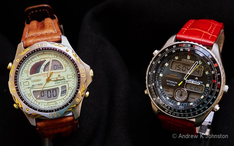
Early 1990s Hybrid Watches
Camera: Panasonic DMC-GX8 | Date: 21-10-2017 10:06 | Resolution: 5118 x 3199 | ISO: 1250 | Exp. bias: -66/100 EV | Exp. Time: 1/60s | Aperture: 8.0 | Focal Length: 30.0mm | Lens: LUMIX G VARIO 12-35/F2.8

I recently started a watch collection. To be different, to control costs and to honour a style which I have long liked, all my watches are hybrid analogue/digital models. Within that constraint, they vary widely in age, cost, manufacturer and style.

I wanted to write something about my observations, but not just a puff piece about my collection. At the same time, I am long overdue to write something on software architecture and design. This piece grew out of wondering whether there are real lessons for the software architect in my collection. Hopefully without being too contrived, there really are.

Hybrid Architectures Allow the Right Technology for the Job

There’s a common tendency in both watch and software design to try and solve all requirements the same way. Sometimes this comes out of a semi-religious obsession with a certain technology, at others it’s down to the limitations of the tools and mind-set of the designer. Designs like the hybrid watch show that allowing multiple technologies to play to their strengths may be a better solution, and not necessarily even with a net increase in complexity.

Using two or three rotating hands to indicate the time is an excellent, elegant and proven solution, arguably more effective for a “quick glance” than the digital equivalent. However, for anything beyond that basic function the world of analogue horology has long had a very apt name: “complications”. Mechanical complexity ratchets up rapidly, for even the simplest of additional functions . Conversely even the cheapest of my watches has a stopwatch, alarm and perpetual calendar, and most support multiple time zones and easy or even automatic travel and clock-change adjustments. Spots of luminous paint make a watch readable in darkness, but illuminating a small digital display is more effective.

The hybrid approach also tackles the aesthetic challenge: while many analogue watches are things of beauty, most digital watches just aren’t. Hybrid watches (just like analogue ones) certainly can be hit with the ugly stick, but I’ve managed to assemble a number of very pretty examples.

The lesson for the software architect is simple: if the compromise of trying to do everything with a single technology is too great, don’t be afraid to embrace a hybrid solution. Hybrid architectures are a powerful tool in the right place, not something to be ruthlessly eliminated by purist “Thought Police”.

A Strong, Layered Architecture Promotes Longevity

Take a look at these three watches: a 1986 Omega Seamaster, a 1999 Rado Diastar, and a recent Breitling Aerospace. Very different, yes?
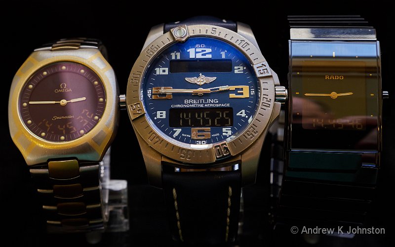

Sisters Under the Skin, or Brothers from Another Mother?

Visually, they are. But their operation is almost identical, so much so that the user manuals are interchangeable. Clearly some Swiss watchmaker just “got it right” in the late 1980s, and that solution has endured, with a life both within and outside the Swatch Group, the watch equivalent of the shark or crocodile. While the underlying technology has changed only slightly, the strong layering has allowed the creation of several different base models, and then numerous variants in size, shape and external materials.

This is a classic example of long-term value from investing in a strong underlying architecture, but also ensuring that the architecture allows for “pace layering”, with the visible elements changing rapidly, while the underpinnings may be remarkably stable.

It’s worth noting that basic functionality alone does not ensure longevity. None of these watches have survived unchanged, it’s the strength of the underlying design which endures.

Oh, and yes, the Omega is a full-sized mans’ watch (as per 1986)! More about fashion later…

Enabling Integration Unlocks New Value

The earliest dual mode watches were little more than a simple digital watch and a quartz analogue watch sharing the same case, but not much else except the battery (and sometimes not even that!). The cheapest are still built on this model, which might most charitably be labelled “Independent” – my Lambretta watch is a good example. There’s actually nothing wrong with this model: improve the capability of the digital part, the quality of the analogue part and the case materials and design and you have, for example, my early 1990s Citizen watches which are among my favourites. However as a watch user you are essentially just running two watches in one case. They may or may not tell the same time.

The three premium Swiss watches represent the next stage of integration. The time is set by the crown moving the hands, but the digital time is set in synchronisation. There’s a simple way to advance and retard both in whole hours to simplify travel and clock-change adjustments. Seconds display is digital-only to simplify matters. Let’s borrow a photography term and call this “Analogue Priority” – still largely manual, but much more streamlined.

“Digital Priority”, as implemented in early 2000s Seikos is another step forwards. You set the digital time accurately for your current location and DST status, and you have one-touch change of both digital and analogue time to any other time zone. The second hand works as a status indicator, or automatically synchronises to the digital time when in time mode.

However the crown has to go to the Tissot T-Touch watches. Here the hands are just three indicators driven entirely by the digital functions: they become the compass needle in compass mode, show the pressure trend in barometer mode, sweep in stopwatch mode, park at 12.00 when the watch is in battery-saving sleep mode. And they tell the time as well! Clearly full integration unlocks a whole set of capabilities not previously accessible.
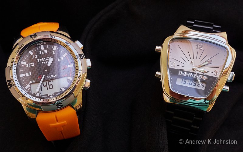

Extremes of analogue/digital integration

So it is with software. Expose the control and integration points of your modules to one another, or to external access, and new value emerges as the whole rapidly becomes much more than the sum of the separate parts.

Provide for Adjustment Where Needed…

While I love the look of some watch bracelets (especially those with unusual materials, like the high-tech black ceramic of the Rado), adjusting them is a complex process, and inevitably ends up with a compromise: either too loose or too tight. Even if the bracelet offers some form of micro-adjustment and you get it “just right” at one point, it will be wrong as the wrist naturally swells and shrinks over time. Leather straps allow easier adjustment, but usually in quite coarse increments of about 1cm, so you’re back to a compromise again.

The ideal would be a bracelet with either an elastic/sprung element, or easily accessible micro-adjustment, but I don’t have a single example in my collection like that. I hear Apple are thinking about an electrically self-adjusting strap for the next iWatch, but that sounds somewhat OTT.

On the other hand, I have a couple of £10 silicone straps for my Fitbit which offer easy adjustment in 2mm increments. Go figure…

We could all quote countless similar software examples, of either a “one size fits all” setting which doesn’t really suit, or an allegedly controllable or automated setting which misses the useful values. The lesson here is to understand where adjustment is required, and provide some accessible way to achieve it.

… But Avoid Wasting Effort on the Useless

At the other end of the scale, several of my watches have “functions” of dubious value. The most obvious is the rotating bezel. In the Tissot, it can be combined with the compass function to provide heading/azimuth information. That’s genuinely useful. The Citizen Wingman has a functioning circular slide rule. Again valid, but something of a hostage to progress. 🙂
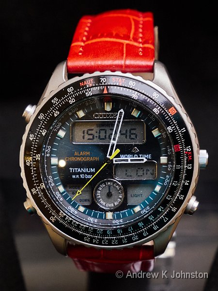

At least the slide rule does something, if you can remember how!

Do the rotating bezels of my Citizen Yachtsman, or the Breitling Aerospace have any function? Not as far as I can see.

Now I’m not against decorative or “fun” features, especially in a product like a watch which nowadays is as frequently worn as jewellery than for its primary function. But I do think that they need to be the result of deliberate decisions, and designers need to think carefully about which are worth the effort, and which introduce complexity outweighing their value. That lesson applies equally to software as to hardware.

… And Don’t Over-Design the User Interface

The other issue here is that unless it’s pure jewellery, a watch does need to honour its primary function, and support easily telling the time, ideally for users with varying eyesight and in varying lighting conditions. While I have been the Rado’s proud owner for nearly 18 years, as my 50-something eyesight has changed it has become increasingly annoying as a time-telling device, mainly due to its “low contrast” design. It’s not alone: for example my very pretty Citizen Yachtsman has gold and pale green hands and a gold and pale green face, which almost renders it back to a pure digital watch in some lights!

At the other end of the scale, the Breitling Aerospace is also very elegant, but an exemplar of clarity, with a high-contrast display, and clear markings including actual numbers. It can be done, and the message is that clarity and simplicity trump “design” in the user interface.

This is equally true of software. I am not the only person to have written bemoaning the usability issues which arise from loss of contrast and colour in modern designs. The message is “keep it simple”, and make sure that your content is properly visible, don’t hide it.

Fashion Drives Technology. Fashion Has Nothing To Do With Technical Excellence

All my watches are good timepieces, bar the odd UI foible, and will run accurately and reliably for years with an occasional battery change. However, if you pick up a watch magazine, or browse any of the dedicated blogs, there is almost no mention of such devices, or largely of quartz/digital watches at all.

Instead, like so much else in the world we are seeing a polarisation around two more “extreme” alternatives: manual wind and “automatic” (i.e. self-winding) mechanical watches, or “charge every day” (and replace every couple of years) smartwatches. The former can be very elegant and impressive pieces of engineering, but will stop and need resetting unless you wind or wear them at least every few days – a challenge for the collector! The latter offer high functionality, but few seem engineered to provide 30 years of hard-wearing service, because we know they will be obsolete in a fraction of that time.

Essentially fashion has driven the market to displace a proven, reliable technology with “challenging” alternatives, which are potentially less good solutions to the core requirements, at least while they are immature.

This is not new, or unique to the watch market. In software, we see a number of equivalent trends which also seem to be driven by fashion rather than technical considerations. A good, if possibly slightly contentious example, might be the displacement of server-centric website technologies, which are very easy to develop, debug and maintain, with more complex and trickier client-centric solutions based on scripting languages. There may be genuine architectural requirements which dictate using such technologies as part of the solution, e.g. “this payload is easy to secure and send as raw data, but difficult and expensive to transmit fully rendered”. Fine. But “it’s what Facebook does” or “it’s the modern solution” are not architecture, just fashion statements.

On a more positive note, another force may tend to correct things. Earlier I likened the Omega/Rado/Breitling design to the evolutionary position of a shark. Well there’s another thing about sharks: evolution keeps using the same design. The shark, swordfish, ichthyosaur, and dolphin are essentially successive re-uses of a successful design with upgraded underlying architecture. Right now, Fossil and others are starting to announce hybrid smartwatches with analogue hands alongside a fully-fledged smartwatch digital display.

In fashion terms, what goes around, comes around. It’s true for many things, watches and software architectures among them.

Conclusions

Trying to understand the familial relationships, similarities and differences in a group of similar artefacts is interesting. It’s also useful for a software architect to try and understand the architectural characteristics behind them, and especially how this can help some designs endure and progressively evolve to deliver long-term value, something we frequently fail to achieve in software. At the same time, it’s also salutary to recognise where non-architectural considerations have a significant architectural impact. Think about the components, relationships and dynamics of other objects in architecture terms, and the architecture of our own software artefacts will benefit.

View featured image in Album
Posted in Agile & Architecture, Thoughts on the World, Watches | Leave a comment

Integration Or Incantation?

I was travelling recently with Virgin Atlantic. I went to check in online, typed in my booking code and selected both our names, clicked "Next", and got an odd error saying that I couldn’t check in. I wondered momentarily if it was yet more pre-Brexit paranoia about Frances’ Irish passport, but there was a "check in individually" option which rapidly revealed that Frances was fine, it was my ticket which was causing the problem.

The web site suggested I ring the reservation number, which I did, listened to 5 minutes of surprisingly loud rock music (you never mistake being on hold for Virgin with anyone else), and got through to a helpful chap. He said "OK, I can see the problem, I will re-issue the ticket." Two minutes of more distinctive music, and he invited me to try again. Same result. He confirmed that we were definitely booked in and had our seat reservations, and suggested that I wait until I get to the airport. "They will help you there." Fine.

Next morning, we were tackled on our way into the Virgin area by a keen young lady who asked if we had had any problems with check in. I said we had, and she led us into what can best be described as a "krall" of check-in terminals, and logged herself into one. This displayed a smart check-in agent’s application, complete with all the logos, the picture of Branson’s glamorous Mum, and so on. She quickly clicked through a set of very similar steps to the ones I had tried, and then click OK. "Oh, that’s odd", she said.

Next, she opens up a green screen application. Well, OK, it’s actually white on a Virgin red background, but I know a green screen application when I see one. She locates my ticket, checks a few things, and types in the command to issue my pass. Now I’m not an expert on Virgin’s IT solutions, but I know the word "ERR" when I see it. "Oh, that’s not right either" says the helpful young lady "I’ll get help".

Two minutes later, the young lady is joined by a somewhat older, rather larger lady. (OK, about the same age as me and she looked a lot better in her uniform than I would, but you get the idea.) "Hello Mr Johnston, let’s see if we can sort this out". She takes one look at the screen and says "We actually have two computer systems, and they don’t always talk to each other or have the same information."

… which could be the best, most succinct summary of the last 25 years of my career I have heard, but I digress…

Back to the story. The new lady looks hard at both applications, and then announces she can see the problem (remember, all this is happening on a screen I can see as well as the two Virgin employees). "Look, they’ve got your name with a ‘T’ here, and no ‘T’ here" (pointing to the "red screen" programme).

Turning to the younger lady, she says "Right, this is how to fix it." "Type DJT, then 01" (The details are wrong, but the flavour is correct…) "Put in his ticket number. Type CHG, then enter. Type in his name, make sure we’ve got the T this time. Now set that value to zero, because this isn’t a chargeable change, and we can do a one letter change without a charge. Put in zero for the luggage, we can change that in a minute. Type DJQ, enter. Type JYZ, enter. OK, that’s better. Now try and print his pass." Back to the sexy new check in app, click a few buttons, and I’m presented with two fresh boarding passes. Job done.

Now didn’t we have a series of books where a bunch of older, experienced wizards taught keen you wizards to tap things with sticks and make incantations? The solution might as well have been to tap the red screen programme with a wand and shout "ticketamus"…

The issues here are common ones. Is it right to be so dependent on what is clearly an elderly and complex legacy system? Are the knowledge transfer processes good enough, or is there a risk that the next time the more experienced lady who knows the magic incantations might not be available? Why is such a fundamental piece of information as the passenger names clearly being copy typed, not part of the automated integrations? As a result, is this a frequent enough problem that there should really be an easier way to fix it? Ultimately the solutions are traditional ones: replace the legacy system, or improve its integrations, but these are never quick or easy.

Now please note I’m not trying to get at Virgin at all. I know for a fact that every company more than a few years old has a similar situation somewhere in the depths of their IT. The Virgin staff were all cheerful, helpful and eventually resolved the problem quickly. However it is maybe a bit of a management error to publicly show the workings "behind the green screen" (to borrow another remarkably apposite magical image, from the Wizard of Oz). We expect to see the swan gliding, not the feet busily paddling. On this occasion it was interesting to get a glimpse, and I was sympathetic, but if the workings cannot be less dependent on "magic", maybe they should be less visible?

Posted in Agile & Architecture, Thoughts on the World | Leave a comment

Singing With Each Other

We went to see The Hollies at G Live in Guildford last night. While the words and melodies were those we loved,  and the instrumental performances were good, the trademark harmonies sounded, frankly, a bit flat, and I wondered if they had finally lost it.

Then, towards the end of the first set, they announced an experiment. They would sing a song around one microphone (“you know, like in the days when we only had one mike”). The three main vocalists moved together and sang Here I Go Again. Suddenly the sound was transformed. The magic was back. It sparkled. It flew. It disappeared, sadly, when the song ended and they moved back to their respective positions on the large stage.

If I had to characterise what happened, and I was being slightly harsh, I would say for short time they were singing together, but the rest of the time they were singing at the same time.

Now we know that G Live has an odd, flat, acoustic. We have seen experienced stand-up comedians struggle because they can’t hear the laughter, and other experienced musicians ask for monitor/foldback adjustments mid performance. However we seem to have really found the Achilles Heel of this otherwise good venue – it doesn’t work if you need to hear what other people are singing and wrap your voice around theirs.

Next time, guys, please just ignore the big stage and use one mike. We’ll love it!

Posted in Thoughts on the World | Leave a comment

Collection, or Obsession?

I have decided to start another collection. Actually the real truth is that I’ve got a bit obsessive about something, and now I’m trying to put a bit of shape and control on it.

I don’t generally have an addictive personality but I do get occasional obsessions where I get one thing and then have to have more similar things, or research and build my kit ad infinitum, until the fascination wears off a bit. The trick is to make sure that it’s something I can afford, where ownership of multiple items makes some sense and where it is possible to dispose of the unwanted items without costing too much money.

Most of my collections involve clothing, where it makes reasonable sense to buy another T shirt, or bright jacket, or endangered species tie (of which I may well have the world’s largest collection). They can all be used, don’t take up too much space, and have some natural turnover as favourites wear out. Likewise I have a reasonable collection of malt whiskies, but I do steadily drink them.

Another trick is to make sure that the collection has a strong theme, which makes sure you stay focused, and which ideally limits the rate of acquisition to one compatible with your financial and storage resources. I don’t collect "ties", or even "animal ties", I collect Endangered Species ties, which only came from two companies and haven’t been made for several years. Likewise my jackets must have a single strong colour, and fit me, which narrows things down usefully.

The new collection got started innocently enough. For nearly 18 years my only "good" watch was a Rado Ceramica, a dual display model. About a year ago I started to fancy a change, not least because between changes in my sight, a dimming of the Rado’s digital display, and a lot of nights in a very dark hotel room I realised it was functioning more as jewellery than a reliable way of telling the time. So I wanted a new watch, but I wasn’t inspired as to what.

Then I watched Broken Arrow, and fell in lust with John Travolta’s Breitling Aerospace. The only challenge was that they are quite expensive items, and I wasn’t quite ready to make that purchase. In the meantime we watched Mission Impossible 5, and I was also quite impressed with Simon Pegg’s Tissot T-Touch. That was more readily satisfied, and I got hold of a second-hand one with nice titanium trim and a cheerful orange strap for about £200. This turned out to be an excellent "holiday" watch, tough, colourful and with lots of fun features including a thermometer, an altimeter/barometer, a compass, and a clever dual time zone system. That temporarily kept the lust at bay, but as quite a chunky device it wasn’t the whole solution.

The astute amongst you will have recognised that there a couple of things going on here which could be the start of a "theme". Firstly I very much like unusual materials: the titanium in all watches I’ve mentioned, the sapphire faces of the Breitling and the Rado and that watch’s hi-tech ceramic.

Second all these watches have a dual digital/analogue display. I’ve always liked that concept, ever since the inexpensive Casio watch which I wore for most of the 90s. Not only is it a style I like, it’s also now a disappearing one, being displaced by cleverer smartphones and smart watches. Of the mainstream manufacturers only Breitling and Tissot still make such watches. That makes older, rarer examples eminently collectable.

To refine the collection, there’s another dimension. I like my stuff to be unusual, ideally unique. Sometimes there’s a functional justification, like the modified keyboards on my MacBooks, but it’s also why my last two cars started off black and ended up being resprayed. Likewise, when I finally decided to take advantage of the cheap jewellery prices in Barbados and bought my Breitling I looked hard at the different colour options and ended up getting the vendor to track down the last Aerospace with a blue face and matching blue strap in the Caribbean.

Of course, if I’m being honest there’s a certain amount of rationalisation after the event going on here. What actually happened is that after buying the Breitling I got a bit obsessed and bought several and sold several cheaper watches before really formulating the rules of my collection. However I can now specify that any new entrant must be (unless I change the rules, which may happen at any time at the collector’s sole option 🙂 ):

  • Dual display. That’s the theme, and I’m happy to stick to it, for now.
  • Functional and in good condition. These watches are going to be worn, and having tried to fix a duff one it’s not worth the effort.
  • Affordable. This is a collection for fun and function, not gain. While there’s a wide range between the cheapest and most expensive, most have cost around £200, and are at least second-hand.
  • The right size. With my relatively small hands and wrists, that means a maximum of about 44mm, but a minimum of about 37mm (below which the eyes may be more challenged). As I’m no fan of "knuckle dusters" most are no more than 11mm thick, although I’m slightly more flexible on that.
  • Beautiful, or really clever, or both. Like most men, a watch is my only jewellery, and I want to feel some pride of ownership and pleasure looking at it. Alternatively I’ll give a bit on that (just a bit) for a watch with unusual functionality or materials.
  • Unusual. Rare colour and material combinations preferred, and I’m highly likely to change straps and bracelets as well.

Ironically I’m not so insistent that it has to be a great "time telling" device. There are honourable exceptions (the Breitling), but there does seem to be a rough inverse relationship between a watch’s beauty and its clarity. I’m prepared to accommodate a range here, although it has to be said that most of the acquisitions beat the Rado in a dark room.

So will these conditions control my obsession, or inflame and challenge it? Time will tell, as will telling the time…

Posted in Thoughts on the World, Watches | 1 Comment

Back to the Future

I’ve opined before about how Microsoft have made significant retrograde steps with recent versions of Office. However this morning they topped themselves when Office 2016 started complaining about not being activated, and the recommended, automated solution was to do a complete download and "click to run" installation of some weird version of Office 365 over the top of my current installation.

In the meantime, I’ve been working with a main client whose standard desktop is based on Office 2010, and, you know what, it’s just better.

I’ve had enough. Office 2016 and 2013 have been removed from the primary operating systems of all my machines. In the unlikely event that I need Office 2016 (and the only real candidate is Skype for Business), I’ll run it in a VM. Long live Office 2010!

Posted in Thoughts on the World | Leave a comment

Business Models

Here’s a business model:

I’m a drug dealer. I sell you a crack cocaine pipe complete with a packet of wraps for £220. It’s a good pipe (assuming that such things exist) – burns clean and always hits the spot (OK I’m making this bit up, it’s not exactly an area of first-hand knowledge.)

To make my business plan work the packet of wraps is half high quality crack cocaine and half icing sugar. You come back to me and I’m very happy to sell you another packet of wraps. This time the price is £340, again for half high quality crack and half icing sugar.

This business model is illegal and for a number of very good reasons.

OK here is a completely different business model, nothing at all like the last one:

I am a manufacturer of consumer electronics. To be specific I’m a Korean manufacturer of occasionally explosively good consumer electronics. I sell you a printer complete with a set of toner cartridges for £220. It’s a very good printer – quiet, reliable, lovely output (I’m on safer ground here.)

To make my business plan work I put a little circuit in each toner cartridge so that at 5000 pages it says that it’s empty even if it it’s still half full. You come back to me and I’m very happy to sell you another set of cartridges, this time the price is £340. Again each cartridge is wired to show empty even when it’s still half full.

For reasons I fail to understand this model is legal, certainly in the UK.

There is of course an answer but it feels morally wrong. I just put my perfectly good printer in the bin and buy a new one complete with toner cartridges. I have also found a little chap in China who for £40 will sell me a set of chips for the cartridges. Five minutes with a junior hacksaw and some blu-tack and I can double their life.

Maybe the answer is just to throw the printer away every time the cartridges are empty. Surely it is not sustainable for the manufacturer if everyone just does this. But it doesn’t feel right…

Posted in Thoughts on the World | 1 Comment

Liberation from the "Frightful Five"

There’s an interesting NY Times article on our dependency on "Tech’s Frightful Five", which includes a little interactive assessment of whether you could liberate yourself, and if so in which order. I thought it would be interesting to document my own assessment.

  1. FaceBook. No great loss. I’ve only started recently and I’m not a terribly social animal. I also have my own website and LinkedIn. Gone.
  2. Apple. Momentary wrench. My only connection to Apple is my MacBook Pro laptop, which is a great bit of kit. However it runs Windows and I’m sure Dell or Sony could sell me a reasonable replacement, although I would really miss the large 16×10 Retina screen.
  3. Alphabet/Google. Harder work, but straightforward. There are alternatives to Chrome as a browser, Google as a search engine, even Android as a phone/tablet operating system. It helps that Google has a bit of a track record of providing something you get to like, and then without warning disabling or crippling that rendering it of reduced or no value (think Android KitKat, Google Currents, I could go on). There’s a bit of work here, but it could be done.

And then I’m stuck. Like Farhad Manjoo Amazon has worked its way into a prime (or should that be "Prime") position in not only our shopping but also our viewing and reading habits. Yes, there are options, but the pain of transition would be substantial, and the loss of content (almost 400 Kindle books, Top Gear, Ripper Street and the Man in the High Castle among others) expensive. Amazon probably gets 4th place, but don’t ask me to do it! Steps 1-3 would leave me with an even heavier dependency than today on Windows and other Microsoft products and subsidiaries for all my day to day technical actions, and unless we’re going back to the Dark Ages I don’t see good alternatives, so Microsoft gets 5th by default, but it’s not really on the list. Well played, Bill.

Who are you most dependent on?

Posted in Thoughts on the World | Leave a comment

What Are Your Waypoints?

Country singer at the Listening Room, Nashville, providing important routeing information!
Camera: Panasonic DMC-GX7 | Date: 24-09-2014 18:14 | Resolution: 3424 x 3424 | ISO: 3200 | Exp. bias: 0 EV | Exp. Time: 1/25s | Aperture: 5.6 | Focal Length: 46.0mm | Location: The District | State/Province: Tennessee | See map | Lens: LUMIX G VARIO 35-100/F2.8

How do you remember the waypoints and landmarks on a journey? What are the key features by which you can replay in your mind, or to someone else, where you went and what you did?

Like any good Englishman, I can navigate substantial sections of our sceptred  isle by drinking establishment. This is, of course, a long tradition and officially recognised mechanism – it’s why British pubs have recognisable iconic signs, so that even if you were illiterate you could get yourself from inn to inn. It’s a bit more difficult today thanks to pub closures and the rise of pub chains with less distinguishable names, but it still works. Ask me to navigate you around Surrey, and there will be a lot of such landmarks in the discussion.

When I look back at other trips, especially to foreign parts, the mechanisms change. I can usually remember where I took favourite photographs, even without the GPS tagging, and I could immediately point to the locations of traumatic events whether in motion ("the Italian motorway with the big steel fences either side") or at rest ("the hotel with the sticky bathroom floor"). I also tend to hold in my head a sort of "moving map" picture of the journey’s flow, which might not be terribly accurate, but could be rendered more so quite quickly by studying a real map.

Frances, despite appearances to the contrary, navigates largely using food. Yesterday we had a typical example: "do you remember that lovely town square where we had breakfast in front of the town hall and we had to ask them whether they had real eggs because the powdered eggs were disagreeing with me? I think it was on the Washington trip." This was a challenge. "Breakfast" was probably right, so that narrowed things down a bit. "The Washington trip" was probably correct, but I have learned to treat such information with an element of caution.

At this point we had therefore to marry up two different reference systems, and try and work out where they overlapped. My first pass was to run the moving map of the Washington trip in my head, and call out the towns where we stayed. That eliminated a couple of stops, where we could both remember the breakfast arrangements (the very good restaurant at the Peaks of Otter Lodge, and a nice diner in Gatlinburg), but we were still missing an obvious match.

Then Frances said "I think we had to drive out of town for a bit because we’d had to change our route". Bingo! This now triggered the "traumatic event" register in my mind, specifically listening to a charming young lady in Nashville singing a song about the journey of a bottle of Jack Daniels, and suddenly realising I had put the wrong bloody Lynchburg on our route! Over dinner I had to do a quick replan and include Lynchburg Tennessee as well as Lynchburg Virginia in our itinerary. That meant an early start from Nashville next morning, heading south rather than directly east, and half-way to Lynchburg (the one with the Jack Daniels distillery) we stopped for breakfast because the offering at the hotel had looked very grim. Got there in the end.

(If you’re wondering, I do actually have a photographic record of this event. The young lady above is the one who sang the song with the critical routeing information.)

We’ve also had "that restaurant where we were the only white faces and the manager kept asking if we were OK" (Memphis, near Gracelands), and "that little store where they did the pulled pork sandwiches and the woman’s daughter lived in Birmingham" (Vesuvius, Virginia). In fairness to my wife, she can also accurately recall details of most of our retail transactions on each trip, including the unsuccessful ones. ("That town where we bought my Kokopeli material, and the old lady had to run across the street although there was no traffic"). Again there’s the challenge of marrying these up with my frame of reference, but the poor old lady in Cortez, Colorado, desperately trying to beat the count down timer on the pedestrian crossing, despite a traffic level of about 1 vehicle a minute, sticks in my mind as well, so that one was easy. Admittedly, I remember Cortez as "that nice town just outside Mesa Verde", but that’s me.

What’s your frame of reference?

View featured image in Album
Posted in Thoughts on the World, Travel | Leave a comment

Why I (Still) Do Programming

It’s an oddity that although I sell most of my time as a senior software architect, and can also afford to purchase software I need, I still spend a lot of time programming, writing code. Twenty-five years ago people a little older than I was then frequently told me “I stopped writing code a long time ago, you will probably be the same”, but it’s just turned out to be completely untrue. It’s not even that I only do it for a hobby or personal projects, I work some hands-on development into the majority of my professional engagements. Why?

At the risk of mis-quoting the Bible, the answer is legion, for they are many…

To get the functionality I want

I have always been a believer in getting computers to automate repetitive actions, something they are supremely good at. At the same time I have a very low patience threshold for undertaking repetitive tasks myself. If I can find an existing software solution great, but if not I will seriously consider writing one, or at the very least the “scaffolding” to integrate available tools into a smooth process. What often happens is I find a partial solution first, but as I get tired of working around its limitations I get to the point where I say “to hell with this, I’ll write my own”. This is more commonly a justification for personal projects, but there have been cases where I have filled gaps in client projects on this basis.

Related to this, if I need to quickly get a result in a complex calculation or piece of data processing, I’m happy to jump into a suitable macro language (or just VB) to get it, even for a single execution. Computers are faster than people, as long as it doesn’t take too long to set the process up.

To explore complex problems

While I am a great believer in the value of analysis and modelling, I acknowledge that words and diagrams have their limits in the case of the most complicated problem domains, and may be fundamentally difficult to formulate and communicate for complex and chaotic problem domains (using all these terms in their formal sense, and as they are used in the Cynefin framework, see here).

Even a low-functionality prototype may do more to elicit an understanding of a complex requirement than a lot of words and pictures: that’s one reason why agile methods have become so popular. The challenge is to strike a balance, and make sure that an analytical understanding does genuinely emerge, rather than just being buried in the code and my head. That’s why I am always keen to generate genuine models and documentation off the back of any such prototype.

The other case in which I may jump into code is if the dynamic behaviour of a system or process is difficult to model, and a simulation may be a valid way of exploring it. This may just be the implementation of a mathematical model, for example a Monte Carlo simulation, but I have also found myself building dynamic visual models of complex interactions.

To prove my ideas

Part of the value I bring to professional engagements is experience or knowledge of a range of architectural solutions, and the willingness to invoke unusual approaches if I think they are a good fit to a challenge. However it’s not unusual to find that other architects or developers are resistant to less traditional approaches, or those outside their comfort zones. Models and PowerPoint can go only so far in such situations, and a working proof of concept can be a very persuasive tool. Conversely, if I find that it isn’t as easy or as effective as I’d hoped, then “prove” takes on its older meaning of “test” and I may be the one being persuaded. I’m a scientist, so that’s fine too.

To prove or assess a technology

Related to the last, I have found by hard-won experience that vendors consistently overstate the capabilities of their solutions, and a quick proof of concept can be very powerful in confirming or refuting a proposed solution, establishing its limitations or narrowing down options.

A variant on this is where I need to measure myself, or others, for example to calibrate what might or might not be adequate productivity in a given situation.

To prove I can

While I am sceptical of overstated claims, I am equally suspicious if I think something should be achievable, and someone else says “that’s not possible”. Many projects both professional and personal have started from the assertion that “X is impossible”, and my disbelief in that. I get a great kick from bending technology to my will. To quote Deep Purple’s famously filthy song, Knocking At Your Back Door, itself a exploration into the limits of possibility (with censorship), “It’s not the kill, it’s the thrill of the chase.”.

In the modern world of agile development processes, architect and analyst roles are becoming blurred with that of “developer”. I have always straddled that boundary, and proving my development abilities my help my credibility with development teams, allowing me to engage at a lower level of detail when necessary. My ability to program makes me a better architect, at the same time as architecture knowledge makes me a better programmer.

To make money?

Maybe. If a development activity can help to sell my skills, or advance a client’s project, then it’s just part of my professional service offering, and on the same commercial basis as the rest. That’s great, especially if I can charge a rate commensurate with the bundle of skills, not just coding. My output may be part of the overall product or solution or a enduring utility, but more often any development I do is merely the means to an end which is a design, proof of concept, or measurement.

On the other hand, quite a lot of what I do makes little or no money. The stuff I build for my own purposes costs me little, but has a substantial opportunity cost if I could use the time another way, and I will usually buy a commercial solution if one exists. The total income from all my app and plugin development over the years has been a few hundred pounds, probably less than I’ve paid out for related tools and components. This is a “hobby with benefits”, not an income stream.

Because I enjoy it

This is perhaps the nub of the case: programming is something I enjoy doing. It’s a creative act, and puts my mind into a state I enjoy, solving problems, mastering technologies and creating an artefact of value from (usually) a blank sheet. It’s good mental exercise, and like any skill, if you want to retain it you have to keep in practice. The challenge is to do it in the right cases and at the right times, and remember that sometimes I really should be doing something else!

Posted in Agile & Architecture, Code & Development, Thoughts on the World | Leave a comment

Travel Blogging and Photo Editing

Weaver's hand
Camera: Panasonic DMC-GX8 | Date: 17-02-2017 11:39 | Resolution: 5184 x 3456 | ISO: 1600 | Exp. bias: -66/100 EV | Exp. Time: 1/40s | Aperture: 4.5 | Focal Length: 30.0mm | Location: Weaving village at In Paw Khone | State/Province: Inbawhkon, Shan | See map | Lens: LUMIX G VARIO 12-35/F2.8

I’ve been asked a number of times recently how I manage to write my blog during the often hectic schedule of my trips. It is sometimes a challenge, but it’s something that I want to do, and so I make it a priority for any "down time". I don’t see it as a chore, but as a way of enhancing my enjoyment, re-living the best experiences, working through any frustrations, and building valuable memories. If I’m travelling without Frances then there’s a lot of overlap with my report home, and if we’re travelling together then drafting the blog has become an enjoyable joint activity for coffee stops and dinner times.

That said, there are a few tricks to make the task manageable, and I’m happy to pass on some of those I have developed.

There’s no great magic to the writing. The main ingredient is practice. However I do spend quite a lot of time thinking through what to say about a day, trying to draft suitable paragraphs in my mind. If it was good enough for Gideon it’s good enough for me :). It is useful to capture ideas and even draft words whenever you get an opportunity, even on the go: travel time in buses and coffee stops are ideal. I just start drafting an email to myself on my phone, which can be saved at any time, reopened to add more as the day goes on, and sent before I start writing the blog.

The other important tool is a blogging app on your device which works offline and can save multiple drafts locally. I use the excellent Microsoft Live Writer on my PC, and the WordPress app on my phone and tablet, but any decent text editor would do. I would strongly counsel against trying to do travel blogging directly onto an online service – you will just be too obstructed by connectivity challenges.

Images are the other part of the equation. It’s very easy to be overwhelmed by the sheer volume of images, especially if you shoot prolifically like I tend to do, and if you have a relatively slow processing workflow. The first trick is to shoot RAW+JPG, so you always have something which you can share and post, even if it’s not perfect. As I observed in a previous post, you don’t need perfect in this context, and it would be rare if you didn’t from a day’s shooting have a least one image good enough in camera to share.

However, as long as I have at least some time, I do try to perform a basic edit (filter) on my shots, and process at least the one or two I want to publish to my blog. That requires a robust but quick and efficient workflow. Different photographers work different ways, but the following describes mine.

Importantly, I don’t use LightRoom or the image management features in Photoshop. Neither do I use Capture One’s catalogue features. All my image management takes place directly in Windows, supported by the excellent XnView and a few tools of my own making. I find that this is both quicker, and puts me in direct control of the process, rather than at the mercy of a model which might not suit.

The first step is to copy (not move) the images off the memory card. If I have only used one card in a session, I find it perfectly adequate to just connect the camera via USB – this works quite quickly, and avoids fiddling with card readers. As long as I have sufficient cards I don’t re-format them until I’m home (just in case something happens to the PC), nor do I do much in-camera deleting, which is very cumbersome.

In terms of organisation I have a top-level directory on each laptop called "Pictures" under which is a directory called "Incoming". This is synchronised across all my computers, and holds all "work in progress". Under that I have two master directories for each year or major trip, and then subdirectories for each event. So for Myanmar I will have top level directories called "Myanmar 2017" (for output files and fully-processed originals) and "Myanmar 2017 – Incoming" (for work in progress). Under the latter I would typically have a directory for the images from each day’s shooting, e.g. "Lake Inle Day 2". On the "output" side I will typically have a directory for each location, plus one for all the originals (RAW files and Capture One settings), but I could easily also end up with others for video, and particular events or topics such as the group.

Having copied the pictures over to the right working directory, I fire up XnView. The first step is to run a batch rename process which sets each image filename to my standard, which includes the date (in YYYYMMDD format), the camera and the number assigned by the camera, so all shots from a given camera will always sort alphabetically in shot order, and I can immediately see when an image was taken and on which camera. After that I run a script which moves all "multi-shot" images into sub-directories by type (I shoot panoramas, HDR, focus blends and 3D images each using a distinct custom mode on the camera) and takes these out of the main editing workflow.

The next step is to "edit" the images, by which I mean filtering out the bad, poor, and very good. Because I have JPG files for each shot, I can set XnView to sort by file type, and quickly scan all the JPG files in full screen mode, tagging each (using shortcut keys) on the following scheme:

  • Two stars means "delete". This is for images which are beyond use: out of focus, blurred, subject not fully in the frame. These will be moved to the wastebasket, and once that’s emptied, they are gone forever.
  • Three stars means "others". This is for images which are technically viable but which I don’t think merit processing. The obvious candidates are things like alternative people shots where the expressions weren’t ideal (but I have a better shot) or where I took a few slightly different compositions and some obviously don’t work. However this is also where I park duplicates or the unwanted frames from high-speed sequences. When I get home the JPGs will be deleted and the RAW files moved to an old external hard drive to free up disk space.
  • Four stars means "OK". This is for technically and compositionally adequate images, albeit which may not be the best, or may need substantial processing work.
  • Five stars means "good". These are the images which leap out at a quick viewing as "yes, that’s going to work".

Having tagged the images in the working folder, I have another script which deletes the two star images, moves the "others", and creates a .XMP file marking the five star images with a colour tag which can be read by Capture One. I can also copy the in-camera JPG versions of the 5 star images as a starting point for my portfolio, although these will be replaced by processed versions later.

The thing about the tagging process is to keep going, quickly, but err on the side of caution (so tag borderline delete as 3 star, and borderline others as 4 star). I can usually work through at an image every one or two seconds, so the first filter of an intensive shoot of 500 images takes less than 20 minutes. At this point I have typically reduced the retained images by 40-60%, but that varies by subject matter and the percentage of rejects can be much higher for challenging subjects such as high-speed action but also people other than professional models, where a lot get rejected for poor expressions. The reason I’ve chosen the image at the top is that I love trying to capture hands at work, but that’s another subject with a high "miss" rate. I also find that I fairly consistently mark about 4-5% of shots as 5 star.

I don’t just delete the "others", because there is the occasional case where my selected shot of a group turns out to have a major flaw, and it’s worth reviewing the options. More importantly, for family events, weddings and the like there’s the occasional "didn’t anyone take a picture of Aunty Ethel?" I rescued a friend of mine from a serious family bust-up when it emerged that the official photographer at his wedding hadn’t taken a single photo of my friend, the groom’s parents! On the case, I found a shot in "others" which after processing kept everyone happy.

At this point, and only then, I start up Capture One and navigate to the target working directory. It takes a minute or two to perform its first scan, and then I can change the sort order to "colour tag", and there are the best of the day’s images, right at the top of the list ready to select a couple for the blog and process them. 90% of the time I restrict processing changes to the crop and exposure (levels and curves) – I wouldn’t usually select for the blog any image needing more than that. Finish the words, and I’m ready to post my blog.

From plugging in the camera to posting typically takes around an hour. There’s some scope for multi-tasking, so I can work on the words (or get a cup of tea) while the images are downloading from the camera, or while posting the images to my website (which in my case is a separate step from posting the blog). As a by-product, I have performed my first edit on the shoot, and have more or less the best images prioritised for further processing.

And I have an enduring and sharable record of what I did on my holidays!

View featured image in Album
Posted in Myanmar Travel Blog, Photography, Thoughts on the World, Travel | Leave a comment

The Perfect is the Enemy of the Good

Buddha at Pa-Hto-Thar-Myar Pagoda, camera lying on bag!
Camera: Panasonic DMC-GX8 | Date: 11-02-2017 12:14 | Resolution: 4072 x 5429 | ISO: 400 | Exp. bias: 0.66 EV | Exp. Time: 1.6s | Aperture: 4.5 | Focal Length: 7.0mm | Location: Pa-Hto-Thar-Myar Pagoda | State/Province: Nyaung-U, Mandalay | See map | Lens: LUMIX G VARIO 7-14/F4.0

The Perfect is the Enemy of the Good. I’m not sure who first explained this to me, but I’m pretty sure it was my school metalwork teacher, Mr Bickle. Physically and vocally he was a cross between Nigel Green and Brian Blessed, and the rumour that he had been a Regimental Sergeant Major during the war was perfectly credible, especially when he was controlling a vast playing field full of chatty children without benefit of a bell or megaphone. However behind the forbidding exterior was a kindly man and a good teacher. When my first attempt at enamel work went a bit wrong, and some of the enamel ended up on the rear of the spoon, I was very upset. He kindly pointed out that it was still a good effort, and the flaw "added character". My mother, another teacher, agreed, and the spoon is still on her kitchen windowsill 45 years later.

I learned an important lesson: things don’t need to be perfect to be "good enough", and it’s better to move on and do something else good than to agonise over imperfections.

I also quickly found that this is a good exam strategy: 16/20 in all five questions is potentially top marks, whereas 20/20 in one and insufficient time for the others could mean a failure. The same is true in some (not all) sports: the strongman who is second in every event may go home with the title.

Later, in my training as a physicist and engineer, I learned a related lesson. There’s no such thing as an exact measurement or a perfectly accurate construction. I learned to think in terms of errors, variances and tolerances, and to understand their net effect on an overall result. When in my late 20s I did some formal Quality Management training the same message emerged a different way: in industrial QA you’re most interested in ensuring that all output meets a defined, measureable standard, and the last thing you want is an individual perfectionist obstructing the process.

Seeking perfection can easily lead to a very low (if high quality) output, and missed opportunities. It also risks absolute failure, as perfectionists often have no "Plan B" and limited if any ability to adapt to changing circumstances. "Very good", on the other hand, is an easy bedfellow with high productivity and planning for contingencies and changes.

I adopt this view in pretty much everything I do: professional work, hobbies, DIY, commercial relationships, entertainment. I hold myself and others to high standards, but I have learned to be tolerant of the odd imperfection. This does mean living with the occasional annoying wrinkle, but I judge that to be an acceptable compromise within overall achievement and satisfaction. Practice, criticism (from self and others) and active continuous improvement are still essential, but I expect them to make me better, not perfect.

The trick, of course, is to define and quantify what is "good enough". I then expect important deficiencies against such a target to be rectified promptly, correctly and completely. In my own work, this means allowing some room for change and correction, whether it’s circulating an early draft of a document to key reviewers, or making sure that I can easily reach plumbing pipework. If something must be "set in stone" then it has to be right, and whatever early checks and tests are possible are essential, but it’s much better to understand and allow for change and adjustment.

In the work of others, it means setting or understanding appropriate standards, and then living by them. After I had my car resprayed, I noticed a small run in the paint on the bonnet. Would I prefer this hadn’t happened? Yes. Does it prevent me enjoying my unique car and cheerfully recommending the guys who did the work? No. Professionally I can and will be highly critical of sloppy, incomplete or inaccurate work, but I will be understanding of odd errors in presentation or detail, providing that they don’t affect the overall result or number too many (which is in turn another indicator of poor underlying quality).

So why have I written this now, why have I tagged it as part of my Myanmar photo blog, and why is there a picture of the Buddha at the top? In photography, there are those who seek to create a small number of "perfect" images. They can get very upset if circumstances prevent them from doing so. My aim is instead to accept the conditions, get a good image if I can, and then move on to the next opportunity. At the Pa-Hto-Thar-Myar Pagoda I (stupidly) arrived without my tripod, and had to get the pictures resting my camera on any convenient support using the self timer to avoid shake, in this case flat on its back on my camera bag on the temple floor. Is this the best possible image from that location? Probably not. Am I happy with it? Yes, and if I have correctly understood Buddhist principles, I think the Buddha would approve as well.

It is in humanity’s interest that in some fields of artistic endeavour, there are those who seek perfection. For the rest of us, perfection is the wrong target.

View featured image in Album
Posted in Agile & Architecture, Myanmar Travel Blog, Thoughts on the World, Travel | Leave a comment

Myanmar Musings (What Worked and What Didn’t)

Scarf seller at Thaung Yoeu
Camera: Panasonic DMC-GX8 | Date: 15-02-2017 17:37 | Resolution: 3888 x 3888 | ISO: 1600 | Exp. bias: 0 EV | Exp. Time: 1/25s | Aperture: 9.0 | Focal Length: 33.0mm | Location: Thaung Yoeu ladies and pagoda ru | State/Province: Indein, Shan | See map | Lens: LUMIX G VARIO 12-35/F2.8

Well, I’m back! Apart from a mad dash the length of Bangkok airport which got us to our plane to the UK with only a couple of minutes to spare, the flights home were uneventful and timely. Here’s my traditional tail-end blog piece, with a combination of “what worked and what didn’t” and more general musings.

This was a truly inspiring photographic trip, with a combination of great locations, events and people to photograph. We had a very capable “leadership team” who got us to great locations in great light, and the Burmese people were only too happy to participate in the process. No praise can be too high for our local guide, Nay Win Oo (Shine), who is not only a great guide and competent logistician, but has a good feel for what makes great photography, and a real talent for directing the local people as models.

If I have a minor complaint, it’s the observation that the trip was largely focused on interiors and people to the occasional exclusion of landscapes and architecture. I had to declare UDI a couple of times to get a bit more of the latter subject matter in front of my lens. Bhutan was perhaps a better match to my own style, but that didn’t stop this trip being a great source of images.

Cameras and Shot Count

The Panasonic GX8 was the workhorse of the trip, and took approximately 3690 exposures. That’s about 20% higher than either Bhutan or Morocco, both of which were slightly longer trips, and reflects the more “interactive” nature of the photography, with a rather higher discard ratio than normal. As usual the total also includes raw material for quite a lot of multi-exposure images, mainly for 3D and panoramas. I expect to end up with 100-200 images worth sharing, which is about the norm.

I took around 84 stills on the Sony RX100, mainly “grab shots” from the bus, but it came into its own for video, and I have a number of great video clips, more than  on previous trips. I also took a handful of images using the infrared-converted Panasonic GX7, but whether due to the subject matter or the lighting they weren’t terribly inspiring.

I used my Ricoh Theta 360-degree camera several times, mainly in the markets and at the group mealtimes. I’m treating this as “found photography” – I haven’t had much of a look yet at what was captured, and will look forward to exploring the output over time.

My equipment all behaved faultlessly. I used all the lenses a reasonable amount, with the Panasonic 12-35mm doing the lion’s share as expected, but the 7-14mm, 35-100mm and 100-300mm all getting substantial use. I didn’t use the camera on my new Sony Experia Ultra phone, but its excellent GPS was a vast improvement over the Galaxy Note’s poor performance in Bhutan.

I also did not use the Panasonic GX7 which I was carrying as a spare, but was able to lend it as a complete solution to another member of the group when her Canon L Series zoom lens started misbehaving. Having been burned previously I always carry a spare everything, and that’s a lot easier with the diminutive Panasonic kit.

Human Factors

While technology was broadly reliable, human systems were more challenged. The combined effects of the intensive schedule and the expected risk of tummy bugs led to as fairly high attrition rate. At least half the group missed a shoot or a meal, and a couple were quite ill for a couple of days. I was lucky that my own “wobble” was brief and started within a quick walk of a five star hotel. I would advise most travellers to think in terms of “when” not “if”, and definitely avoid all uncooked food.

Hotels and restaurants were clean, and even out and about most washrooms were acceptable. Similarly temple areas were kept clean, with the fact that all shoes are removed at the entrance a clear contributor. The challenge is in the more general areas, especially in the towns and cities, where any surface you touch may also have been touched by many others. Money is a particular challenge. All you can do is to keep sanitising your hands, but also bags, cameras, wallets and other items which you may have to touch with dirty hands.

Our Burmese travel agents certainly did everything they could to reduce stress.  Once we arrived in Burma responsibility for our large luggage and travel documents began and ended with putting our bags outside the room at the appointed time. Then we just got on the bus, walked through the airport picking up a boarding pass as we passed Shine, and that’s about it! I could get used to travelling that way…

With someone else doing the “heavy lifting” (quite literally in the case of my case), you can get around with two phrases and 3 gestures:

  • Minga-la-ba, which is a polite “good day” exchanged between any two people who make eye contact. The choruses in the school and markets were fascinating! This can be used to cover a multitude of sins, and works very well as “please can I take your photograph?”
  • Che-su-ba, which means “thank you”. ‘Nuff said.
  • The smiley face and thumbs up, which work when you’re not close enough to use Minga-la-ba and che-su-ba.
  • A gesture consisting of the left hand held out at table level, palm up, with the right hand held about a foot above it, palm down. This is universally interpreted as “I would like a large Myanman beer, please” 🙂

Burmese Bizarre

Myanmar is a bit bizarre in a number of ways. Let’s start with the name. Myanmar (pronounce “mee…” not “my…”) is a relatively recent invention, and is not universally adopted. It doesn’t help that Aung San Suu Kyi (the popular and de-facto leader) tends to use “Burma” herself, and there’s no common adjective derived from Myanmar, whereas “Burmese” works, and is officially valid if it relates to the dominant ethnic group and language. It wouldn’t surprise me if “Myanmar” goes the way of “Zaire” and “Tanganyika”, and we’re all back to “Burma” in a few years.

The Burmese really do “drive on the wrong side of the road”. In another anti-colonial dictat a few years ago, one of the madder generals decided to change from the British practice, and instructed the country to drive on the right. On it’s own, that’s not a problem. It works fairly well for the Americas and most of Europe. However the Burmese are trying to do it with the same almost completely right-hand-drive vehicle supply as the rest of Asia and Australasia. So all of the drivers are unable to see round corners or larger vehicles in front, and every bus has a “driver’s assistant” who’s main job is to stop passengers being mown down by passing traffic as they disembark into the middle of the road!

At a daily level Myanmar is almost entirely cash-based, with effectively three currencies in circulation. Major tourist transactions are conducted in US Dollars. These must be large denominations and absolutely pristine – they may be rejected for a tiny mark or fold. Next down, most day to day transactions by tourists and the more wealthy are conducted in Kyat (pronounced “Chat”), in round units of 1000 Kyat (about 60p). 10,000K and 5,000K notes tend to also be quite tidy. Transactions with and between the poorer people are in tens or hundreds of Kyat and the money is quite different. It’s absolutely disgusting, clearly and literally passing through a lot of hands in its lifetime. It’s all slightly reminiscent of the two currency system in Cuba, but with one currency used two distinct ways.

Uniquely among the countries I have visited, Myanmar has no international GSM roaming. However we had good straightforward Wifi connectivity at reasonable speeds and without any obvious restrictions at all the hotels and in several other locations. I suspect this is a transitional state, as the enthusiastic adoption of mobile phones in the local population will inevitably drive a standard solution fairly rapidly.

One thing which did amuse me – one of the primary providers of Internet services is a company called SkyNet. Shine say’s they’ve all seen the films, so I’m assuming the founder is a Terminator fan…

The usual Asian approach of throwing people at any problem showed mixed results. Bangkok Airport is an enormous hub trying to run on small site processes which don’t scale just by adding people. The role of “bus driver’s assistant” does find employment for young lads with a helpful attitude but few exams. However we did have one very delayed meal where the problem seemed to be one of short staffing, despite a lot of people milling around the restaurant with nothing to do, most of the order taking, cooking and serving was being done by one or two individuals who were run ragged. It will be interesting to see how the approaches vary as the economy grows.

Guide books describe the food as “a rich fusion of unusual flavours” and “a repertoire of ingredients not found in any other cuisine”. Yeah, right. I’ll admit that I was being a bit cautious and avoided some of the more unusual fish and hot curry dishes, but basically it was Chinese or Thai food with a few local variations (more pineapple), alongside a number of Indian, Italian and Anglo-American favourites. One member of our group survived almost the whole trip on chicken and cashew nuts, and I’ll admit to a couple of pizzas!

To Sum Up

Lovely country, lovely people, great photos, but keep cleaning your hands and stick to the Chinese food (and beer)!

View featured image in Album
Posted in Myanmar Travel Blog, Photography, Thoughts on the World, Travel | Leave a comment