Author Archives: Andrew

 List
List Abstract
 One+Abstract
The World’s Third Worst Panorama 2023
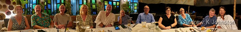
As is traditional, here’s my group panorama from the “last supper”. From left to right Louise, Andrew (yours truly), Other Andrew (“Spike”), Ann, Mark, Richard, Lee, Sarah, Nicola, Jon and Michelle. As it was shot in very low light I … Continue reading
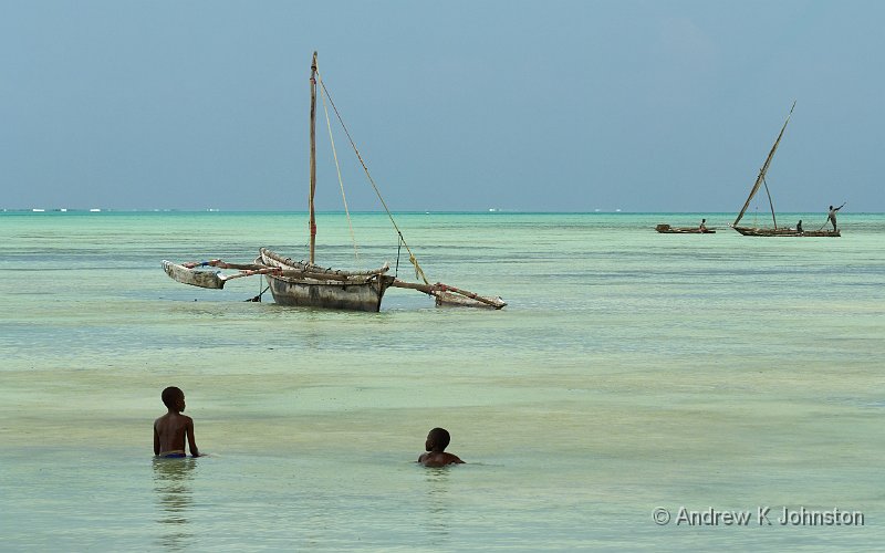
Another Day, Another Village, Very Different
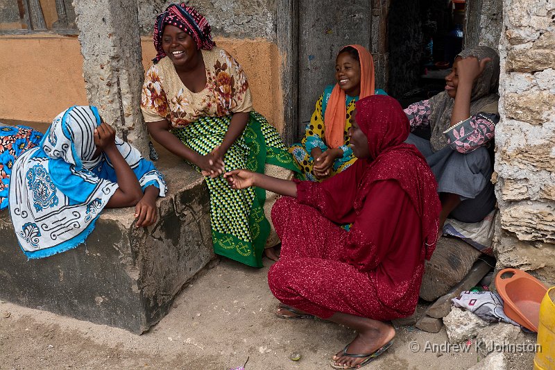
The departure time for the morning shoot was set even earlier than on previous days and I again demurred, preferring to catch up on sleep now my body had adapted to the warm. Apparently I missed a shark being landed … Continue reading
Foiled!
I carefully did not set my alarm, so that I would not have to get up to join the sunset shoot, which would be another walk up and down the length of the beach. However this all proved academic when … Continue reading
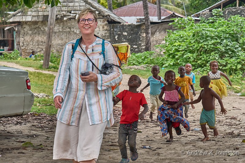
I Love Work, I Could Sit and Watch It All Day
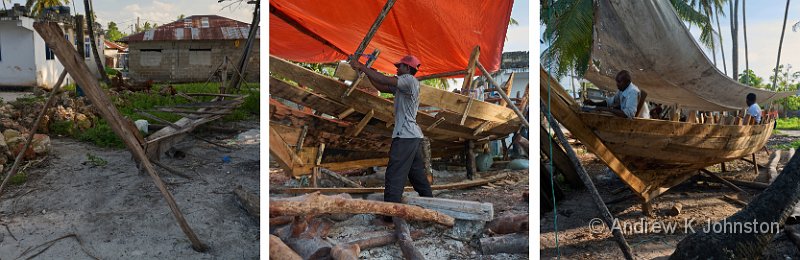
We made an early start and met our new guide, Omar, at about 5.30. He immediately set off at a pace which would not have disgraced some military route marches, through the rough back streets of Nungwi. This was a … Continue reading
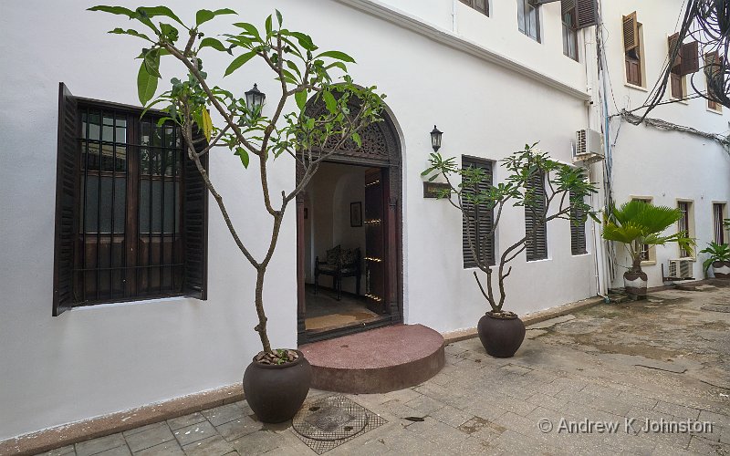
Bububu and M’Kokotoni
I eschewed the opportunity for a 4.30 start. Instead I took advantage of the lack of an arms race between the various religious factions regarding who can wake up whom earlier, and had a bit of a lie-in. After a … Continue reading
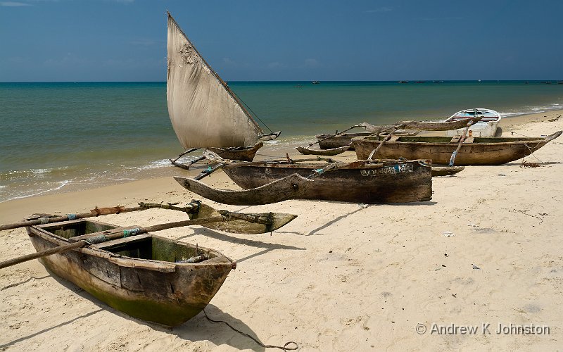
Jambiani
We made an early start and headed for Zanzibar’s South East coast. The trip took a bit longer than expected, but at least we were in a comfortable air-conditioned bus. After dropping our luggage at the hotel we headed for … Continue reading
Market Forces
Night 2 was an improvement on night 1, but I was awoken by an unfortunate combination of back-ache (something to do with all the steep stairs?) and a very early Muslim call to prayer. We started at the big Malindi … Continue reading
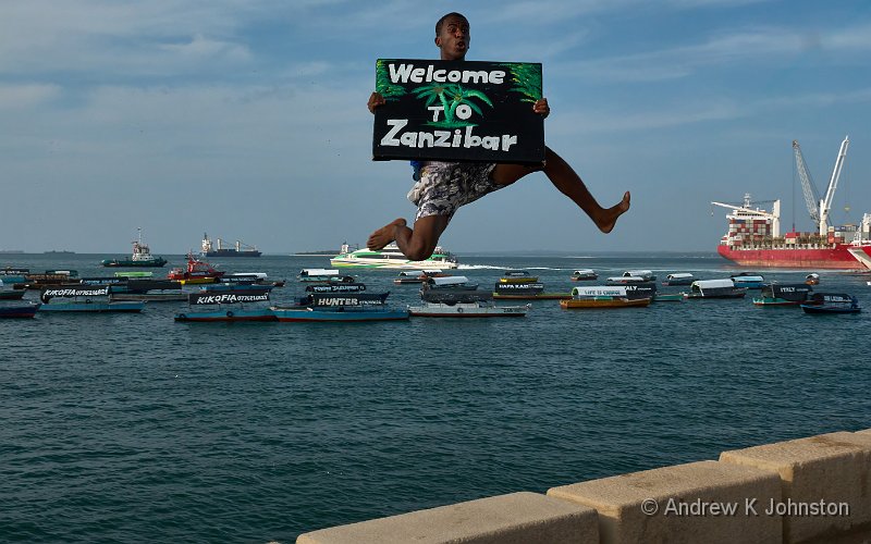
The Zanziblog
No sooner is the Red Rock Blog committed to the Internet, then I’m off travelling again. This is yet another catch-up multiply deferred due to the pandemic. While all the travel this year has been great, it’s been a bit … Continue reading
Red Rock Retrospective
With our trip now firmly in the rear-view mirror, I’ve looked back and tried to condense what we experienced into guidance for future visitors and photographers. The primary purpose of our Red Rock Trip was very definitely to look at … Continue reading
Second Time Lucky
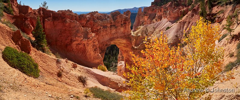
I made an early start and made the short drive to Sunrise Point. This one is aptly named – you see the sun rise over the distant plateaus, and then a minute or so later the rocks in the amphitheatre … Continue reading
Looping Back to Bryce
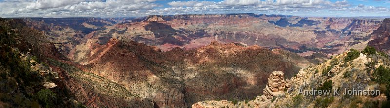
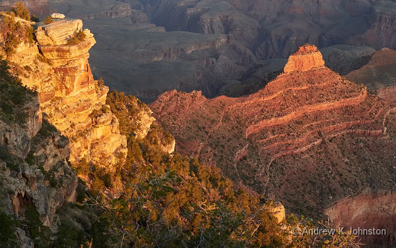
I started the day in Grand Canyon with a third sunrise shoot, this time at Yavapai Point. I was almost first there and could choose my spot, but it soon got very busy. What was interesting was that in the … Continue reading
In Which Andrew and Frances Solve the Problem of Food in the Grand Canyon
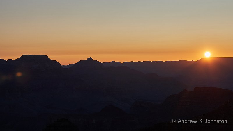
Tuesday started with another dawn shoot. I caught the 5.30 shuttle bus to Yaki Point, which was full, but to my great surprise almost everyone got off at the prior stop, and I had the sunrise spot almost to myself. … Continue reading
 Email me
 @TweetAndrewJ
 Others
 Thoughts on the World (Main Feed)
 Main feed (direct XML)